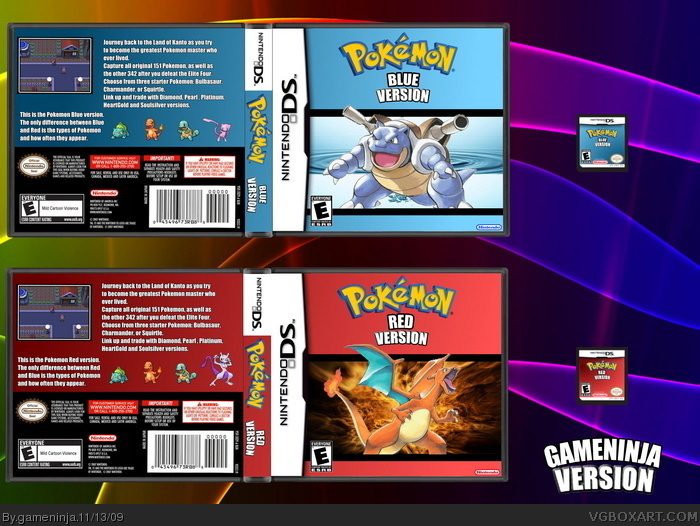
My fourth (and favorite) box. It took me a whole day to do this one. Cred goes to
spypilot for DS card
Ray Blade for all of the DS box stuff
roza for the Pokemon logo
E G for the ESRB
Cerium for the Nintendo
Pokemon Platinum for the sprites
Pokemon Manga for the charizard and blastoise
I agree with Delicious, plus you could maybe add a couple screenshots showing battles? That would maybe improve it, but looking good, definatly your best box yet! :)
I feel like the use of the horizontal line is pretty similar to my R/B boxes, but I by no means hold the exclusive rights to the concept. I'm not accusing you of copying anything, I'm just saying that you probably could've come up with something that wasn't already done.
Regardless of that, conceptually I think this is spectacular. I get so tired of "Pick color name, create color gradient, paste pokemon" covers. So this is certainly a nice variation of what one might expect from a typical box.
I think the fire and water within the bar could've stood to be more discreet. Maybe if you were to darken them, it would make it more subtle and also allow for Charizard and Blastoise to be more visible. (Right now they both kind of blend with the background.)
I also feel like the text on the back could stand some work. It feels really unnatural, and the games aren't going to say "Oh, and after you do X, you unlock Y!" like you wrote (Concerning the Elite Four and catching other Pokemon.)
Lastly, never underestimate the importance of high resolution, clean, images. There's no excuse for having choppy or white/pixelated edges, since anyone can crop images, it only depends on how much effort and time you put into it.
 Pokemon Red & Blue Box Cover Comments
My fourth (and favorite) box. It took me a whole day to do this one. Cred goes to
spypilot for DS card
Ray Blade for all of the DS box stuff
roza for the Pokemon logo
E G for the ESRB
Cerium for the Nintendo
Pokemon Platinum for the sprites
Pokemon Manga for the charizard and blastoise
Please give tips or advice!!
[ Reply ]
I like the fronts, they're real nice. The backs are a little boring because of how text heavy they are, and the solid colored backgrounds they have.
[ Reply ]
#2, thanks. I'll do a version 2 eventually.
[ Reply ]
I agree with Delicious, plus you could maybe add a couple screenshots showing battles? That would maybe improve it, but looking good, definatly your best box yet! :)
[ Reply ]
I feel like the use of the horizontal line is pretty similar to my R/B boxes, but I by no means hold the exclusive rights to the concept. I'm not accusing you of copying anything, I'm just saying that you probably could've come up with something that wasn't already done.
Regardless of that, conceptually I think this is spectacular. I get so tired of "Pick color name, create color gradient, paste pokemon" covers. So this is certainly a nice variation of what one might expect from a typical box.
I think the fire and water within the bar could've stood to be more discreet. Maybe if you were to darken them, it would make it more subtle and also allow for Charizard and Blastoise to be more visible. (Right now they both kind of blend with the background.)
I also feel like the text on the back could stand some work. It feels really unnatural, and the games aren't going to say "Oh, and after you do X, you unlock Y!" like you wrote (Concerning the Elite Four and catching other Pokemon.)
Lastly, never underestimate the importance of high resolution, clean, images. There's no excuse for having choppy or white/pixelated edges, since anyone can crop images, it only depends on how much effort and time you put into it.
[ Reply ]
#5, Thanks a lot for your comments. I was actually inspired by your boxes.
[ Reply ]
#6, I'm glad you like them. It's good to know I've inspired someone.
[ Reply ]