It's really creepy, but this and the last two boxes I've posted have all been on the SEVENTH of the month... :O
Creepy. Yeah, so the last one I did was Batman Arkham Asylum and I really liked the new template (a nice change from making them 3D all the time) so I decided to do it again for this one.
OK so I know I only did Assassin's Creed II a couple of boxes ago, but the problem is I still don't have the bloody game and this seems to be the only way to get a bit closer to it :D
No idea how, unless someone wants to give me some money...?
#2, I was considering whether or not to cut the text or not. In the end I decided to because it seemed to fit in with the box. Only part of the end letters is cut but only to a degree which allows you to still read the text easily. Oh well, you can't please everyone! :D
#11, Care to name any more of these stylistic/grammatical errors?
But thanks for mentioning about the name, I hadn't realised it was 'da' rather than 'de'.
THANK YOU TO EVERYONE WHO HAS FAVOURITED MY BOXARTS!
1000 FAVS AND COUNTING!
#13, Unfortunately there's no prize for being the 1000th person, Adhiboy, but please live the rest of your life with the satisfaction of getting me to this milestone!
That's a great box, very nice flow, great balance, great effects, lighting and color choice. It really looks nice, I just don't like how some of the words on the back are cut off.
tbh I can't say I really like it much at all. When I first saw it I was skeptical and when I zoomed in on it there were parts of it that I liked, but overall I don't like the look of it really.
It looks a lot like some feathered pictures with some sort of texture placed over them. The washed out color scheme makes it hard to distinguish pictures in it. When I look at a cover I like to automatically know what I'm looking at. A few parts on this I had to stare at for a few seconds to recognize them.
I guess the main reason I don't like it is that it just comes off looking real messy. The combination of a few feathered renders, a washed out color scheme, and a texture I'm not feeling make me not really like the look of this.
This seems to be well received by some so you are definitely doing som things right, good job!
#27, Thanks for your in-depth analysis and opinion.
I agree with you in some instances, but not in others. The images used are effectively blended and feathered together and overlayed onto the same blue Da-Vinci-esque background that I used in my last Assassin's Creed II box.
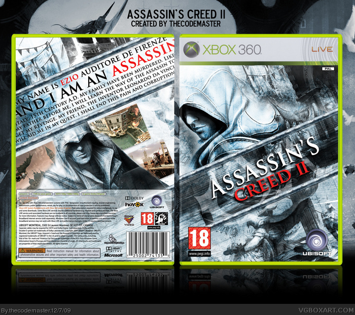
There are actually only three main components to the imagery, however, if you ignore the overlaying lines and geometrical shapes in the Da Vinci background. There is Ezio himself, in two instances, on the front and rear colour. The second image is that of Ezio stabbing another man (bottom right), the third image is a wallpaper you may have seen before (of a canal boat and an image of some streets and architecture). I disagree, therefore, about not seeing the individual images - but that's the thing, you stopped, and you looked. That's the idea of videogame packaging, is it not?
I know what you mean about the front looking messy, not perhaps the back. The presence of Ezio taking up a large proportion and the rest as thick shapes and lines of Renaissance Italy does make the central section and upper-right look quite busy. There are no renders. Only artwork.
 Assassin's Creed II Box Cover Comments
It's really creepy, but this and the last two boxes I've posted have all been on the SEVENTH of the month... :O
Creepy. Yeah, so the last one I did was Batman Arkham Asylum and I really liked the new template (a nice change from making them 3D all the time) so I decided to do it again for this one.
OK so I know I only did Assassin's Creed II a couple of boxes ago, but the problem is I still don't have the bloody game and this seems to be the only way to get a bit closer to it :D
No idea how, unless someone wants to give me some money...?
[ Reply ]
Wow, this is awesome. Good to see a different looking AC2 box. The only thing I don't like about it is that the text on the back is cutoff.
[ Reply ]
Shamwow!
[ Reply ]
You know what I think, haha :D
[ Reply ]
#2, I was considering whether or not to cut the text or not. In the end I decided to because it seemed to fit in with the box. Only part of the end letters is cut but only to a degree which allows you to still read the text easily. Oh well, you can't please everyone! :D
[ Reply ]
mmmmm slanty.
[ Reply ]
A unique design to compared to other ACII boxes, even if the quality is not as high in full view.
+FAV
[ Reply ]
it looks cool, good job fav
Edited at 1 decade ago
[ Reply ]
OH LAWD
[ Reply ]
dotdotdot
[ Reply ]
It's
"Ezio Auditore DA Firenze"
not
"Ezio Auditore DE Firenze"
And rewrite the text on the back. It's awkward and has a few stylistic/grammatical errors.
That's the only thing wrong with it. Otherwise it's awesome.
[ Reply ]
#11, Care to name any more of these stylistic/grammatical errors?
But thanks for mentioning about the name, I hadn't realised it was 'da' rather than 'de'.
[ Reply ]
This is good. It isn't like most of the other AC2 boxes.
[ Reply ]
THANK YOU TO EVERYONE WHO HAS FAVOURITED MY BOXARTS!
1000 FAVS AND COUNTING!
#13, Unfortunately there's no prize for being the 1000th person, Adhiboy, but please live the rest of your life with the satisfaction of getting me to this milestone!
[ Reply ]
I don't know why but I'm not a real fan of this one. I absolutely love Assassin's Creed 2 though.
[ Reply ]
nice job!
[ Reply ]
That's a great box, very nice flow, great balance, great effects, lighting and color choice. It really looks nice, I just don't like how some of the words on the back are cut off.
[ Reply ]
#14
lol
[ Reply ]
AMAZING.
[ Reply ]
Plis, imprimible!!!!!!!!!!!!!!!!!!!
is the best ...
[ Reply ]
Wow this box has been up for one day and has HoF. But I can see why!
[ Reply ]
Wow, this is very cool
[ Reply ]
Love the editing and the text layouts. Great job my friend.
[ Reply ]
Uh huh.
[ Reply ]
This could be your first MasterWorks.
[ Reply ]
#25, It's already my most favourited box! The only other up this high is my Rock Band DS design :)
[ Reply ]
tbh I can't say I really like it much at all. When I first saw it I was skeptical and when I zoomed in on it there were parts of it that I liked, but overall I don't like the look of it really.
It looks a lot like some feathered pictures with some sort of texture placed over them. The washed out color scheme makes it hard to distinguish pictures in it. When I look at a cover I like to automatically know what I'm looking at. A few parts on this I had to stare at for a few seconds to recognize them.
I guess the main reason I don't like it is that it just comes off looking real messy. The combination of a few feathered renders, a washed out color scheme, and a texture I'm not feeling make me not really like the look of this.
This seems to be well received by some so you are definitely doing som things right, good job!
[ Reply ]
#27, Thanks for your in-depth analysis and opinion.
I agree with you in some instances, but not in others. The images used are effectively blended and feathered together and overlayed onto the same blue Da-Vinci-esque background that I used in my last Assassin's Creed II box.
There are actually only three main components to the imagery, however, if you ignore the overlaying lines and geometrical shapes in the Da Vinci background. There is Ezio himself, in two instances, on the front and rear colour. The second image is that of Ezio stabbing another man (bottom right), the third image is a wallpaper you may have seen before (of a canal boat and an image of some streets and architecture). I disagree, therefore, about not seeing the individual images - but that's the thing, you stopped, and you looked. That's the idea of videogame packaging, is it not?
I know what you mean about the front looking messy, not perhaps the back. The presence of Ezio taking up a large proportion and the rest as thick shapes and lines of Renaissance Italy does make the central section and upper-right look quite busy. There are no renders. Only artwork.
[ Reply ]
I have to agree with Hawt ES that the textures could've been applied better.
[ Reply ]
Congrats on MW!
[ Reply ]
Thanks for all the favs guys/gals!
My first MasterWorks!
[ Reply ]
Nice man, The only thing that would make it better would be a printable and an ESRB Rating instead of a PEGI.
[ Reply ]
#32, Printable fair enough but I have no reason whatsoever to use an ESRB rating because our country uses the PEGI rating system.
[ Reply ]
Nice Job BRO
[ Reply ]
Ich liebe das box!
[ Reply ]
nice cover great
[ Reply ]
please printable awesome
[ Reply ]
Wow beautiful! is it possible to have the print model?
[ Reply ]