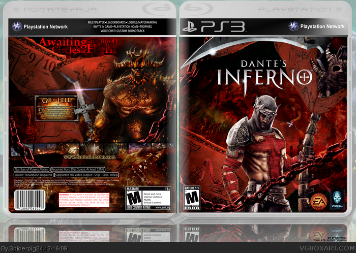
This is okay,
FRONT: It's pretty good but i think the render is used to much and he isn't fitting into the background well with all the destruction yet he stands without a scratch (excluding his chest)
BACK: Okay you're biggest flaws are that the screenshots get lost in the design and there to small, same with the tag-line and synopsis although i do like the background.
But i don't feel it's worth a fav. sorry.
Fix the things i said and i will cause this box has a lot of potential.
I like it actually. Although the dude on the front needs to have his colours altered to suit his background more, and he needs to have been cut out with an ounce more precision.
If you can, take Graham's advice. lol I was about to say basically the same things as he did. If you did those things on a Version 2, this would be perfect.
Wow. Thats amazing! A lot of good artist on this site. Is it possible for me do download this and use it as my game cover art pls. Sorry newbie. Thanks
 Dantes Inferno Box Cover Comments
Well here is my newest box, credit to Silent Oblivion for the template. Thanks to everyone in the critiques forum for their help, please view in full.
[ Reply ]
this is great! especially like the back.
[ Reply ]
Perfect!
[ Reply ]
Looks pretty good.
[ Reply ]
Epic in every respect!
[ Reply ]
Thanks everybody for the comments and favorites.
#2-5, Thanks, I really appreciate the comments.
[ Reply ]
This Is amazing man!
[ Reply ]
Overall it looks amazing but I think that the synopsis box on the back is way to small.
[ Reply ]
This is okay,
FRONT: It's pretty good but i think the render is used to much and he isn't fitting into the background well with all the destruction yet he stands without a scratch (excluding his chest)
BACK: Okay you're biggest flaws are that the screenshots get lost in the design and there to small, same with the tag-line and synopsis although i do like the background.
But i don't feel it's worth a fav. sorry.
Fix the things i said and i will cause this box has a lot of potential.
[ Reply ]
I like it actually. Although the dude on the front needs to have his colours altered to suit his background more, and he needs to have been cut out with an ounce more precision.
Edited at 1 decade ago
[ Reply ]
Oh I remember of this game. A friend of mine bought this game for his cousin and we both played most of that day. \o/
BTW, great box! The front and the back were very creative.
+fav
[ Reply ]
#11, lies
[ Reply ]
#11, The game isn't out you idiot :P
Beautiful box. I really hope this makes hall.
[ Reply ]
If you can, take Graham's advice. lol I was about to say basically the same things as he did. If you did those things on a Version 2, this would be perfect.
[ Reply ]
#11, You... Prune.
[ Reply ]
Thanks everybody for the comments and favorites!
#9, 14, Thanks VERY much for the critiques, I will update with those changes.
[ Reply ]
wait... this game has nothing to do with DMC?
*feels like an idiot*
[ Reply ]
Wow. Thats amazing! A lot of good artist on this site. Is it possible for me do download this and use it as my game cover art pls. Sorry newbie. Thanks
[ Reply ]