[ Buy EA Fight Nig... at Amazon ] By treesquirrel12 5 on July 23rd, 2006 No Printable Available [ Box updated on July 23rd, 2006 ] [ original ] EA Fight Night: Round 3 Box Cover Comments Comment on treesquirrel12's EA Fight Night: Round 3 Box Art / Cover. Cancel Reply hawaiian_dragon 3 [ 1 decade ago ] The logo is kind of blurry, It's in the wrong spot, but I like the picture. However, this looks like a mockup box. 3/5 [ Reply ] treesquirrel12 5 [ 1 decade ago ] I feel that i really caught the feel of the ga,e here as in your so close you can feel the blood and sweat flying from the TV on to you. please rate and comment. this is treesquirrel12 have a squirrely wrath day, thank you. :) [ Reply ] gizmo 1 [ 1 decade ago ] Fight Night logo is badly cut out. [ Reply ] treesquirrel12 5 [ 1 decade ago ] ill fix that logo but where is it really supposed to be??? [ Reply ] gizmo 1 [ 1 decade ago ] Above the shoulder of the guy punching maybe. [ Reply ] treesquirrel12 5 [ 1 decade ago ] k ill try that [ Reply ] treesquirrel12 5 [ 1 decade ago ] i fixed up the logo and moved it and sharpened it tell me what you think. [ Reply ] WickedGamer1 37 [ 1 decade ago ] whats that random while curvey line by the guy's glove? O_o [ Reply ] gizmo 1 [ 1 decade ago ] It's better, maybe fix the logo a little more. [ Reply ] gizmo 1 [ 1 decade ago ] Maybe a little wider. [ Reply ] robot343 1 [ 1 decade ago ] 5/5 [ Reply ] Ratchetcomand 8 [ 1 decade ago ] you've gotten a lot better treesquirrel12 . 4/5 [ Reply ] mooglybear 1 [ 1 decade ago ] sweet [ Reply ] Lenny819 38 [ 1 decade ago ] 38 yeah i wondered the same thing ,#4 wats the white thing inbetween his gloves [ Reply ]

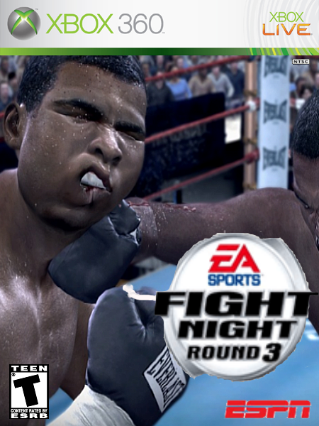
 EA Fight Night: Round 3 Box Cover Comments
The logo is kind of blurry, It's in the wrong spot, but I like the picture. However, this looks like a mockup box. 3/5
[ Reply ]
I feel that i really caught the feel of the ga,e here as in your so close you can feel the blood and sweat flying from the TV on to you. please rate and comment. this is treesquirrel12 have a squirrely wrath day, thank you. :)
[ Reply ]
Fight Night logo is badly cut out.
[ Reply ]
ill fix that logo but where is it really supposed to be???
[ Reply ]
Above the shoulder of the guy punching maybe.
[ Reply ]
k ill try that
[ Reply ]
i fixed up the logo and moved it and sharpened it tell me what you think.
[ Reply ]
whats that random while curvey line by the guy's glove? O_o
[ Reply ]
It's better, maybe fix the logo a little more.
[ Reply ]
Maybe a little wider.
[ Reply ]
5/5
[ Reply ]
you've gotten a lot better treesquirrel12 .
4/5
[ Reply ]
sweet
[ Reply ]
38 yeah i wondered the same thing ,#4 wats the white thing inbetween his gloves
[ Reply ]