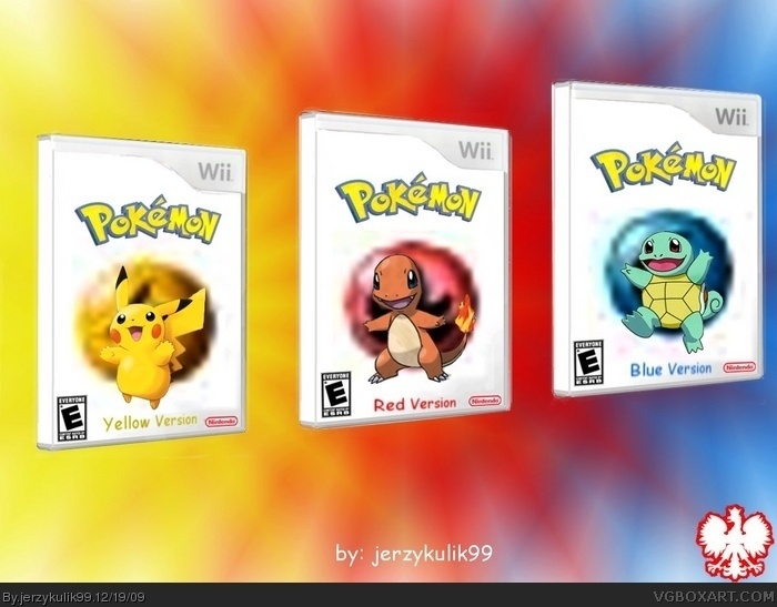
I'm gonna be honest here, I despise the coloured frames, they are poorly drawn. And I'm struggling to see what took you "a while to make", however, I will say this: Seeing as this is a wii game, the minimalist thing can and does go well, as you have shown quite well here. The single pokemon on the front with the logo above says it all. So what I would do is remove your frames and the text saying the version of the game at the bottom, and there you have it. Simple yet effective, although I'd be carful with that - it usually leads to people saying shit like "This is clearly not a good enough effort", but hey, sometimes its not about the time poured into a piece, more the eye for good taste. Nice though, but untill the frames are gone there shall be no fav's from me. Just keep playing around with the GIMP, time spent = skill gained. Phew that was a long post. ;)
#2, I completely disagree, you can't just say 'it usually leads to people saying shit like "This is clearly not a good enough effort", but hey, sometimes its not about the time poured into a piece' yes simplicity can work but there is still a lot of effort put into them, and when most boxes are amazing they take a lot of effort, and you must have effort in your boxes to make them look good. And I see what he means when he said it takes a while to make, the presentation is pretty good and the borders may have been tricky yo keep them completely parallel and an even distance from the sides of the box.
Anyway the box, I would lose the borders like #2 said but keep the version text (you can tell which is which on the gameboy, but they still had it there in text) but i would make it stand out more, you could probably go into the forums and request one for each. Also get rid of the white back ground and add something, maybe an effect or an image of an area from pokemon. With a bit of work, this could be very good :)
#3, Let's remember that in fact he is not going for an official look - I mean whats the point, theres already an official. And Jay if you look at my work you will see, I, myself am not a huge fan of simplicity in my own work :)
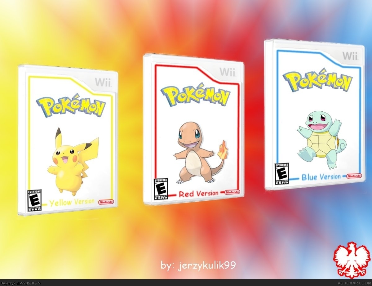
there u go i updated it. i got rid of the borders as asked and i added a little something to the back
oh and yes i was going for a simplistic look
tell me wut u think
 Pokemon Box Cover Comments
took me a while to make it on gimp
comments are appreciated
[ Reply ]
I'm gonna be honest here, I despise the coloured frames, they are poorly drawn. And I'm struggling to see what took you "a while to make", however, I will say this: Seeing as this is a wii game, the minimalist thing can and does go well, as you have shown quite well here. The single pokemon on the front with the logo above says it all. So what I would do is remove your frames and the text saying the version of the game at the bottom, and there you have it. Simple yet effective, although I'd be carful with that - it usually leads to people saying shit like "This is clearly not a good enough effort", but hey, sometimes its not about the time poured into a piece, more the eye for good taste. Nice though, but untill the frames are gone there shall be no fav's from me. Just keep playing around with the GIMP, time spent = skill gained. Phew that was a long post. ;)
[ Reply ]
#2, I completely disagree, you can't just say 'it usually leads to people saying shit like "This is clearly not a good enough effort", but hey, sometimes its not about the time poured into a piece' yes simplicity can work but there is still a lot of effort put into them, and when most boxes are amazing they take a lot of effort, and you must have effort in your boxes to make them look good. And I see what he means when he said it takes a while to make, the presentation is pretty good and the borders may have been tricky yo keep them completely parallel and an even distance from the sides of the box.
Anyway the box, I would lose the borders like #2 said but keep the version text (you can tell which is which on the gameboy, but they still had it there in text) but i would make it stand out more, you could probably go into the forums and request one for each. Also get rid of the white back ground and add something, maybe an effect or an image of an area from pokemon. With a bit of work, this could be very good :)
Edited at 1 decade ago
[ Reply ]
#3, Let's remember that in fact he is not going for an official look - I mean whats the point, theres already an official. And Jay if you look at my work you will see, I, myself am not a huge fan of simplicity in my own work :)
[ Reply ]
there u go i updated it. i got rid of the borders as asked and i added a little something to the back
oh and yes i was going for a simplistic look
tell me wut u think
[ Reply ]
OK, glad the boarders are gone but the backdrop honestly is horrible: too pixelly. If I were you I'd look for renders in the resource section.
[ Reply ]