Hey VGBoxart! I spent a lot of time on this box, so I hope you like it! Oh, sorry about the synopsis on the back, I don't know the exact storyline. So, other than that, tell me what you think!
Uh, del337er, not trying to sound pushy, but you didn't fav. Thanks to both of you for the favs though! And you're my two favorite authors, yay I'm happy!
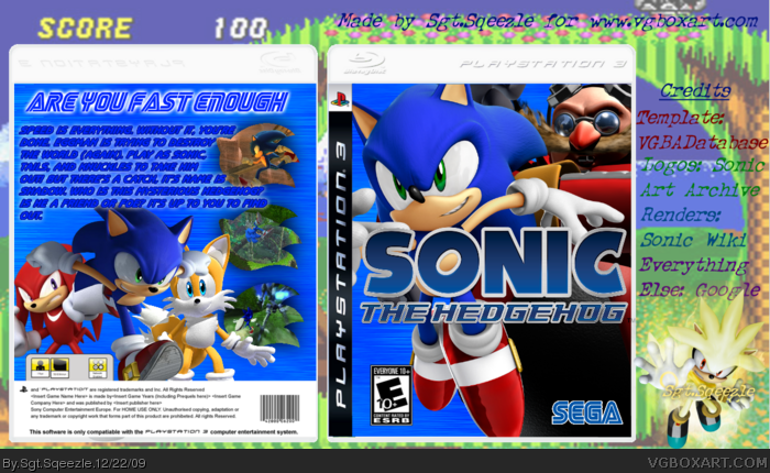
My biggest issues with this box are the background of the box and the font choices on the description. The font should at least be white against that background so it is more visible. I have a hard time reading it.
The layout seems too crammed and it has little flow.
I have definitely seen much worse, but I think it would help to look at images and boxes for the game and try to make something that feels more like the game.
Okay. The background, I was trying to capitalize on the speed aspect of the game by using motion blur, I added a white glow to the text to try to prevent that from happening, and well, yes I can't fix the crammed layout, sorry. And I try not to look at the actual box so I can make my boxes kind of unique. All the things here were part of a kind of speed and rushing theme.
My biggest problem with this box is the back. I don't like the Sega font on the "ARE YOU FAST ENOUGH" heading, even though I know only lowercase letters will work with it. It just looks... I don't know, and you've used it so many times, it seems kind of repetitive. I mean, I'm okay with it, just not entirely happy with it. And I can't read the text below. So, 3/5 +fav.
 Sonic the Hedgehog Box Cover Comments
Hey VGBoxart! I spent a lot of time on this box, so I hope you like it! Oh, sorry about the synopsis on the back, I don't know the exact storyline. So, other than that, tell me what you think!
[ Reply ]
It's sad that no one even comment this
------------------------------------------------------
It's actually pretty good
+fav
[ Reply ]
Woah! Dude this is definatly your best box yet, very nice job :) +FAV
[ Reply ]
Uh, del337er, not trying to sound pushy, but you didn't fav. Thanks to both of you for the favs though! And you're my two favorite authors, yay I'm happy!
[ Reply ]
My biggest issues with this box are the background of the box and the font choices on the description. The font should at least be white against that background so it is more visible. I have a hard time reading it.
The layout seems too crammed and it has little flow.
I have definitely seen much worse, but I think it would help to look at images and boxes for the game and try to make something that feels more like the game.
[ Reply ]
Okay. The background, I was trying to capitalize on the speed aspect of the game by using motion blur, I added a white glow to the text to try to prevent that from happening, and well, yes I can't fix the crammed layout, sorry. And I try not to look at the actual box so I can make my boxes kind of unique. All the things here were part of a kind of speed and rushing theme.
[ Reply ]
Forgot to mention this earlier, but tleeart, no offense but I'm not changing anything.
[ Reply ]
This is really good +fav
[ Reply ]
Thanks for the fav!
[ Reply ]
My biggest problem with this box is the back. I don't like the Sega font on the "ARE YOU FAST ENOUGH" heading, even though I know only lowercase letters will work with it. It just looks... I don't know, and you've used it so many times, it seems kind of repetitive. I mean, I'm okay with it, just not entirely happy with it. And I can't read the text below. So, 3/5 +fav.
[ Reply ]