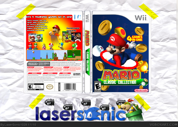
The front has just a plain background with some rotated coins and mushrooms; a poorly cut out Mario render, a choppy white elypse with a choppy stroke; the stroke on the "Mario" part of the logo its choppy and a developer logo/ESRB rating too near the template border.
The back seems to have a PowerPoint-made background and a Mario render with a transparent-to-foreground gradient; the tagline is, again, too near to the template border; the tagline/synopsis/screenshots descriptions seems to be just a native Windows (R) font with a choppy stroke. The upper screenshots are randomly placed; the lower screenshots just have a plain stroke as a border; the titles of the lower screenshots are barely visible; the renders behind those same screenshots looks weird and they're out of scale (And I'm not gonna talk about that they have different styles...).
The logoS on the spine should be merged like in the front, in the actual way they looks bad.
BTW the adhesive tape (On the presentation) does not look good; the entire box don't seem to be that it's on the paper and your logo does not seems to be printed on that piece of paper.
I kinda like the front, it would be great if you could remove that horrible red circle and tried to make a new one that isn't so choppy. Also, I love the idea ;)
#4, I completely agree, I think you covered just about everything.
IMO this box could have a lot of potential, but you just need to take more time on your boxes, plan it out before you jump straight into a box, think about what you want to have, and what you can have if you cant have what you originally wanted.
I have been looking at your page..it seems to me that all you do is slap on renders. you think putting loads of render on a bright background makes a good box? It does not mate sorry. you have to think Now you have the basics sorted in box making you should now start working on effects and things like that You seem to have lots of potential you just have to remember practice makes perfect. :)
good luck Ps ;).
EDIT: looking at your older boxes you have got a lot better keep it up :)
 Mario Classic Collection Box Cover Comments
View in full please
I thought this box's gonna fail but the back turned out pretty good
Credit:
All image from PlanetRenders, Google, and Super Mario Wiki
Template by Jevangod
[ Reply ]
its good,
the back is just a little bare
[ Reply ]
#2, yeah I guess
[ Reply ]
To be honest, this is bad.
The front has just a plain background with some rotated coins and mushrooms; a poorly cut out Mario render, a choppy white elypse with a choppy stroke; the stroke on the "Mario" part of the logo its choppy and a developer logo/ESRB rating too near the template border.
The back seems to have a PowerPoint-made background and a Mario render with a transparent-to-foreground gradient; the tagline is, again, too near to the template border; the tagline/synopsis/screenshots descriptions seems to be just a native Windows (R) font with a choppy stroke. The upper screenshots are randomly placed; the lower screenshots just have a plain stroke as a border; the titles of the lower screenshots are barely visible; the renders behind those same screenshots looks weird and they're out of scale (And I'm not gonna talk about that they have different styles...).
The logoS on the spine should be merged like in the front, in the actual way they looks bad.
BTW the adhesive tape (On the presentation) does not look good; the entire box don't seem to be that it's on the paper and your logo does not seems to be printed on that piece of paper.
Sorry, but this could use lots of work.
-Manuel.
#5, Then why submit it?
Edited at 1 decade ago
[ Reply ]
#4, I knew This was a failed box... :(
[ Reply ]
Um....it's a classic collection yet you use no classic imagery of Mario. That's wrong.
[ Reply ]
I kinda like the front, it would be great if you could remove that horrible red circle and tried to make a new one that isn't so choppy. Also, I love the idea ;)
[ Reply ]
#4, I completely agree, I think you covered just about everything.
IMO this box could have a lot of potential, but you just need to take more time on your boxes, plan it out before you jump straight into a box, think about what you want to have, and what you can have if you cant have what you originally wanted.
[ Reply ]
Sorry, but, this is just bad. And anyways, they have this stuff on Wii VC.
[ Reply ]
I have been looking at your page..it seems to me that all you do is slap on renders. you think putting loads of render on a bright background makes a good box? It does not mate sorry. you have to think Now you have the basics sorted in box making you should now start working on effects and things like that You seem to have lots of potential you just have to remember practice makes perfect. :)
good luck Ps ;).
EDIT: looking at your older boxes you have got a lot better keep it up :)
Edited at 1 decade ago
[ Reply ]
The red circle make it bad... althought, i like the style so i'll fav! +author fav
[ Reply ]
I'll try to make it better
[ Reply ]
Double Post.......
Edited at 1 decade ago
[ Reply ]
wheres donkey konk and mario bros.?
but i fav all your stuff so i fav
[ Reply ]
This is a pretty decent box. Good enough for a fave.
[ Reply ]