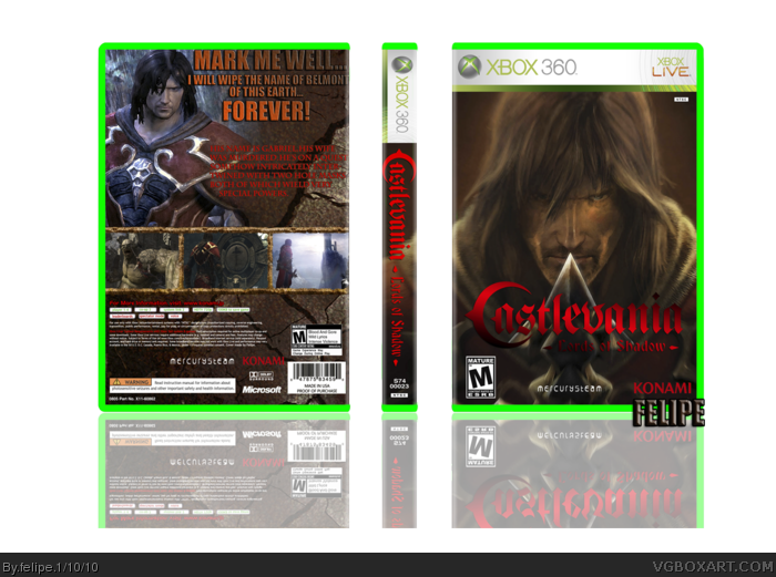
The back feels a bit empty.
Try adding some texture in the background,and add some other small elements.
I'd also change the screenshots borders into something more fitting.
Also,the front could use some editing/extra elements.
Overall,a pretty good box.
Keep it up.
I suggest you to, in the from, turn the "Lords of Shadow" part of the logo a bit brighter.
In the back, turn the tagline on a lighter color and fix the positon of the synopsis.
Fix the width of the spine, looks a bit weird for an 360 box.
BTW, make the reflection more transparent and smaller.
Otherwise, It's pretty good!
I like it,
+Fav!
 Castlevania: Lords of Shadow Box Cover Comments
Hi! I hope you like it!
[ Reply ]
The back feels a bit empty.
Try adding some texture in the background,and add some other small elements.
I'd also change the screenshots borders into something more fitting.
Also,the front could use some editing/extra elements.
Overall,a pretty good box.
Keep it up.
[ Reply ]
thanks!
[ Reply ]
Good work.
[ Reply ]
thanks!
[ Reply ]
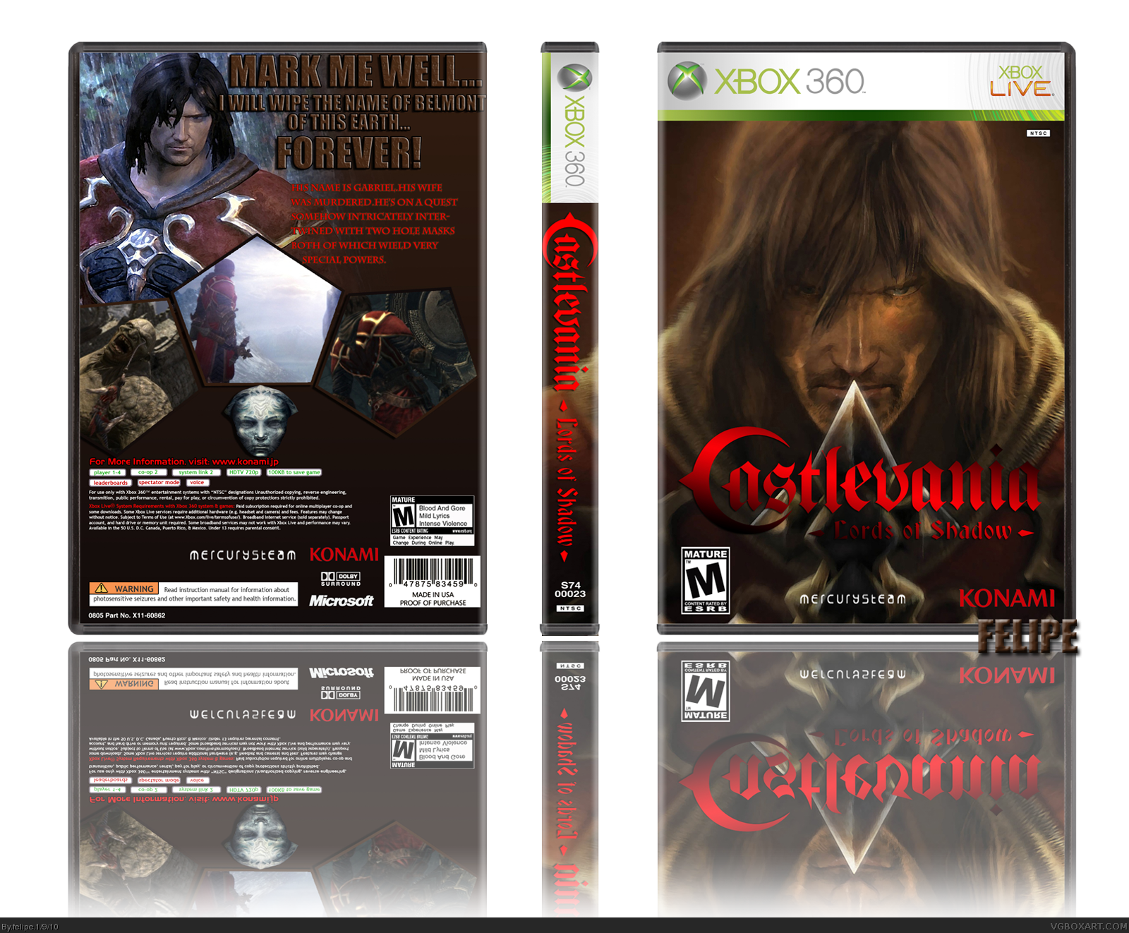
The image isnt showing :S
[ Reply ]
Ohh there we go. The back looks alright but dont make the text the same color as the background.
Edited at 1 decade ago
[ Reply ]
I suggest you to, in the from, turn the "Lords of Shadow" part of the logo a bit brighter.
In the back, turn the tagline on a lighter color and fix the positon of the synopsis.
Fix the width of the spine, looks a bit weird for an 360 box.
BTW, make the reflection more transparent and smaller.
Otherwise, It's pretty good!
I like it,
+Fav!
Edited at 1 decade ago
[ Reply ]
Nice but the plastic needs to be green.
But no biggie.
[ Reply ]
It is not that bad but I dont get any castlevania vibe from it
[ Reply ]
muito bom recomendo a todos!!the best
[ Reply ]