I think it looks pretty good, I really like the placement of the characters on both the front and the back. I don't really like the tagline or the screenborders though.
#4, I'm really against when people favorite a box that they made, but that's your choice I guess.
#5, Thanks mate, good enough for a fav? I wasn't too sure about him facing his own box either but it's his choice. He could just fav for the front and I guess that would be OK. Thanks Spiderpig.
I actually quite like this, the only part im not sure about is the solid colour behind the log, but yeah i understand that sometimes a logo doesnt look right without something behind it. Good effort fav :)
 Mario Party 9 Box Cover Comments
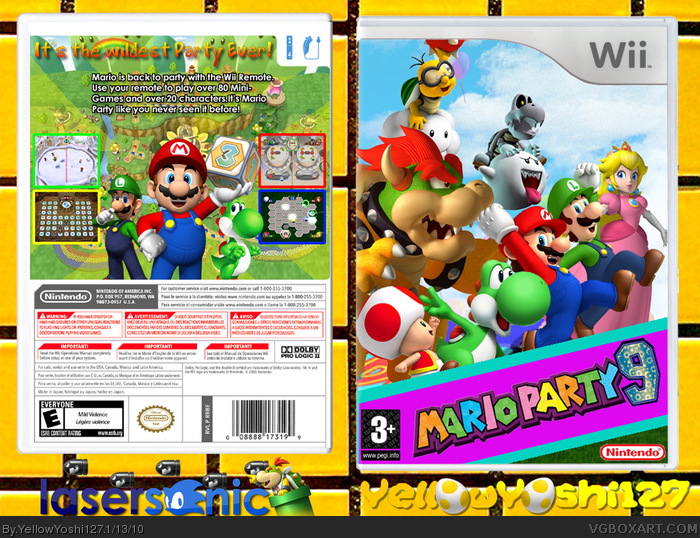
The collab between me and the wonderful LaserSonic. I did front, he did back.
Credit to tmrd for the template.
Edited at 1 decade ago
[ Reply ]
Its good, but I don't like how the front logo has a solid color behind it.
[ Reply ]
#2, I tried without solid but it didnt look as good....
[ Reply ]
#1, Actually, my back's template is Jevangod's
It's partly my box so of course:
+FAV
[ Reply ]
I think it looks pretty good, I really like the placement of the characters on both the front and the back. I don't really like the tagline or the screenborders though.
#4, I'm really against when people favorite a box that they made, but that's your choice I guess.
[ Reply ]
#5, Thanks mate, good enough for a fav? I wasn't too sure about him facing his own box either but it's his choice. He could just fav for the front and I guess that would be OK. Thanks Spiderpig.
[ Reply ]
I actually quite like this, the only part im not sure about is the solid colour behind the log, but yeah i understand that sometimes a logo doesnt look right without something behind it. Good effort fav :)
[ Reply ]
#7, Thanks, Ill test it out with a different background for the logo tomorrow.
[ Reply ]
#7, Thanks, Ill test it out with a different background for the logo tomorrow.
[ Reply ]