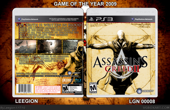
This wasn't the box i was going to submit today, but after looking through my drake's fortune cover, i decided it needed a little more work.
So i decided to upload this, Assassin's Creed 2 is one of my favourite games of the last year or in recent memory, one of the greatest adventure games i have ever played, a sure fire step up from the first and one awesome game, from flying, horse riding, assassinations, graphics, storyline, mini-games, optional missions and assassins tombs, this is one of the best games ever made.
Oh, and the cliffhanger ending....AGAIN.
Template: Deiviuxs
Renders: PlanetRenders
Screenborders: ICO, from the screenborders thread.
Logo: Resources.
If your wondering what tone i went with, i just ended up messing around with the dials and colorisation tools in the gimp program, it ended in a sepia-gold tone, so i blended it altogether and this come out.
For some odd reason, I think ive seen this front before...o.o
But the back is new and fresh! FAV
Also zooming the box, the bakcground looks stretched and blurred, you should fix that.
 Assassin's Creed II Box Cover Comments
This wasn't the box i was going to submit today, but after looking through my drake's fortune cover, i decided it needed a little more work.
So i decided to upload this, Assassin's Creed 2 is one of my favourite games of the last year or in recent memory, one of the greatest adventure games i have ever played, a sure fire step up from the first and one awesome game, from flying, horse riding, assassinations, graphics, storyline, mini-games, optional missions and assassins tombs, this is one of the best games ever made.
Oh, and the cliffhanger ending....AGAIN.
Template: Deiviuxs
Renders: PlanetRenders
Screenborders: ICO, from the screenborders thread.
Logo: Resources.
If your wondering what tone i went with, i just ended up messing around with the dials and colorisation tools in the gimp program, it ended in a sepia-gold tone, so i blended it altogether and this come out.
Edited at 1 decade ago
[ Reply ]
For some odd reason, I think ive seen this front before...o.o
But the back is new and fresh! FAV
Also zooming the box, the bakcground looks stretched and blurred, you should fix that.
Edited at 1 decade ago
[ Reply ]
The front looks almost exactly the same as mine.
[ Reply ]
#3, That's where ive seen it, same idea, but different.
Edited at 1 decade ago
[ Reply ]
#3, Great minds think alike huh.
EDIT: you were not wrong, we both had the same idea to use the vitruvian man and put Ezio in front.
#2, Thanks.
Edited at 1 decade ago
[ Reply ]
Finish this one because I would LOVE to use it.
[ Reply ]