Two hours? Seriously, you have a good start, but you need to spend more time on it. This box is far from a finished product, in my opinion. The logo on the front looks horribly jagged on the edges. Try this logo... link
Also, the screenshot borders could use some work to make them more original. Additionally, the text looks rather unfitting for this box.
I would recommend using the Critiques/Works in progress forum next time around. You can get some useful feedback there during the design process.
HUGE UPDATE!
-Template minor revamp; matches actual case preportions.
-'Halo Reach' logo updated with one of Crotales (Thx again btw).
-Background on case changed to one more central to the game.
-Back totaly reorganised.
-Signature added
This is looking waaaaaaayyyy better! Four things I'd do if it was me:
1. Take the signature off the box itself.
2. Work on brightening the text on the back. It does not stand out enough and rather looks out of place a bit still.
3. Update the screenshot borders with something more original. I used custom made Spartan uniform parts for my borders.
4. Beginning is spelled incorrectly at the top of the back.
You take care of those items and I'll bet this gets a LOT of faves.
 Halo Reach Box Cover Comments
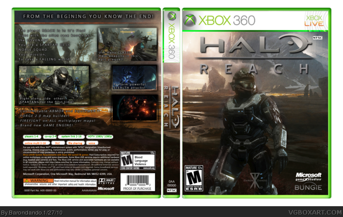
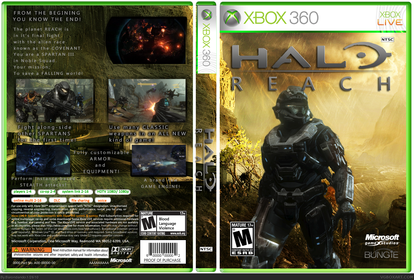
I made two versions of this box, the only differance between them is the background image.
I wanted to do a Halo Reach box that was more than just the spartans standing in front of a backdrop of the planet Reach, so I did.
2 Hours Photoshop CS3
Edited at 1 decade ago
[ Reply ]
This cover is amazing! Fav.
[ Reply ]
Two hours? Seriously, you have a good start, but you need to spend more time on it. This box is far from a finished product, in my opinion. The logo on the front looks horribly jagged on the edges. Try this logo... link
Also, the screenshot borders could use some work to make them more original. Additionally, the text looks rather unfitting for this box.
I would recommend using the Critiques/Works in progress forum next time around. You can get some useful feedback there during the design process.
Edited at 1 decade ago
[ Reply ]
#3, Thank you for the logo! I'll be updating this box soon, I'll be switching the background out for a more plot related one.
I won't update the back quite yet, but eventualy I'll revamp that too, any suggestions for it?
Edited at 1 decade ago
[ Reply ]
HUGE UPDATE!
-Template minor revamp; matches actual case preportions.
-'Halo Reach' logo updated with one of Crotales (Thx again btw).
-Background on case changed to one more central to the game.
-Back totaly reorganised.
-Signature added
[ Reply ]
This is looking waaaaaaayyyy better! Four things I'd do if it was me:
1. Take the signature off the box itself.
2. Work on brightening the text on the back. It does not stand out enough and rather looks out of place a bit still.
3. Update the screenshot borders with something more original. I used custom made Spartan uniform parts for my borders.
4. Beginning is spelled incorrectly at the top of the back.
You take care of those items and I'll bet this gets a LOT of faves.
[ Reply ]
I agree with everything Crotale suggested. I would try to make a better presentation too.
[ Reply ]