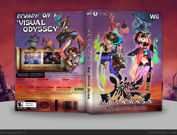
This one took quite a long time. Its strange that such a beautiful game like this only has 3 boxes. I started making this a long time back, but lost my work due to formatting. So i restarted it now.
I think it to be my personal best ever.
Credits:
Jevangod for the inspiration for the template.
Silent Oblivion for The scroll.
very well done, but the copy-part on the back is bad. I don't know how that effekt is called in english, but it should be something with "multiply"? The whole white get's transparent, yes, but this way you change the logo from the rating as well as the seal of quality. The bar code is getting alsmost unreadable if there are images behind it, that's why it is supposed to be on a white square. The red "attention" headlines are hard to read that way as well, so I'd try to redo this.
Very nice colors throughout. As far as Wasa-bi's comments go, he's often spoken against altering the template. I guess that's just the mark of a hardcore OCD typographer. I'm kind of surprised by the lack of response to this.
 Muramasa: The Demon Blade Box Cover Comments
This one took quite a long time. Its strange that such a beautiful game like this only has 3 boxes. I started making this a long time back, but lost my work due to formatting. So i restarted it now.
I think it to be my personal best ever.
Credits:
Jevangod for the inspiration for the template.
Silent Oblivion for The scroll.
Thanks in advance for comments and favs, if any.
Edited at 1 decade ago
[ Reply ]
The front looks similar to this unfinished boxart I made: link
But it's probably just coincidence?
Good job.
Edited at 1 decade ago
[ Reply ]
#2, Wow those are similar.
Great job though, I'm liking the colors.
[ Reply ]
#2, #3, Thanks.
And yes it is a coincidence.
Guess its a win for me if my box looks similar to qwerty's.
Edited at 1 decade ago
[ Reply ]
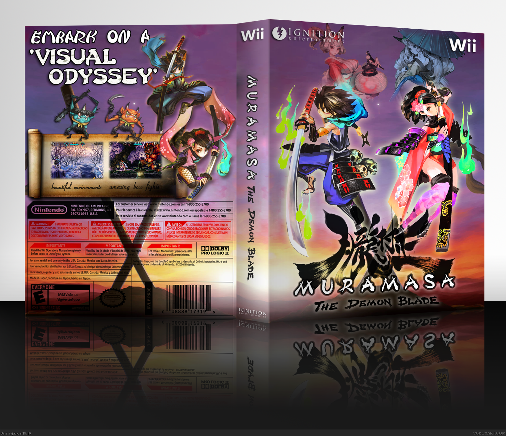
#1, I am also surprised that there are only 3 pieces of box art for this game. (Well, 4 now that yours is up).
I like it, but the shadow on the scroll on the back looks weird.
[ Reply ]
#5, Thanks for pointing out.
Updated!
[ Reply ]
Printable added!
Hope the box gets some attention...
Edited at 1 decade ago
[ Reply ]
So pretty.
+Fav
[ Reply ]
This box is not "awesome", or "one hell of a box". It is simply beautiful and fantastic. Favorite!
[ Reply ]
#8, #9, Thanks.
[ Reply ]
very well done, but the copy-part on the back is bad. I don't know how that effekt is called in english, but it should be something with "multiply"? The whole white get's transparent, yes, but this way you change the logo from the rating as well as the seal of quality. The bar code is getting alsmost unreadable if there are images behind it, that's why it is supposed to be on a white square. The red "attention" headlines are hard to read that way as well, so I'd try to redo this.
Edited at 1 decade ago
[ Reply ]
#2, #3, #5, #11, isn't it worth a fav guys?
Edited at 1 decade ago
[ Reply ]
#11, everything(maybe except Nintendo seal) seems clearly readable to me.
[ Reply ]
UPDATE
- Removed the interrupting swords from the backgrounds of both the front and the back.
- Updated the presentation with a thin spine.
[ Reply ]
Very nice colors throughout. As far as Wasa-bi's comments go, he's often spoken against altering the template. I guess that's just the mark of a hardcore OCD typographer. I'm kind of surprised by the lack of response to this.
[ Reply ]
#15, thanks man. And yeah, that lack of response thing is with most of my boxes :p
Edited at 1 decade ago
[ Reply ]