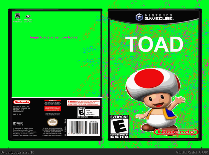
How good do you think this box art is? And I'm not talking about the background, I mean the actual box art. On a scale of 1 to 10, 1 being awful and 10 being as good as a real box, where would YOU put it?
This is closer to a 2 just because you managed to find a template and center it in the image. But otherwise, it's bad for reasons that should be immediately apparent.
Toad is badly rendered. A single borging background image. There is no logo only text. The ESRB and Nintendo logos are badly stretched. The whole thing is extending past the template. These are what are wrong with this box. Take these things into consideration next time. Avoidoing these problems will lead to a better box. Take this advice and stop acting like a troll goddamnit.
Honestly. I understand if you find joy in frustrating others on the internet, we all do. But please, spend some more time on your boxes! Some people are actually trying to post good boxes they've worked on for days, and boxes like these that you probably didn't spend more than 10-20 minutes on are drawing more attention.
PLEASE, work on your boxes! Get GIMP, read tutorials, use the forum, and post them here IF they seem good enough.
This box is NOT good enough. I'm sorry.
#26, You obviously didn't read the advice MasterKatsumi and Delicious gave you. You never put any effort into your boxes and you love to spam this site.
You need to seriously star working hard on these. They show little to no effort. What you need to do is get a proper background... I would suggest part of a wallpaper. Then you are going to want to use a proper logo, if you can't find one... request it. Using a cutout filter really doesn't look good. So just start working on this stuff. Also Google some tutorials, you may find something.
#28, I'm not saying, because you never listen. I've said it to you and you don't listen, okay,
-bg is boring and sucks
-the toad looks messed up
-the back is horrible
-"begin toads adventure today" that explains very much!
-no screenshot
-no toad on the back
-toad is floating
-sucky logo
-stupid name of the game
-the nintendo is streched and doesnt have the white
-esrb is to big
-"blood" "language" "Mild violence" to a game based on a toad?! uh...
#33, look at #29, that is constructive criticism. Thats not what your looking for it seems, you want someone to say that it is fantastic and what not, but that is not constructive criticism, its not even the truth.
#33, Ever heard of a joke? Oh wait, yeah. This boxart's a bit of a joke.
Look, do you really think this is good? Look at some boxes around the site. Look at the Hall of Fame. Do you really think this even compares with them? For god's sake, you didn't even BOTHER to capitalise the "T" in "Toad" above the box. The back is just green (with parts of the front's "background" seeping over on to it, which is STUPID) accompanied by LOWERCASE text saying "begin toads adventure today"... and "toads" should be "toad's"... notice the apostrophe?
Here's a little advice for making boxes on PDN (it's the program I did most of my boxes on, my LittleBIDPlanet box for example);
~ First, go to this site: link -
~ Sign up, and find the characters you are looking for.
~ Next, don't make the background yourself. You obviously don't have the right skill level yet. For example, if you were making a Super Mario Galaxy box, you'd type in on Google Images "Super Mario Galaxy background".
~ Then, find an actual logo! Don't just type the text in with a boring font, if the boxart you're making is for a non-existent game, then ask someone who specialises in this sort of thing to make it for you.
~ Lay off making backs for a while... it obviously isn't your forte.
~ When resizing images, hold the "Shift" button on your keyboard. It'll keep it the same aspect ratio and won't stretch it.
Now some tips for being on the site:
~ Use good grammar and capitalise when typing.
~ NEVER explain the rules of the site to a more experienced member. I've been here for two years now, I know the rules. I just thought you might know how terrible this looks.
~ Be polite of course, but it's okay to have a joke.
#43, While I honestly don't want to sound like I'm attacking you I can only say that this sucks. There is no logo, no real background, the render looks horrible, the description is one sentence, there are might as well be no back, and the logos are stretched. Honestly, can someone please ban this user if he's not going to put any effort into his boxes? #36 is right, why isn't this in the humor section? (xD)
the back of it is just a joke
the toad and nintendo images on the front are cut out bad
the logo is plain
its rated E for language and blood i thought mario games were supposed to be holsem
#46, We don't assume it's his alt, we KNOW it's his alt. Only a blind, mentally challenged, or EXTREMELY high self esteemed person could say this looks good.
Dude seriously just delete this box. No effort was put into this. You think it deserves a seven out of ten?!?! ON the back, all you did was use incorrect grammar to write one line that is supposed to be the only thing on the back. You couldn't even throw in some picture of Toad in MG or MS or even M64 too? That is so lazy. And you're acting like you spent all of your precious time on it. .000001/10 But there's still hope if you accually try.
#35, The quality of this box is not what we'd like to have in our database. Before you upload another, I suggest that you upload it to the WIP thread in the forums first.
#45, It's not his alt.
#48, I've mentioned to you once before about you abrasive comments, and the how you aren't really in the position to be dishing them out. Comment constructively and respectfully or not at all.
 Toad Box Cover Comments
So i found out how to do the DENT feature in paint.net, thats how I made the background, it looks cool, like confetti
[ Reply ]
How good do you think this box art is? And I'm not talking about the background, I mean the actual box art. On a scale of 1 to 10, 1 being awful and 10 being as good as a real box, where would YOU put it?
[ Reply ]
probably 6 or 7, It could be better but because I just learned this function in paint.net then its the best I can do right now
[ Reply ]
Ok I accidently saved it as .gif but I updated it with .png
[ Reply ]
#3, HA! A 6 or 7?
This is closer to a 2 just because you managed to find a template and center it in the image. But otherwise, it's bad for reasons that should be immediately apparent.
[ Reply ]
E for everyone Blood,language,Minor violence?
[ Reply ]
The render is prett bad and the logo is just arial. Please put more effort into your boxes.
[ Reply ]
#6, leno thats just what the template was and I didnt change it. I probably should have though
[ Reply ]
#8, No. You should have changed EVERYTHING.
[ Reply ]
oh dear god
1. 6 or 7 well you got a high self-esteem
2.i hate toad
3.this is bad really BAD
[ Reply ]
Well can you guys rate it then?
[ Reply ]
#11, 0.0005/100
Edited at 1 decade ago
[ Reply ]
Its not THAT bad
[ Reply ]
#13, oh yea it is that bad you could of a least tried a little more with rendering the toad
[ Reply ]
#11, 1/10
Toad is badly rendered. A single borging background image. There is no logo only text. The ESRB and Nintendo logos are badly stretched. The whole thing is extending past the template. These are what are wrong with this box. Take these things into consideration next time. Avoidoing these problems will lead to a better box. Take this advice and stop acting like a troll goddamnit.
[ Reply ]
#13, It is.
[ Reply ]
Wow. How old are you?
[ Reply ]
Why do you wanna know?
[ Reply ]
I think you might be a little young for this site...
[ Reply ]
I think I could do better than that, and I just joined the site.
Edited at 1 decade ago
[ Reply ]
And couldnt you put something more than: "Begin Toads Adventure Today!"?
[ Reply ]
I was gonna do more of a back cover but I ran out of time so no
[ Reply ]
Honestly. I understand if you find joy in frustrating others on the internet, we all do. But please, spend some more time on your boxes! Some people are actually trying to post good boxes they've worked on for days, and boxes like these that you probably didn't spend more than 10-20 minutes on are drawing more attention.
PLEASE, work on your boxes! Get GIMP, read tutorials, use the forum, and post them here IF they seem good enough.
This box is NOT good enough. I'm sorry.
[ Reply ]
Obvious troll is obvious. People like partyboy should've been kicked out of the web just because they won't listen to advice by more mature people.
[ Reply ]
#3, and i would give it a 1.5-2.1
[ Reply ]
why?
[ Reply ]
#26, You obviously didn't read the advice MasterKatsumi and Delicious gave you. You never put any effort into your boxes and you love to spam this site.
Edited at 1 decade ago
[ Reply ]
No i am asking him to explain his rating so I can use his constructive criticism to help improve my work
[ Reply ]
Rating - 1.5/5
You need to seriously star working hard on these. They show little to no effort. What you need to do is get a proper background... I would suggest part of a wallpaper. Then you are going to want to use a proper logo, if you can't find one... request it. Using a cutout filter really doesn't look good. So just start working on this stuff. Also Google some tutorials, you may find something.
[ Reply ]
#28, I'm not saying, because you never listen. I've said it to you and you don't listen, okay,
-bg is boring and sucks
-the toad looks messed up
-the back is horrible
-"begin toads adventure today" that explains very much!
-no screenshot
-no toad on the back
-toad is floating
-sucky logo
-stupid name of the game
-the nintendo is streched and doesnt have the white
-esrb is to big
-"blood" "language" "Mild violence" to a game based on a toad?! uh...
it's more like a 1.7/10
Edited at 1 decade ago
[ Reply ]
Can somebody please ban this kid? There IS a rule about not posting extremely low-quality boxes.
[ Reply ]
Who else here clicked on this box expecting it to be terrible?
Who else here was right?
[ Reply ]
#32, You have to post constructive criticism not just tell me its terrible
[ Reply ]
#33, look at #29, that is constructive criticism. Thats not what your looking for it seems, you want someone to say that it is fantastic and what not, but that is not constructive criticism, its not even the truth.
[ Reply ]
I know #29 did but #32 didnt thats who I was talking to
[ Reply ]
#33, Ever heard of a joke? Oh wait, yeah. This boxart's a bit of a joke.
Look, do you really think this is good? Look at some boxes around the site. Look at the Hall of Fame. Do you really think this even compares with them? For god's sake, you didn't even BOTHER to capitalise the "T" in "Toad" above the box. The back is just green (with parts of the front's "background" seeping over on to it, which is STUPID) accompanied by LOWERCASE text saying "begin toads adventure today"... and "toads" should be "toad's"... notice the apostrophe?
Here's a little advice for making boxes on PDN (it's the program I did most of my boxes on, my LittleBIDPlanet box for example);
~ First, go to this site: link -
~ Sign up, and find the characters you are looking for.
~ Next, don't make the background yourself. You obviously don't have the right skill level yet. For example, if you were making a Super Mario Galaxy box, you'd type in on Google Images "Super Mario Galaxy background".
~ Then, find an actual logo! Don't just type the text in with a boring font, if the boxart you're making is for a non-existent game, then ask someone who specialises in this sort of thing to make it for you.
~ Lay off making backs for a while... it obviously isn't your forte.
~ When resizing images, hold the "Shift" button on your keyboard. It'll keep it the same aspect ratio and won't stretch it.
Now some tips for being on the site:
~ Use good grammar and capitalise when typing.
~ NEVER explain the rules of the site to a more experienced member. I've been here for two years now, I know the rules. I just thought you might know how terrible this looks.
~ Be polite of course, but it's okay to have a joke.
I hope this is constructive enough for you.
~Olly - Screw it, I'm going to sign my name.
[ Reply ]
This is the worst box ive seen in a while. The backgrounds meant to be just on the box not floating around. And everything else #30 said.
[ Reply ]
THIS IS THE BEST BOX EVER
[ Reply ]
#28, BUT YOUR NOT GONNA IMPROVE.
[ Reply ]
Dude please put stuff like this in the WIP fourm before you upload it seriously you should be smart enough to do that
Edited at 1 decade ago
[ Reply ]
I LOVE that back.
[ Reply ]
#41, There is nothing there but text.
[ Reply ]
#42, Exactly, LOL!
[ Reply ]
#43, While I honestly don't want to sound like I'm attacking you I can only say that this sucks. There is no logo, no real background, the render looks horrible, the description is one sentence, there are might as well be no back, and the logos are stretched. Honestly, can someone please ban this user if he's not going to put any effort into his boxes? #36 is right, why isn't this in the humor section? (xD)
Edited at 1 decade ago
[ Reply ]
Sorry to bump this lol =P Can we assume that anyone who fav's this is an alt? Or any of this guys boxes? :|
[ Reply ]
the back of it is just a joke
the toad and nintendo images on the front are cut out bad
the logo is plain
its rated E for language and blood i thought mario games were supposed to be holsem
nice try but very choppy 3/10
[ Reply ]
#42, I was being sarcastic.
[ Reply ]
#46, We don't assume it's his alt, we KNOW it's his alt. Only a blind, mentally challenged, or EXTREMELY high self esteemed person could say this looks good.
[ Reply ]
Dude seriously just delete this box. No effort was put into this. You think it deserves a seven out of ten?!?! ON the back, all you did was use incorrect grammar to write one line that is supposed to be the only thing on the back. You couldn't even throw in some picture of Toad in MG or MS or even M64 too? That is so lazy. And you're acting like you spent all of your precious time on it. .000001/10 But there's still hope if you accually try.
Edited at 1 decade ago
[ Reply ]
#35, The quality of this box is not what we'd like to have in our database. Before you upload another, I suggest that you upload it to the WIP thread in the forums first.
#45, It's not his alt.
#48, I've mentioned to you once before about you abrasive comments, and the how you aren't really in the position to be dishing them out. Comment constructively and respectfully or not at all.
[ Reply ]
#50, drakxxx, i dont want to get you mad, but youre a mod, and you helped to bump a 2 month old box.
[ Reply ]
#51 I bumped it while it was already bumped to say what I had to say.
[ Reply ]
#52, alright then.
[ Reply ]
If there was ever a hall of shame on this website you would probably be the only person who's box art's were featured there
[ Reply ]
#54, Are you an Alt to Boulderbasher.
When ever there was a worse box than his - which is unlikely as his were crap, he would always say Hall of Shame
[ Reply ]
That is the worst back I have ever seen. -10/10.
[ Reply ]
#56, OH THE IRONY
[ Reply ]
#55 nope I have no alts unlike some people *couch* partyboy2 *cough*
[ Reply ]
partyboy, you're a little fucking scrotumsucker!
[ Reply ]