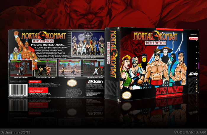
I love the fact that you made us of John Tobias' original artwork for the game. The cover doesn't really give off a fighting game vibe as much as a "We're going to save the world from Goro" vibe, but I still really like it.
I love the aged, wrinkled, and torn template. It really makes it look like a real Super NES box. (God knows you couldn't save those things from destruction.)
I'm guessing you made it the "Red Edition" to compensate for the fact that the SNES was censored and didn't have the Blood Code? Pretty clever, I approve.
I, for obvious reasons, always preferred the Genesis version, and personally like the Genesis template better as well, but that's personal choice. I also think that you could've found cleaner artwork for the cover (Or at least manually cleaned up the "comic scan dots" on the characters, or hell, if that didn't work, you could've CREATED them for the logo and background so that it all blends together.)
I think you did a great job with this, I'm definitely favoriting it, and not just because I'm a huge Mortal Kombat fan. Everything from the subtleties of the template to the background for the presentation is lovely.
I couldn't help but notice the screenshot of Scorpion about to kill Goro, though. I'm assuming you can do Fatalities to bosses and mini-bosses in this hypothetical "Red Edition" of the game, which I definitely approve of.
TheSlyder, yeah, some pretty low-res comic book scans were used (the page was about 500x720 pixels), and the characters at the front had to be resized considerably. It's so hard to find Tobias artwork with decent resolution if you don't have the original comics. You pretty much nailed it about my thoughts behind "Red Edition", Nintendo certainly lost many customers back then with the so-called "Competition Edition" MK.
I agree completely with everything Slyder said, this is spot-on, the level of detail is amazing, the use of the artwork is incredible, and the amount of thought that went into it is top-notch. Great job.
 Mortal Kombat Box Cover Comments
Wow, so many different things to say.
I love the fact that you made us of John Tobias' original artwork for the game. The cover doesn't really give off a fighting game vibe as much as a "We're going to save the world from Goro" vibe, but I still really like it.
I love the aged, wrinkled, and torn template. It really makes it look like a real Super NES box. (God knows you couldn't save those things from destruction.)
I'm guessing you made it the "Red Edition" to compensate for the fact that the SNES was censored and didn't have the Blood Code? Pretty clever, I approve.
I, for obvious reasons, always preferred the Genesis version, and personally like the Genesis template better as well, but that's personal choice. I also think that you could've found cleaner artwork for the cover (Or at least manually cleaned up the "comic scan dots" on the characters, or hell, if that didn't work, you could've CREATED them for the logo and background so that it all blends together.)
I think you did a great job with this, I'm definitely favoriting it, and not just because I'm a huge Mortal Kombat fan. Everything from the subtleties of the template to the background for the presentation is lovely.
I couldn't help but notice the screenshot of Scorpion about to kill Goro, though. I'm assuming you can do Fatalities to bosses and mini-bosses in this hypothetical "Red Edition" of the game, which I definitely approve of.
[ Reply ]
sweet jesus man, i love this
[ Reply ]
Holy shit, this is good. Welcome to the site.
[ Reply ]
TheSlyder, yes, that sums up my feelings completely.
[ Reply ]
Thanks for the comments
TheSlyder, yeah, some pretty low-res comic book scans were used (the page was about 500x720 pixels), and the characters at the front had to be resized considerably. It's so hard to find Tobias artwork with decent resolution if you don't have the original comics. You pretty much nailed it about my thoughts behind "Red Edition", Nintendo certainly lost many customers back then with the so-called "Competition Edition" MK.
Thanks again
Edited at 1 decade ago
[ Reply ]
Wow this is great, very official looking.
[ Reply ]
I agree completely with everything Slyder said, this is spot-on, the level of detail is amazing, the use of the artwork is incredible, and the amount of thought that went into it is top-notch. Great job.
[ Reply ]
Yep, TheSlyder said it best, well done! And great first too!
[ Reply ]