#14, There's no logic behind it. There's no association between Yahtzee and Portal, aside from the fact that he's reviewed it and he likes it.
It's just nonsensical. If it were a DVD with his review, or some sort of fictional extended review or something, this would be damn near a 10/10, because technically it's very well done, but conceptually it's just...
I'm with TheSlyder on this one. To me the concept is absurd.
Technically, its well made in the style of the ZP aesthetic.
From all the comments it seems people find Yahtzee humourous, which he certainly is, however there is nothing about the box which comes across as humorous to me.
Maybe if you had taken a jab at Yahtzee himself due to his hyperbolic praise for the game - then we would've had something going. I actually remember him using portal on a scale, where it is ranked higher than god.
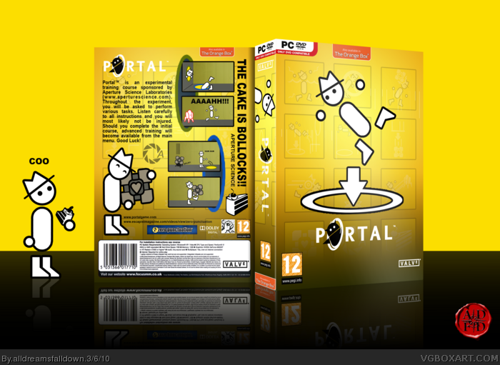
Wow! I knew that Portal was popular in Zero Punctuation but I never expected anyone to design an unofficial cover based on Zero Punctuation.
I really like how you've used specific visual elements (e.g. plain yellow background, simple high-contrast characters) to stay true to Yahtzee's original style. I also like how you've created and arranged the necessary imagery in order to achieve a realistic PC game cover. Excellent job! I'm sure Yahtzee would be proud.
Reminds me of a regular guy getting up to go to work, then he falls through a portal and ends up in Aperture Labs. At least there's a cube to keep him company. Great box. And the cake is moist too.
 Portal Box Cover Comments
I like it :)
[ Reply ]
Brilliant, thats all i can say. Id fav more than once if i could.
[ Reply ]
YESSSSSSSSSSSSSSSSSSSSSSSSSSSSSSSSSSSSSSSSSSS
I love ZP! =D
[ Reply ]
Zero punctuation is awesome.
Nice stylistic choices,as usual.
[ Reply ]
"THE CAKE IS BOLLOCKS!!"
Really funny stuff.
[ Reply ]
Wow, I LOVE this box!
[ Reply ]
Ah, yay.... never enough Portal on the site. And great job, love the artwork use, the typography, the style, everything.
[ Reply ]
Oh you be trollin' XD
[ Reply ]
If this isn't HoF'd I'll eat Yahtzee's hat. *fav*
[ Reply ]
Don't get it.
[ Reply ]
Oh Dear God Zero Punctuation
Damn This Is Awesome
Definately The Best Box In The Site
Another Masterwork
[ Reply ]
#10, Watch some Zero Puntuation. Google it.
[ Reply ]
I don't understand why you'd make a Portal box that looks like it's the DVD cover for a Yahtzee review. It makes no sense.
[ Reply ]
#13, It's just a Portal box in the style of Zero Punctuation. What's not to understand?
Edited at 1 decade ago
[ Reply ]
posted one day ago and already in the hall AMAZING +fav
[ Reply ]
#14, There's no logic behind it. There's no association between Yahtzee and Portal, aside from the fact that he's reviewed it and he likes it.
It's just nonsensical. If it were a DVD with his review, or some sort of fictional extended review or something, this would be damn near a 10/10, because technically it's very well done, but conceptually it's just...
...ugh.
[ Reply ]
#16, I just thought it was a funny idea but whatever.
[ Reply ]
Looks awesome. :)
[ Reply ]
Oh god, I freakin' love Portal and ZP. Great job!
[ Reply ]
I'm with TheSlyder on this one. To me the concept is absurd.
Technically, its well made in the style of the ZP aesthetic.
From all the comments it seems people find Yahtzee humourous, which he certainly is, however there is nothing about the box which comes across as humorous to me.
Maybe if you had taken a jab at Yahtzee himself due to his hyperbolic praise for the game - then we would've had something going. I actually remember him using portal on a scale, where it is ranked higher than god.
[ Reply ]
Wow, this looks awesome man
[ Reply ]
Amazing job man. Pleeeeeeaaaaseeeee printable :)
[ Reply ]
It's in MasterWorks...
[ Reply ]
Fantastic...That is all
[ Reply ]
Woah. Humour boxes can go MasterWorks? Since when? :)
Edited at 1 decade ago
[ Reply ]
Coo.
[ Reply ]
Printable added.
[ Reply ]
Nice job ADFD it is different from the norm that is for sure +fave
[ Reply ]
nice dude
[ Reply ]
Wow! I knew that Portal was popular in Zero Punctuation but I never expected anyone to design an unofficial cover based on Zero Punctuation.
I really like how you've used specific visual elements (e.g. plain yellow background, simple high-contrast characters) to stay true to Yahtzee's original style. I also like how you've created and arranged the necessary imagery in order to achieve a realistic PC game cover. Excellent job! I'm sure Yahtzee would be proud.
[ Reply ]
We need a Spoony game!
[ Reply ]
#31, We do.
[ Reply ]
HIGH FIVE FOR YAHTZEE
[ Reply ]
Reminds me of a regular guy getting up to go to work, then he falls through a portal and ends up in Aperture Labs. At least there's a cube to keep him company. Great box. And the cake is moist too.
[ Reply ]
This is the best weirdest idea!
[ Reply ]
cool portal :]]
[ Reply ]