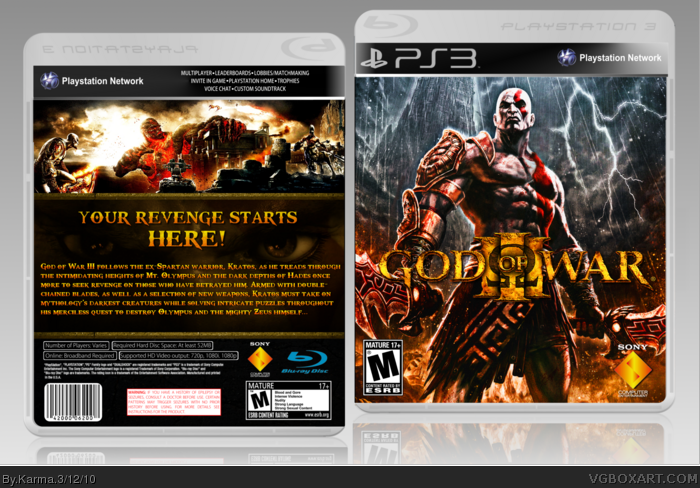
Removing the watermark took flipping forever, but I was extremely satisfied with it. I decided to keep the original image as it was, but I edited the colours to make the blue/orange theme more prominent.
Not much else to say, other then I hope you enjoy! I put tons of time into this box, and I think it shows :)
Credit to Silent Oblivion for the template (which I slightly edited---some parts were a bit off,) and Steven for the logo.
I think I owe you more of an explanation other than "No" since you commented on my box as well.
#9 (sd1833) is right. I had no problem telling you where I got the art from, and giving you the method I used to remove the watermark, but I expected the box to look quite different from mine when it was finished.
This looks (composition wise) almost identical to mine. Same front image, most of the same back image. That is the only real problem I have with it. Since so little has changed, I look at this and ask, "What is the point?"
That is not at all to sound rude. Who am I to tell you what you can and cannot do with your boxes. That is simply my opinion on this box, and why I have a problem with it.
 God of War III Box Cover Comments
RAWR!
In honour of this game coming out next Tuesday (which can't come fast enough, btw,) I decided to make a box.
The front image was from here: link
Removing the watermark took flipping forever, but I was extremely satisfied with it. I decided to keep the original image as it was, but I edited the colours to make the blue/orange theme more prominent.
Not much else to say, other then I hope you enjoy! I put tons of time into this box, and I think it shows :)
Credit to Silent Oblivion for the template (which I slightly edited---some parts were a bit off,) and Steven for the logo.
-Karma
[ Reply ]
I'd recommend using another template, apart from that, fantastic.
[ Reply ]
You've done a good job removing the watermark :) Nice design also.
[ Reply ]
I believe his revenge started in the first game.
[ Reply ]
#4, link
Please, just don't bother commenting if you're going to post smartass comments.
Anyways, thank you to those who commented/faved, I appreciate it!
[ Reply ]
this is sexy man, fav all over man!!! =]
can i fav twice?? =p
[ Reply ]
No.
[ Reply ]
#7, ?
[ Reply ]
The whole layout looks similar to eat nade's case, I think.
[ Reply ]
I think I owe you more of an explanation other than "No" since you commented on my box as well.
#9 (sd1833) is right. I had no problem telling you where I got the art from, and giving you the method I used to remove the watermark, but I expected the box to look quite different from mine when it was finished.
This looks (composition wise) almost identical to mine. Same front image, most of the same back image. That is the only real problem I have with it. Since so little has changed, I look at this and ask, "What is the point?"
That is not at all to sound rude. Who am I to tell you what you can and cannot do with your boxes. That is simply my opinion on this box, and why I have a problem with it.
Edited at 1 decade ago
[ Reply ]
#10, Fair enough, I guess I will update the back. The last thing I want is for people to think I'm plagiarizing, I apologize if it seems that way.
[ Reply ]
This definitely needs more attention.
[ Reply ]
#5, Not being a smartass. You should have just came up with a better caption, thats all.
[ Reply ]