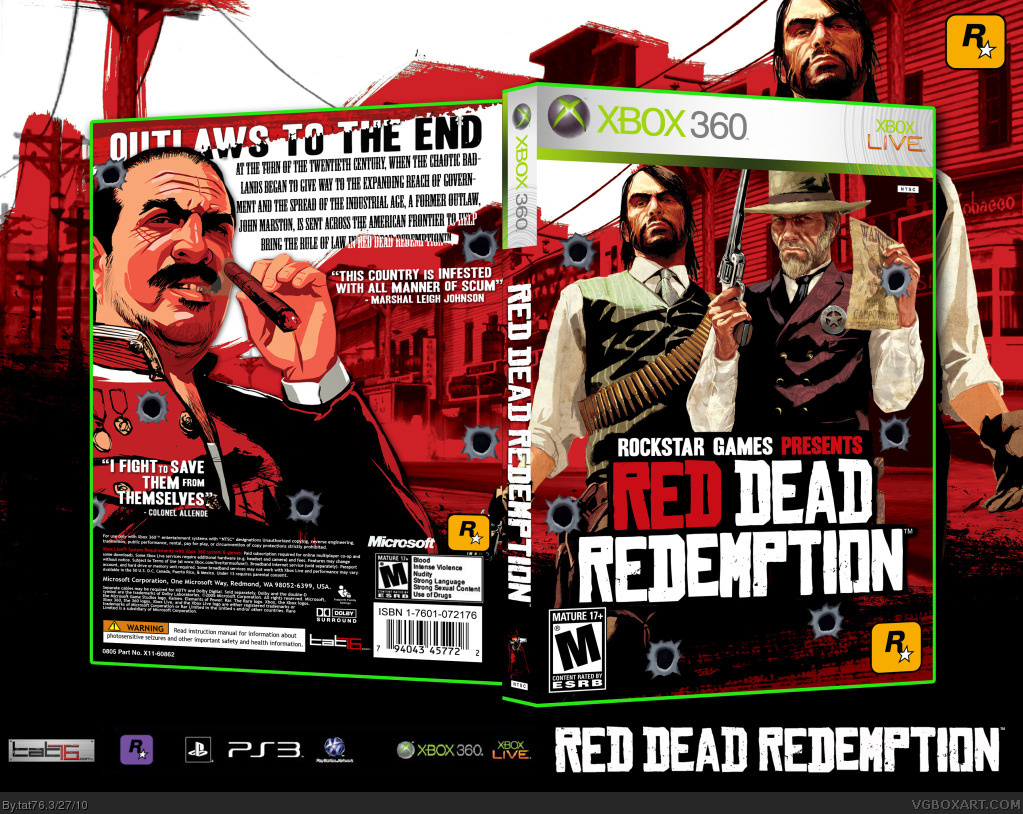
Can't even describe how much better it is without the bullet holes. It all looks very nice. I like how it flows almost seamlessly from front to back. Some screenshots would be nice but I could see how they might be difficult to incorporate into the design. Good job.
 Red Dead Redemption Box Cover Comments
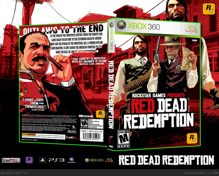
My Custom cover for Red Dead Redemption. Hope you all like it.
[ Reply ]
Good bro, the quote "I fight..." could perfectly fit under the "This country..." quote.
[ Reply ]
#2, Than the other corner would be too empty...
[ Reply ]
It looks great, but the bullet holes are just too much for my taste.
[ Reply ]
#4, 6 on the front. 6 on the back....
[ Reply ]
I agree with 2,it would make it look a whole lot better.
Anyway, decent box, just a shame it was released so close to Hesit's masterpiece.
[ Reply ]
i really like it
[ Reply ]
Looks great, but the bullet hold ruin it for me :/
[ Reply ]
#8, I guess I have to update without bullet holes....
[ Reply ]
Ok. Version 2 without bullet holes. Thanx for the advice...
[ Reply ]
Can't even describe how much better it is without the bullet holes. It all looks very nice. I like how it flows almost seamlessly from front to back. Some screenshots would be nice but I could see how they might be difficult to incorporate into the design. Good job.
[ Reply ]
Move the left quote beneath the right quote and it'll look way better.
[ Reply ]
Looks very good, the only thing I don't like is there the background doesn't follow the 3D. Other than that, great job.
[ Reply ]
nice, how do you create a box for it?
[ Reply ]