#1, I get that you work hard on this one
But after you finished the box you gotta to check that everything looks right
For Example:
The logo's blocking Shadow and Silver's face
Shadow's glow got cut off
There's a random triangle on the top of the back
There's no screen border
It's hard to read the text on the back
#4, sorry, no itsn't.. maybe not for me, you know.
Work on the logo and fix lasersonic1029's box requests,
post it in the WIP forum. To big SEGA logo, make the "beautiful graphics" smaller, and add sonic on the back
UPDATE! Same credit..
Fixed:
Logo position(no longer directly on front of Silver and Shadow's face)
Shadow's glow
No random triangle on the front
Text is visible
 Super Sonic The Hedgehog Box Cover Comments
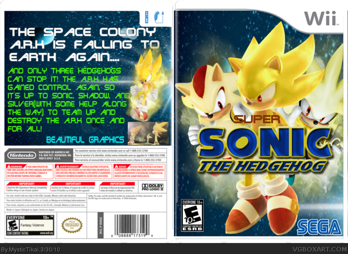
This is my new box!
Credit-
Sonic News Network-Renders
Template, "Sonic the Hedgehog" logo, E10+ logo, Sega logo-KoopaDasher/VGBA Simple Needs
I worked really hard so I hope you like it!
[ Reply ]
Pretty good.
[ Reply ]
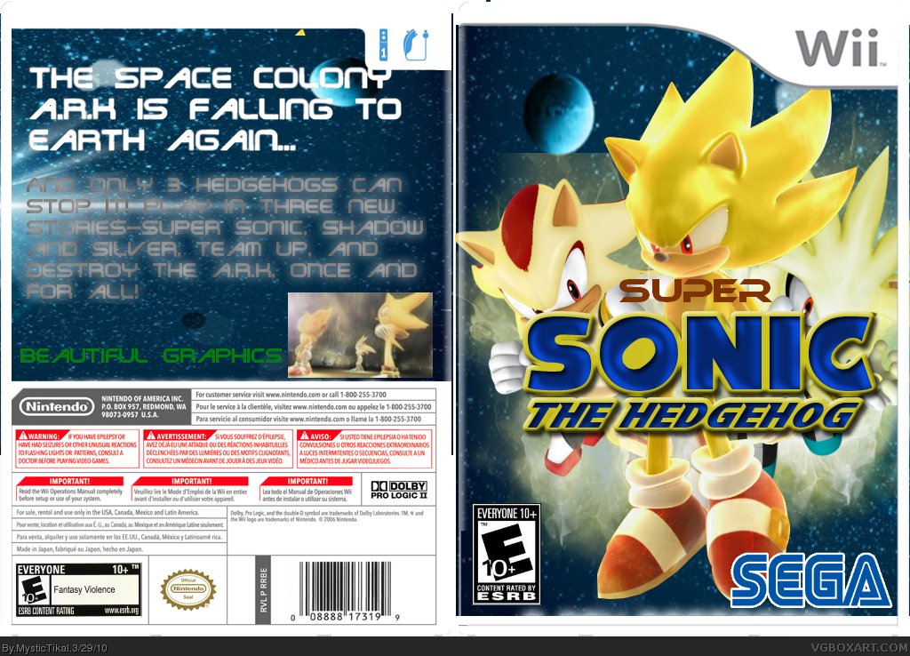
#1, I get that you work hard on this one
But after you finished the box you gotta to check that everything looks right
For Example:
The logo's blocking Shadow and Silver's face
Shadow's glow got cut off
There's a random triangle on the top of the back
There's no screen border
It's hard to read the text on the back
Edited at 1 decade ago
[ Reply ]
#3, I'll try to fix that. Is it worth a fav?
[ Reply ]
#4, sorry, no itsn't.. maybe not for me, you know.
Work on the logo and fix lasersonic1029's box requests,
post it in the WIP forum. To big SEGA logo, make the "beautiful graphics" smaller, and add sonic on the back
[ Reply ]
UPDATE! Same credit..
Fixed:
Logo position(no longer directly on front of Silver and Shadow's face)
Shadow's glow
No random triangle on the front
Text is visible
[ Reply ]
The space back is squashed on the back of box, other than that good!
[ Reply ]