#2, It's meant to be consistent. Haven't you ever seen a boxed set? Multiple titles united by a common design. Each of those renders is from the appropriate game and I spent shitloads of time doing 'em all.
If the boxes looked unique and different, then it wouldn't be a boxed set/collection -- it would just be a handful of Zelda games.
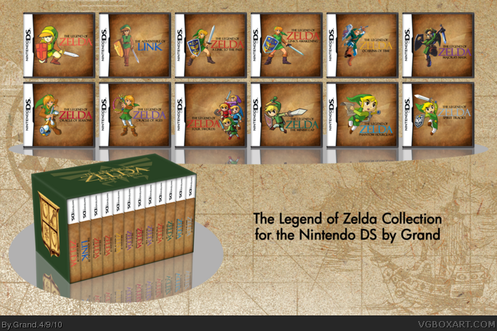
I think its really interesting to see how link has changed over time. I mean, link looks realistic and gets more realistic until OoT, and then slowly turns into the cartoony link that we love.
And yes, I am just talking about the ones in this series, I know link is realistic in Twilight Princess.
I like it a lot. But may I suggest that you flip 4 swords. You're very consistant about the placement of Link and the logos except for that one which is opposite the others. It stands out a bit too much. Just a thought though. Lookds great though. :)
Honestly dude, I think this is pretty lame. I could probably whip something like this up in 20-40 minutes. Each box is just a render and logo placed upon the same background, I know it a box set so you wanted to make them similar. But dude, it's to similar you could at least change the background color a bit. The renders just look like they've just been slapped on as well with not much thought into placement, same goes for the logos. You could've put a filter or something on them as well they don't really fit with the background. The 3D box set looks nice, but overrall, 'really boring boxart'.
#11, Haw haw no you couldn't. Because the scanning/searching I needed to do to get those high res images and the rendering I had to do to cut them out took at least 2 hours. The logos were custom made, as were the backgrounds.
Much thought was given to placement and the fact that it doesn't seem that way indicates I did my job right.
Filters are lame as all hell and would only make this box look shittier. In fact, filters usually make any box look shittier.
But more importantly, collections are meant to look like this. The MGS Collection is just 3 different renders/logos on plain white backgrounds. The Final Fantasy collection (PAL/JAP boxes) is only the Amano logo on white.
The variety is in the renders--Zelda fans will recognize each one
Same thing happened to me Grand. My first box was a Portal box, and it took forever. I created unique icons just for the box, and made it from scratch, and everyone dismissed it because it looked like it didn't take long to create, and there wasn't any commercialization on it (ESRB, developer logos, etc.)
I think it's nice. It's not spectacular from a design stand-point, but as a set, it looks great. I'm a big sucker for consistency in a set like this, and I'd buy this as soon as I saw it.
Maybe I don't get the point. I like these covers but why do you have the non DS games here. I can see the GBC games because you can mod the cases to fit a GBC cart but what about the NES and other big carts?
 The Legend of Zelda Collection Box Cover Comments
I rarely work more than a few hours on any box, but since this one required a lot more work, it took me over a week.
SO much rendering. SO much layering. The final PSD was close to 200MB and the original .png was 22.5MB. I had to size it down to get it uploaded.
But please view full anyway.
Templates, plastic, 3D--all by me.
(And I only included games that could run on the Nintendo DS--so no GameCube titles.)
[ Reply ]
It's ok I guess.
I mean, you did the same to all the boxes only with different logos and renders. Not your best man =/
I know it took you a lot of time so that's a good thing, at least you don't rush to make a box.
[ Reply ]
#2, It's meant to be consistent. Haven't you ever seen a boxed set? Multiple titles united by a common design. Each of those renders is from the appropriate game and I spent shitloads of time doing 'em all.
If the boxes looked unique and different, then it wouldn't be a boxed set/collection -- it would just be a handful of Zelda games.
[ Reply ]
I really like it. Can't imagine how much something like this would cost though lol.
[ Reply ]
Your Really are Amazing Grand,
Fav Author+
[ Reply ]
Nice. I bet that collection would be expenisive as hell! :P
[ Reply ]
I think its really interesting to see how link has changed over time. I mean, link looks realistic and gets more realistic until OoT, and then slowly turns into the cartoony link that we love.
And yes, I am just talking about the ones in this series, I know link is realistic in Twilight Princess.
[ Reply ]
It's nice and simple. That's how collection boxes should look. Instant +fav.
[ Reply ]
Very simplistic, but extraordinary.
Yet another nice addition.
[ Reply ]
I like it a lot. But may I suggest that you flip 4 swords. You're very consistant about the placement of Link and the logos except for that one which is opposite the others. It stands out a bit too much. Just a thought though. Lookds great though. :)
[ Reply ]
Honestly dude, I think this is pretty lame. I could probably whip something like this up in 20-40 minutes. Each box is just a render and logo placed upon the same background, I know it a box set so you wanted to make them similar. But dude, it's to similar you could at least change the background color a bit. The renders just look like they've just been slapped on as well with not much thought into placement, same goes for the logos. You could've put a filter or something on them as well they don't really fit with the background. The 3D box set looks nice, but overrall, 'really boring boxart'.
[ Reply ]
#11, Haw haw no you couldn't. Because the scanning/searching I needed to do to get those high res images and the rendering I had to do to cut them out took at least 2 hours. The logos were custom made, as were the backgrounds.
Much thought was given to placement and the fact that it doesn't seem that way indicates I did my job right.
Filters are lame as all hell and would only make this box look shittier. In fact, filters usually make any box look shittier.
But more importantly, collections are meant to look like this. The MGS Collection is just 3 different renders/logos on plain white backgrounds. The Final Fantasy collection (PAL/JAP boxes) is only the Amano logo on white.
The variety is in the renders--Zelda fans will recognize each one
[ Reply ]
#12, High res images -___-. I'm a Zelda fan. I recognize the variety, but your boxarts are still really really boring.
Edited at 1 decade ago
[ Reply ]
#13, Well the original .png is 22.5 MB and the limit for VGBoxArt is 7.5 MB. And the original .psd is close to 200MB.
[ Reply ]
No Wand of Gamelon?
[ Reply ]
#11, Not enough splatters and filigree for you?
Same thing happened to me Grand. My first box was a Portal box, and it took forever. I created unique icons just for the box, and made it from scratch, and everyone dismissed it because it looked like it didn't take long to create, and there wasn't any commercialization on it (ESRB, developer logos, etc.)
I think it's nice. It's not spectacular from a design stand-point, but as a set, it looks great. I'm a big sucker for consistency in a set like this, and I'd buy this as soon as I saw it.
Beautiful.
[ Reply ]
#15, Yeah...I just ignore the CD-i games like most Zelda fans and Nintendo itself. Those things are best left behind.
[ Reply ]
Maybe I don't get the point. I like these covers but why do you have the non DS games here. I can see the GBC games because you can mod the cases to fit a GBC cart but what about the NES and other big carts?
[ Reply ]