#4, Yeah, obviously Zoroark will not be on the front of any version, since he is a Lucario counterpart, but you did excellent with the limited materials.
Thanks guys, and Destiny, I can't add to the resources because I think you need to be level 7 to do that.
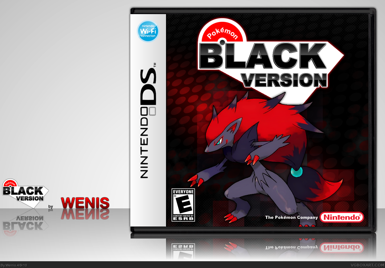
And Jbone, I just made a simple dot pattern then rotated it so it was at sort of an angle, and then just messed around with gradients overlayed on top of it from there, it actually didn't take long to make at all
Ah lighten up man, it's still pretty decent, and it looks like the real one probably would. Pokemon on cover + Background + Logo. Even if it is the wrong pokemon...
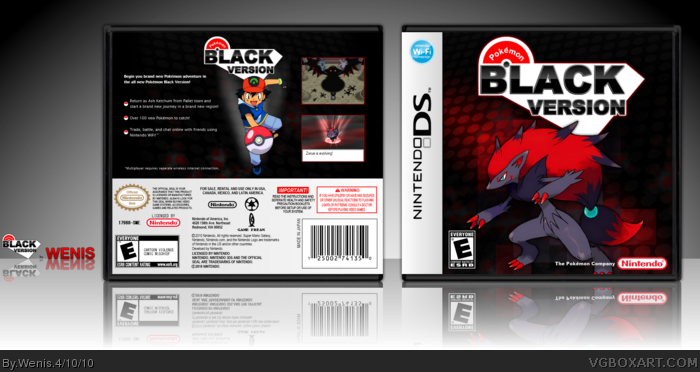
I added a back, I had started it before uploading but sorta gave up, but finished it now. And I know its not a race lol, I'm not tryin to race anyone. You really don't need many resources to make a Pokemon box though. Honestly just look at any official box, its just a logo with a Pokemon and some background.
#18, Because Ash is just a crappy anime version of Red. Also, by the way, I think the box is good but why would you say that you start in Pallet Town but show a screenshot of Spear Pillar in Sinnoh?
#20, It doesn't say the game starts in Pallet town, it just says Ash is from Pallet town. I just wanted to be able to add a little more text instead of just saying "play as Ash". But really thats probably my worst part of box arts, adding text summaries about the game on the back lol.
And like Roarshark said, there is limited resources. (I knew the top screen was from diamond/pearl), but it had a Dark feel to it obviously and I thought that matched up with the whole Black Version thingy. Again we don't konw what the game is about so I just had to make it up lol.
"Wait until the game is out before you make a box for it."
"It's pokemon. All you need is a pokemon on the cover!"
"Why is there a crappy anime version of Red on the back?"
"I didn't have any resources for the game!"
Well then.
I stand by my original statement. Even if Pokemon boxes are formulaic and simple, that isn't excuse for recreating the crappy boxes that they release for the official covers. Besides, where's the fun in "predicting" what the cover will look like when it's so mediocre and formulaic in the first place? Why even bother? We all know what it'll look like, and it won't be anything special to replicate.
Why not do like Phoenix did and actually strive to create a GOOD LOOKING box, instead of just recreating what the official covers look like?
I'm beginning to think you're a troll, because I dont understand how you can think I'm crying about it lol. I appreciate all criticism, but I don't always agree with it.
#28, You know, you shouldn't be whining about how bad this box is(It's good though! Good job Wenis!) and trying to give him tips on how to improve and make it better? How does it look crappy anyway? :3
but the japanese logo got more style and the text is not just placed in some... random vector. it is a nice try though. (but the "A" of "BLACK" is too much at the "L". there should be at least a bit of the same spaces between single letters, you know?)
as for the rest: very "basic" pokemon design. it is not your fault this looks so plain and uninspired. however you could have changed that...
# 28, it's not what you say, but how you say it. congrats, you just found your new wasa-bi, crotale, ... always the same. anyways, I do wonder why you say that phoenix-box is looking good. after all it got some of your hated "splatter design" and low res parts. i know what you did comment on it, but still... that's a surprise!
#34, Yeah I agree that I could have picked a better font for the Logo. Its not fair that Japanese text simply looks more artistic than English though, lol.
#35, it's not like there is just one font available, you know? how about using some more artistic one, or making this one look more artistic. It doesn't change the fact the japanese text is not placed on some random vector-thing ;)
 Pokemon Black Version Box Cover Comments
I wanted the logo to look like the Japanese logo here link
Hope you like it.
[ Reply ]
great this is awesome
i would love if you add the logo to the resources
[ Reply ]
Wow, I didn't expect that it's that good! Well done!
[ Reply ]
I doubt this would be the featured pokemon, but hey, you did what you could in a short period of time. Nice job.
[ Reply ]
awesome
[ Reply ]
Dude, how'd you do the background?
[ Reply ]
Very well crafted.
[ Reply ]
#4, Yeah, obviously Zoroark will not be on the front of any version, since he is a Lucario counterpart, but you did excellent with the limited materials.
[ Reply ]
Thanks guys, and Destiny, I can't add to the resources because I think you need to be level 7 to do that.
And Jbone, I just made a simple dot pattern then rotated it so it was at sort of an angle, and then just messed around with gradients overlayed on top of it from there, it actually didn't take long to make at all
[ Reply ]
Gimme a back. Nao.
Edited at 1 decade ago
[ Reply ]
thanks.
Edited at 1 decade ago
[ Reply ]
It's not a race. Just because you're one of the first to make a box for a game that just got released doesn't mean it's going to be good.
You need to know what's going to be IN the game before you can make a decent box FOR the game.
Damnit!
[ Reply ]
Ah lighten up man, it's still pretty decent, and it looks like the real one probably would. Pokemon on cover + Background + Logo. Even if it is the wrong pokemon...
[ Reply ]
I added a back, I had started it before uploading but sorta gave up, but finished it now. And I know its not a race lol, I'm not tryin to race anyone. You really don't need many resources to make a Pokemon box though. Honestly just look at any official box, its just a logo with a Pokemon and some background.
[ Reply ]
Damn it!! Now I want to fav it again seeing that Back, it just looks very good.
[ Reply ]
#12, link
[ Reply ]
It's great, but Ash should not be on the back. Ash isn't in the games, he's just a anime version of Red.
[ Reply ]
Well, I don't see why they couldn't have Ash
[ Reply ]
The back needs work, but the front is stellar
[ Reply ]
#18, Because Ash is just a crappy anime version of Red. Also, by the way, I think the box is good but why would you say that you start in Pallet Town but show a screenshot of Spear Pillar in Sinnoh?
[ Reply ]
#20, There is limited resuorces, plus the images don't have to show what the summary talks about.
[ Reply ]
#20, It doesn't say the game starts in Pallet town, it just says Ash is from Pallet town. I just wanted to be able to add a little more text instead of just saying "play as Ash". But really thats probably my worst part of box arts, adding text summaries about the game on the back lol.
And like Roarshark said, there is limited resources. (I knew the top screen was from diamond/pearl), but it had a Dark feel to it obviously and I thought that matched up with the whole Black Version thingy. Again we don't konw what the game is about so I just had to make it up lol.
Edited at 1 decade ago
[ Reply ]
"Wait until the game is out before you make a box for it."
"It's pokemon. All you need is a pokemon on the cover!"
"Why is there a crappy anime version of Red on the back?"
"I didn't have any resources for the game!"
Well then.
I stand by my original statement. Even if Pokemon boxes are formulaic and simple, that isn't excuse for recreating the crappy boxes that they release for the official covers. Besides, where's the fun in "predicting" what the cover will look like when it's so mediocre and formulaic in the first place? Why even bother? We all know what it'll look like, and it won't be anything special to replicate.
Why not do like Phoenix did and actually strive to create a GOOD LOOKING box, instead of just recreating what the official covers look like?
[ Reply ]
#23, Phoenix?
[ Reply ]
#23, Better question.. why do you care so much lol? its just simple fan art, that's all.
[ Reply ]
I like the front, but the back is lacking
[ Reply ]
#9, can you pm me the pokemon black logo, and if you have a white, that too. thanks, i'll give credit
[ Reply ]
#25, If you're too much of a little cry-bitch-baby-sissy-girl to take criticism then don't post your work on a forum.
#24, link
[ Reply ]
I'm beginning to think you're a troll, because I dont understand how you can think I'm crying about it lol. I appreciate all criticism, but I don't always agree with it.
[ Reply ]
Good design :) Yet I don't think that will be the logo for America - Europe..... and Ash? That would be awesome if he was back :D
Btw check my Japaneese cover for Black! link
:D
[ Reply ]
How can Ash be "back"?
He was never in a game to start with.
[ Reply ]
#31, its debatable Red and Ash are the same character
[ Reply ]
#28, You know, you shouldn't be whining about how bad this box is(It's good though! Good job Wenis!) and trying to give him tips on how to improve and make it better? How does it look crappy anyway? :3
[ Reply ]
but the japanese logo got more style and the text is not just placed in some... random vector. it is a nice try though. (but the "A" of "BLACK" is too much at the "L". there should be at least a bit of the same spaces between single letters, you know?)
as for the rest: very "basic" pokemon design. it is not your fault this looks so plain and uninspired. however you could have changed that...
# 28, it's not what you say, but how you say it. congrats, you just found your new wasa-bi, crotale, ... always the same. anyways, I do wonder why you say that phoenix-box is looking good. after all it got some of your hated "splatter design" and low res parts. i know what you did comment on it, but still... that's a surprise!
Edited at 1 decade ago
[ Reply ]
#34, Yeah I agree that I could have picked a better font for the Logo. Its not fair that Japanese text simply looks more artistic than English though, lol.
[ Reply ]
#35, it's not like there is just one font available, you know? how about using some more artistic one, or making this one look more artistic. It doesn't change the fact the japanese text is not placed on some random vector-thing ;)
[ Reply ]
Yeah I understand. Though I'm not sure if i'll bother making a new logo, because I don't think I'll bother updating this box
[ Reply ]
#28 your link took me to some heart gold box
[ Reply ]