The bold red text is terrible and ruins the presentation. I don't see the point of people writing long essays on their box, that's what this comment system is for. You should try it, it's a very good system.
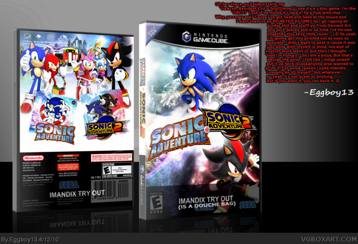
Anyway it's a pretty nice box. I dont get why you have included every major character in two games apart from Eggman? Seems odd
TBH Pat, I'm not a huge fan of this one... the fact that all the characters on the back are at different perspectives just looks off. And also as Cerium said, Eggy isn't on there... along with Big the Cat, I don't care what anyone thinks of him, he was a main character.
You guys need to stop thinking of this as a real box, box. it's really just me making somthing for myself and thinking, hey, maybe someone else would use it...
The presentation is not really meant to be taken seriously either.
 Sonic Adventure + Sonic Adventure 2 Box Cover Comments
Just read what on the box. ^
[ Reply ]
damn, you know exactly what I want.
Great box btw XD
[ Reply ]
My two favorite Sonic games of all time. Nice box, btw.
Edited at 1 decade ago
[ Reply ]
Lol, thought Omega was on the back. Then I saw it WAS, just edited to look like Gamma. Nice editing and box.
[ Reply ]
AWESOME! 5/5 faved.
[ Reply ]
Imandix try out?
Edited at 1 decade ago
[ Reply ]
Damn, this took my box art for this idea and destroyed it. Nice job.
[ Reply ]
GAWRSH RESIDENT EVIL 0 SUX!!11one!!
Honestly?
lol
nice box!
[ Reply ]
The red writing isn't even remotely funny.
[ Reply ]
The bold red text is terrible and ruins the presentation. I don't see the point of people writing long essays on their box, that's what this comment system is for. You should try it, it's a very good system.
Anyway it's a pretty nice box. I dont get why you have included every major character in two games apart from Eggman? Seems odd
[ Reply ]
TBH Pat, I'm not a huge fan of this one... the fact that all the characters on the back are at different perspectives just looks off. And also as Cerium said, Eggy isn't on there... along with Big the Cat, I don't care what anyone thinks of him, he was a main character.
[ Reply ]
#11 Big is there, look harder :p
[ Reply ]
It's alright... the red text ruins it..
[ Reply ]
No major complaints really. The front looks awesome. I might actually print this off... I have a 2-disc Gamecube case. :D
[ Reply ]
#12, Ah... whoops. Still, he's a little bit in the BG.
[ Reply ]
You guys need to stop thinking of this as a real box, box. it's really just me making somthing for myself and thinking, hey, maybe someone else would use it...
The presentation is not really meant to be taken seriously either.
[ Reply ]
Very nice! 5/5 +fav!
I saw this box and started crying... :'(
[ Reply ]
#17, I'm not sure how to take that.... :l
[ Reply ]