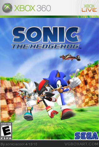
New box. I got everything on Sonic Style except the template and ESRB. Those were from Google Images and the SEGA logo is by Cerium. I don't know how the white line got under the background.
Nice work. I'd maybe like to see a little better use of the space up top and the sonic logo is off center. Otherwise though, it's a great effort. I'd love to see a back.
Now, I'm gonna be completely HONEST about this box.
There's no originality. It pretty much is the Sonic Rivals front with the exception of Knuckles. Then you added blur effects to the logo and characters. And then you added a 360 temp.
Sorry to say, but this box is bad-no originality.
 Sonic The Hedgehog Box Cover Comments
New box. I got everything on Sonic Style except the template and ESRB. Those were from Google Images and the SEGA logo is by Cerium. I don't know how the white line got under the background.
[ Reply ]
Whoa SIC this is a good box, if fact i think ill fav it, love the style, the background, the images, overall great box
EDIT: #3 Ahh thank you!
Edited at 1 decade ago
[ Reply ]
#2,Thanks man. I still think your boxes are better.
[ Reply ]
It looks similar to mine. Not exact but somehow like it. Anyways, great box man!
[ Reply ]
#4,Now that I look at it,It kinda does. Thanks for the favorite. I used the same Shadow and Silver renders and template :I
Edited at 1 decade ago
[ Reply ]
Nice work. I'd maybe like to see a little better use of the space up top and the sonic logo is off center. Otherwise though, it's a great effort. I'd love to see a back.
[ Reply ]
#6,I am horrible at backs. It's better off without one.
[ Reply ]
Nice! Exept one thing... WHY THE HELL IS SILVER IN THE BACK!?!?! lol normaly it be 5/5... but cuz silver 3/5, but still fav!
[ Reply ]
#8,You didn't fave?
[ Reply ]
It's very good but the ESRB is all the way in the corner. it should not be touching the corner. Overall, good box. 5/5 faved.
[ Reply ]
#10,Thank you.
[ Reply ]
Sonic is stoping shadow while shadow is stoping silver while silver is like "aw, fuck!"
[ Reply ]
#12ok
Edited at 1 decade ago
[ Reply ]
... I did fav...
[ Reply ]
#14,Not before you did.
[ Reply ]
Now, I'm gonna be completely HONEST about this box.
There's no originality. It pretty much is the Sonic Rivals front with the exception of Knuckles. Then you added blur effects to the logo and characters. And then you added a 360 temp.
Sorry to say, but this box is bad-no originality.
[ Reply ]