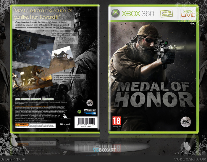
Nice. But I dont see much editing on the front. Looks like just a wallpaper with a slapped on logo. You should change up the color tone or something. The font on back is kind of weak. This is a war game you need to get something thats a bit more epic.
 Medal of Honor Box Cover Comments
So, a new box. Hop you like :)
Logo by del337er
[ Reply ]
Where did you get that art on the front?
[ Reply ]
#2, Probably from gamewallpapers.com, they just put up some new ones for MoH.
Nice box, dude. Think you could have found a better font for the tagline though.
[ Reply ]
Pretty interesting cover, I think the back would look better if the guy had his original coloring.
[ Reply ]
I think this looks somehow better than the official (but they're pretty similar).
[ Reply ]
Nice. But I dont see much editing on the front. Looks like just a wallpaper with a slapped on logo. You should change up the color tone or something. The font on back is kind of weak. This is a war game you need to get something thats a bit more epic.
[ Reply ]
Wow, $20 a year to get the HQ wallpapers on gamewallpapers.com? Rip off.
Anyways, it looks nice, but very little editing. The logo isn't very good either. Not a fan of the back either.
[ Reply ]