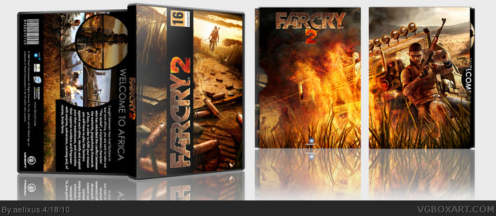
Not bad. But not really impressive. The front has very little editting done but it does look nice. The logo going up on the cover to the left is getting pretty annoying and doesnt make the box look any better I suggest moving it all the way to the left or removing it completely. The back is alright but I hurt my neck trying to get a good angle to view it.
I am intended let the logo at this position because I want to make a diferent not the annoying, hope you understand. Your neck won't hurt when you have gotten the priting, lol. :D
You have a very unique and interesting style. My only suggestion would be to start experimenting more with pictures. Try adding some more effects and making them look different from original ones. I will give you my first fav on this box, because I like what you did with the back, even if the front is very simple.
 FarCry 2 Box Cover Comments
thank to jevangod & Throavium :) I'll put more effort into my boxes
my old: link
[ Reply ]
Not bad. But not really impressive. The front has very little editting done but it does look nice. The logo going up on the cover to the left is getting pretty annoying and doesnt make the box look any better I suggest moving it all the way to the left or removing it completely. The back is alright but I hurt my neck trying to get a good angle to view it.
Edited at 1 decade ago
[ Reply ]
I am intended let the logo at this position because I want to make a diferent not the annoying, hope you understand. Your neck won't hurt when you have gotten the priting, lol. :D
[ Reply ]
Love the slipcover.
[ Reply ]
You have a very unique and interesting style. My only suggestion would be to start experimenting more with pictures. Try adding some more effects and making them look different from original ones. I will give you my first fav on this box, because I like what you did with the back, even if the front is very simple.
[ Reply ]