Apologies for missing this, everyone seems to have... It's not bad, reminds of Dmshaposv's design, I like the front but the back text/screenshots could be edited to better fit the dark and bloody theme you have going.
ok like number 4 said. the text is weird on the back and should be different. The front is loving but the title font should be different. I like it alot.
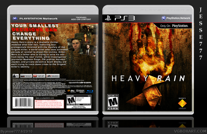
 Heavy Rain Box Cover Comments
Credit to Indexenos for the plastic, sens for the template, and Scorpion Soldier for the template inlay. Comment and Favorite if you wish.
[ Reply ]
Lets not all comment at once!
[ Reply ]
the front alone is eye catching! good job man!
[ Reply ]
Apologies for missing this, everyone seems to have... It's not bad, reminds of Dmshaposv's design, I like the front but the back text/screenshots could be edited to better fit the dark and bloody theme you have going.
[ Reply ]
ok like number 4 said. the text is weird on the back and should be different. The front is loving but the title font should be different. I like it alot.
[ Reply ]
It's very hard to make a eye catching Heavy Rain box art. Very nice! ;)
[ Reply ]
Very nice, I like the textures a lot, especially on the front.
[ Reply ]
#7 Thanks man I appreciate the feedback.
[ Reply ]
Pretty neat. I like the colors and the front. The text on the back could be organized better and screens are too small, imo.
[ Reply ]