Well. This one has a problem. It's to easy. Black and white with so small count of a details. Box should be more... atractive, more... something.
Come on! Put some renders on it, do your best! This art is not for the box!
I agree, the art style is pretty cool - looks like it might be something out of Killer 7. If I were to make changes to this, I might just leave Chief black-and-white, but use the Threshold adjustment in Photoshop. Not bad for now though - 3.5/5.
#7, you cant just say that and give someone a one, thats completely unfair and you didnt list your reasons.
i agree with #4 & #6, the art style is interesting but it doesnt exactly fit in with the halo. its still cool tho. you could improve on is the title font, however. and it it still a little plain. maybe you could add some sort of simple border that fits in with teh rest of the art
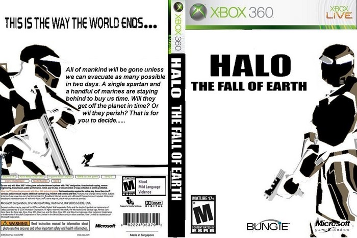
 Halo: The Fall of Earth Box Cover Comments
came up with the idea and made this box hope you all like it. i know i like it alot it took alot of work.
[ Reply ]
when you vote can you please tell me what to improve on.... thanks
[ Reply ]
Well. This one has a problem. It's to easy. Black and white with so small count of a details. Box should be more... atractive, more... something.
Come on! Put some renders on it, do your best! This art is not for the box!
[ Reply ]
the art stile is cool but its not good for a real halo box
3
[ Reply ]
i was thinking at as like a promo bouns or something but my next will be better trust me im owrking on it now.
[ Reply ]
I agree, the art style is pretty cool - looks like it might be something out of Killer 7. If I were to make changes to this, I might just leave Chief black-and-white, but use the Threshold adjustment in Photoshop. Not bad for now though - 3.5/5.
[ Reply ]
i gave u a one, BECAUSE IT ALL NEEDS IMPROVING!
[ Reply ]
#7, you cant just say that and give someone a one, thats completely unfair and you didnt list your reasons.
i agree with #4 & #6, the art style is interesting but it doesnt exactly fit in with the halo. its still cool tho. you could improve on is the title font, however. and it it still a little plain. maybe you could add some sort of simple border that fits in with teh rest of the art
[ Reply ]
He's the new troll. Just ignore him.
He's probably an alternate account anyway.
[ Reply ]
GREAT. what luck.
[ Reply ]
You know... I'm wondering why this is for 360...
Maybe X-box, just maybe
[ Reply ]