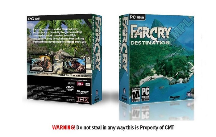
Why all this "Do not steal" and "Sample" over the hole box?
I think you should do next things:
1) Add reflection to the back cover
2) Make this reflection dissapearing at the bottom of the screen
3) Add stroke to "Destination" title
4) Make Microsoft logo white
5) Improve quality of the jpeg... Cos now it is a real bad.
Anyway, box looks like real :D
 Farcry Destination Box Cover Comments
*gasp!* a cmt box that isnt a boring wallpaper shot. good job 4/5
[ Reply ]
MAJOR improvement, good job man
[ Reply ]
yah I was sitting around yesterday and decided to make better boxes and i guees it worked Thanx guys
[ Reply ]
Wow cmt, this is y far your BEST box art! a well earned 5/5
[ Reply ]
Why all this "Do not steal" and "Sample" over the hole box?
I think you should do next things:
1) Add reflection to the back cover
2) Make this reflection dissapearing at the bottom of the screen
3) Add stroke to "Destination" title
4) Make Microsoft logo white
5) Improve quality of the jpeg... Cos now it is a real bad.
Anyway, box looks like real :D
[ Reply ]
You know putting thick text on a thick spine is ugly, its ok to put normal but smother fonts on the spine.
Still you did put effort it it so its ok.
[ Reply ]