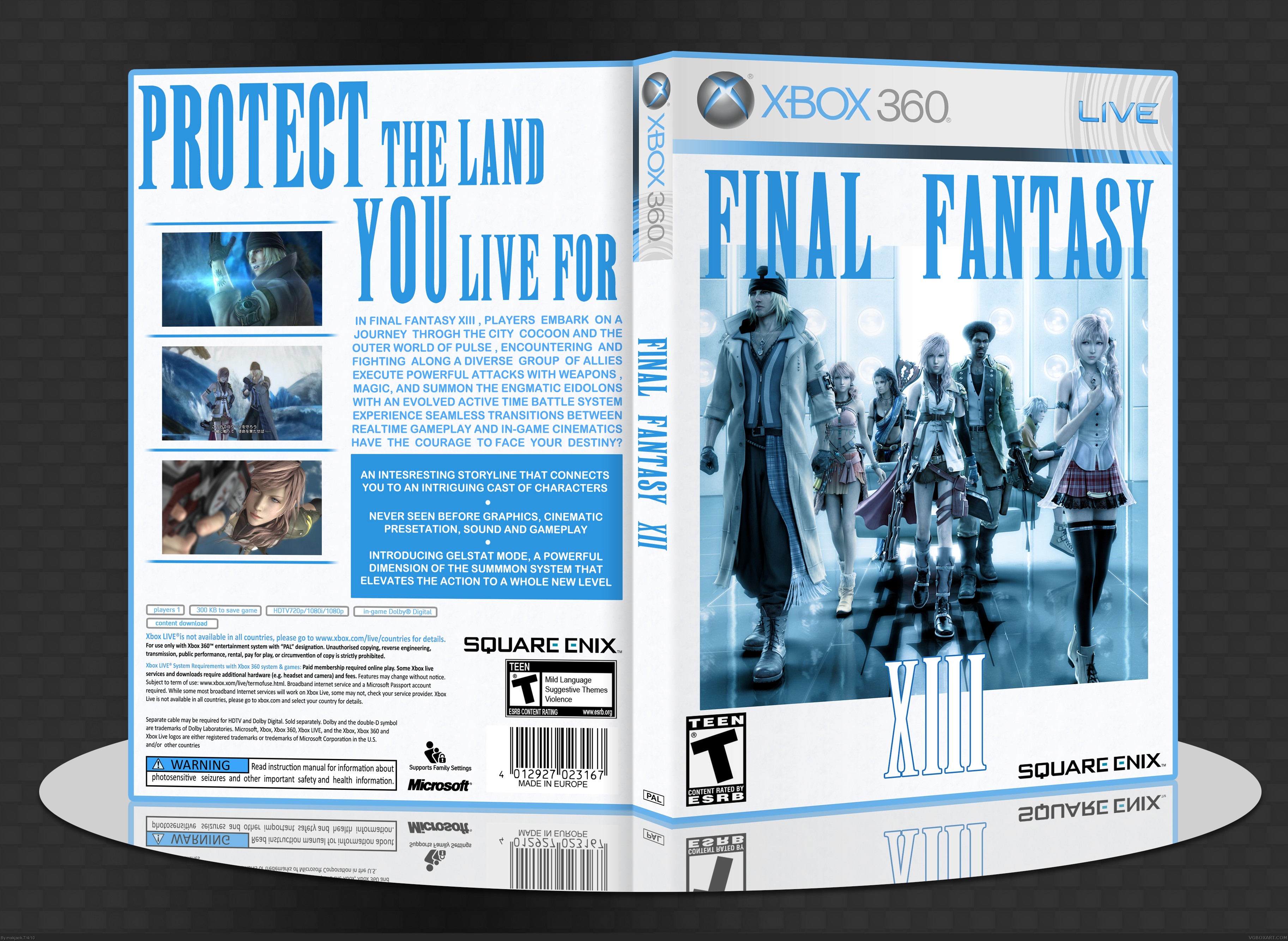
Very nice job, the light blue color scheme fits the simplistic approach very well. I love the arrangement of the front and what you did with the logo. On the back, the tagline looks good and the font choice for the description fits the box well. I kinda wish there was more color variation to this, like keeping the front characters in their original color with the rest blue, but this is still great.
This cover is kind of odd looking, the colors match pretty well, but the image on the front instead has a general hue of blue, not completely blue (would look weird completely blue too). The back also is color coordinated but the cover overall has too much emphasis on black, white, and blue.
I really like this. Simple, effective. I wish you would have put a bit more effort into making the back text grammatically correct, though. It's difficult to read as it is.
I like it so, it is very calm and soothing in a way. The blue and white added so much simplicity and beauty to this box but I still feel it is a bit empty in a way... something is missing when I look at it but that could just be me. Anyway, great design, definitely a fav for me. :)
I'd have to say this is probably one of my favorite XIII boxes. I love replacing the 360 green with blue and keeping it simple. It looks so wonderful, and I personally think if this was on a shelf, it would draw more attention than the official box art. I don't understand why companies decide on art that is packed full of crap, and realize that simplicity and a good eye attracts more customers. My only (tiny) gripe is the tagline on the back is just a little too space-consuming, but it doesn't take away from the overall value AT ALL. Good job.
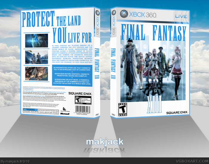
 Final Fantasy XIII Box Cover Comments
Love the simplistic approach!
[ Reply ]
Hey. Did this for the Expressions session 01.
Credit to Indexenos for the temp.
Critiques are most welcome. Thanks for viewing. Have a nice day.
[ Reply ]
Nice work.
Don't forget to tag it with session01
[ Reply ]
The spine has the wrong title on it.
[ Reply ]
I like it. It's different than most FFXIII boxes.
[ Reply ]
Thanks all.
#3, updated the tag.
#4, that'll be done asap.
[ Reply ]
Very nice job, the light blue color scheme fits the simplistic approach very well. I love the arrangement of the front and what you did with the logo. On the back, the tagline looks good and the font choice for the description fits the box well. I kinda wish there was more color variation to this, like keeping the front characters in their original color with the rest blue, but this is still great.
[ Reply ]
Forgot to say that the description and features are stolen from Felipe's FFXIII box.
[ Reply ]
#7, I did keep some of the original color hidden in the blue. But yeah, i agree that some more color wouldn't have hurt the blue design.
[ Reply ]
This cover is kind of odd looking, the colors match pretty well, but the image on the front instead has a general hue of blue, not completely blue (would look weird completely blue too). The back also is color coordinated but the cover overall has too much emphasis on black, white, and blue.
[ Reply ]
I like it. The entire design is very clean and works very well together.
[ Reply ]
I really like this. Simple, effective. I wish you would have put a bit more effort into making the back text grammatically correct, though. It's difficult to read as it is.
[ Reply ]
Thanks again guys.
[ Reply ]
Not bad, like Koopa said the simplicity is nice. Oh and Cocoon isn't a city. :P
Edited at 1 decade ago
[ Reply ]
The blue looks really nice against the white man. Great job.
[ Reply ]
#15, hey thanks a lot man.
[ Reply ]
UPDATE:
- Fixed the spelling errors on the back.
- Increased the color of the front pic.
- Updated the presentation.
[ Reply ]
I like it so, it is very calm and soothing in a way. The blue and white added so much simplicity and beauty to this box but I still feel it is a bit empty in a way... something is missing when I look at it but that could just be me. Anyway, great design, definitely a fav for me. :)
[ Reply ]
#18, Thanks for the feedback and the fav.
[ Reply ]
I'd have to say this is probably one of my favorite XIII boxes. I love replacing the 360 green with blue and keeping it simple. It looks so wonderful, and I personally think if this was on a shelf, it would draw more attention than the official box art. I don't understand why companies decide on art that is packed full of crap, and realize that simplicity and a good eye attracts more customers. My only (tiny) gripe is the tagline on the back is just a little too space-consuming, but it doesn't take away from the overall value AT ALL. Good job.
[ Reply ]
#20, thanks man. This means a lot coming from an artist like you.
[ Reply ]