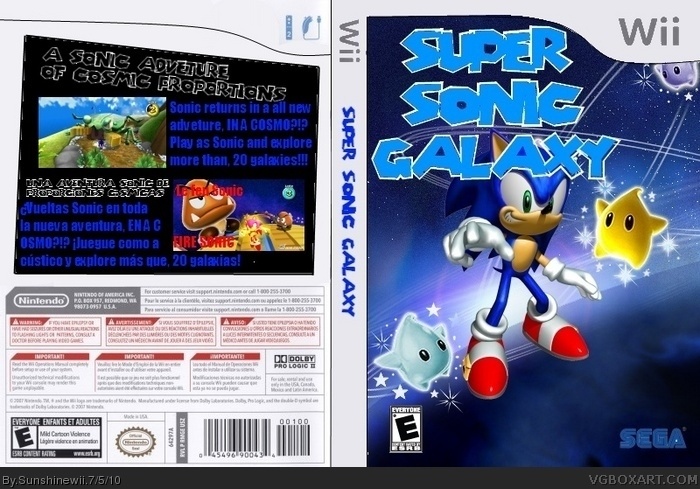
Needs quite alot of work.
The borders and all logos on the front look very choppy, as does the spine.
Also the font on the back is a strain to read, on paragraphs on the back, try to use an easy to read font, and a lighter colour if on a black background.
The actual layout of the box isnt that bad, it just needs alot of cleaning up, maybe try working on a bigger size document and either use pre-rendered logos, or cut them out properly. Rather than using what looks like a magic ereaser as it leaves horrible white edges everywhere.
 Super Sonic Galaxy Box Cover Comments
Needs quite alot of work.
The borders and all logos on the front look very choppy, as does the spine.
Also the font on the back is a strain to read, on paragraphs on the back, try to use an easy to read font, and a lighter colour if on a black background.
The actual layout of the box isnt that bad, it just needs alot of cleaning up, maybe try working on a bigger size document and either use pre-rendered logos, or cut them out properly. Rather than using what looks like a magic ereaser as it leaves horrible white edges everywhere.
[ Reply ]
You try editing it!
[ Reply ]