The text on the back is very hard to read, the front looks nice with the effects, but I dont know how much effort went into this. From looking at this I would give you a 6.7/10
um, yeah, so, the art is taken from signalnoise (James White) and then put through a few filters, other credits are on the presentation.
if the back is hard to read, tell me what I could do to make it more legible, because i couldn't come up with anything that worked better with the background.
#2
I think you should change the color to black, or try to change the background. Because grey on white isn't easy to read. I dont know exactly what you can do without changing the design; but if you can change it so that the text is easy to read youll get the fav.
#4, yeah, no problem. My advice would be even longer but my English isn't good enough for that. Try to add a kind of black border around the letters like in the last inFAMOUS2 box added to the site.
#5
Black stroke didn't look so great, i halved the back's opacity and darkened the summary texts. Lemme just upload it. I didn't change the rest of the text, tho, I think the light grey works for the rest of the box.
Also, I'm sorry if it doesn't seem like I did a lot of work on it. I try to go for minimalist boxes, and I'm not the best at Photoshop, so I try to keep things simple. I hope that doesn't just sound like laziness on my part.
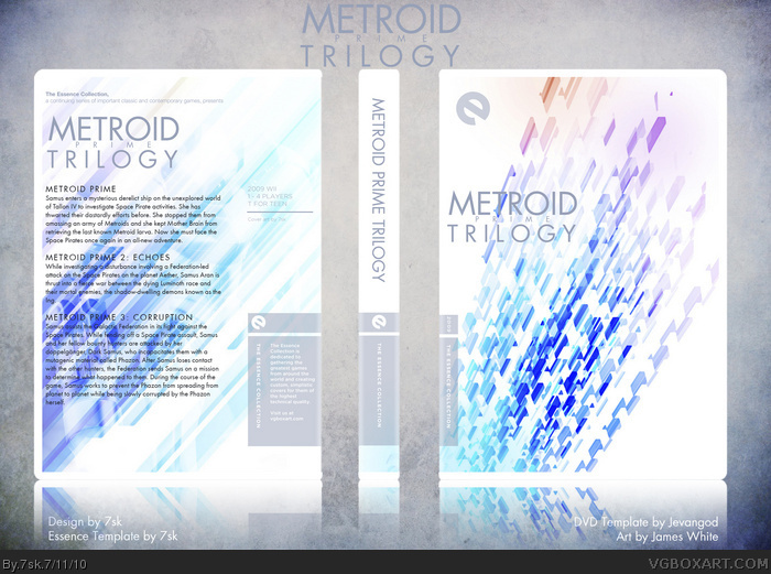
I was going more for the feel of the series (or at least how I interpret the Metroid Prime feel) rather than having any recognizable game elements. Samus was a lot more pronounced before, but I had to lower the opacity of the back in order to make the text more legible.
Has the front something to do with Metroid or did you just love James White's arts, I just have his arts as a Theme in Google Chrome.
What I'm telling is.. Well. It's so light. What I expect from Metroid is she's in a dark scary planet to kill monsters and other scary stuffs.
But now I didn't said this template is Bad, I love James White Arts so.. this one is ok, I guess. Luckily I recognize it was Metroid at the back... hmmm you should have the back on the front instead, and make it darker.
#17
Since it's the Trilogy package, I wanted something that seemed more triumphant and cumulative, but also incorporated the theme of isolation. I found that light colors served to highlight the many colors of enemies Samus fought, as well as the number of beams she finds. The white serves the purpose of "triumphant" while still "isolated." The original James White artwork was rainbowed on a field of black, which I didn't think worked for a cumulative package. For MP1, sure, but not for a total collection. I took his work and inverted it/ran it through some filters until I came up with what what's up there.
Thank you! And yeah, I know, sometimes the site kinda freaks on me a bit too. But thanks for the box fave! I'm gonna post my Heavy Rain cover soon, as soon as I mock up a slip cover for it.
#18, Looking at it that way I can certainly see what you mean, and how it captures the essence of Prime. Maybe it's only me but it seems like it'd be difficult at first glance to really tell how this refers to Metroid other than the title, without it being explained first.
Sorry, but this is just too simplistic. I understand what the essence collection is supposed to be about but this just piggybacks off of the fact that it gives you an excuse to be simplistic and in some cases, lazy, while trying to make the box seem deeper than it is. I really don't think this works. Here's the thing, video game boxes shouldn't contain obscure symbolism, the art needs blatant or at least more blatant than this. To me, this looks like nothing more than brushes or textures (or in your case, picture, I suppose) slapped on a white background; hardly blatant enough, wouldn't you say? I'm sorry but this just looks lazy.
EDIT: I just read above that Samus is on the background and I can just barely see her when I get really close to the computer screen and squint.
#24
I'm sorry if you found my explanation unsatisfactory. You are fully entitled to your opinion. However, in the future, please refrain from referring to my designs as "lazy," as it undermines the work put into them and my integrity as a contributing member of this site. I may not be the most skilled Photoshopper, but I do take my time with each box to make sure it passes my standards before even considering asking for another person's opinion, be it on NeoGAF, VGBA, The Auteurs, or what have you. I am not in the business of making commercial video game boxes. I make these boxes for my own personal use, so I make them in the style that I prefer, oftentimes an ultra-minimalist style. Minimalism is, by definition, directly opposed to blatant or obvious displays, ultra-minimalism especially so. While it may not seem like much, the concept and work put behind my boxes is considerable. So again, I ask you to please respect my creative perspective, even if you don't agree with it.
#18
I realize that, but I'm glad that my explanation worked for you.
 Metroid Prime Trilogy Box Cover Comments
The text on the back is very hard to read, the front looks nice with the effects, but I dont know how much effort went into this. From looking at this I would give you a 6.7/10
[ Reply ]
you're...quick.
um, yeah, so, the art is taken from signalnoise (James White) and then put through a few filters, other credits are on the presentation.
if the back is hard to read, tell me what I could do to make it more legible, because i couldn't come up with anything that worked better with the background.
and quite a bit of effort, thanks.
[ Reply ]
#2
I think you should change the color to black, or try to change the background. Because grey on white isn't easy to read. I dont know exactly what you can do without changing the design; but if you can change it so that the text is easy to read youll get the fav.
[ Reply ]
Hmm, gimme a minute then (cos fave from an initial 6.7 is quite motivating).
[ Reply ]
#4, yeah, no problem. My advice would be even longer but my English isn't good enough for that. Try to add a kind of black border around the letters like in the last inFAMOUS2 box added to the site.
[ Reply ]
#5
Black stroke didn't look so great, i halved the back's opacity and darkened the summary texts. Lemme just upload it. I didn't change the rest of the text, tho, I think the light grey works for the rest of the box.
Edited at 1 decade ago
[ Reply ]
Also, I'm sorry if it doesn't seem like I did a lot of work on it. I try to go for minimalist boxes, and I'm not the best at Photoshop, so I try to keep things simple. I hope that doesn't just sound like laziness on my part.
[ Reply ]
Yeah, but the text is much more easier to read now. 7.2/10 +fav =)
[ Reply ]
Haha, thanks :)
[ Reply ]
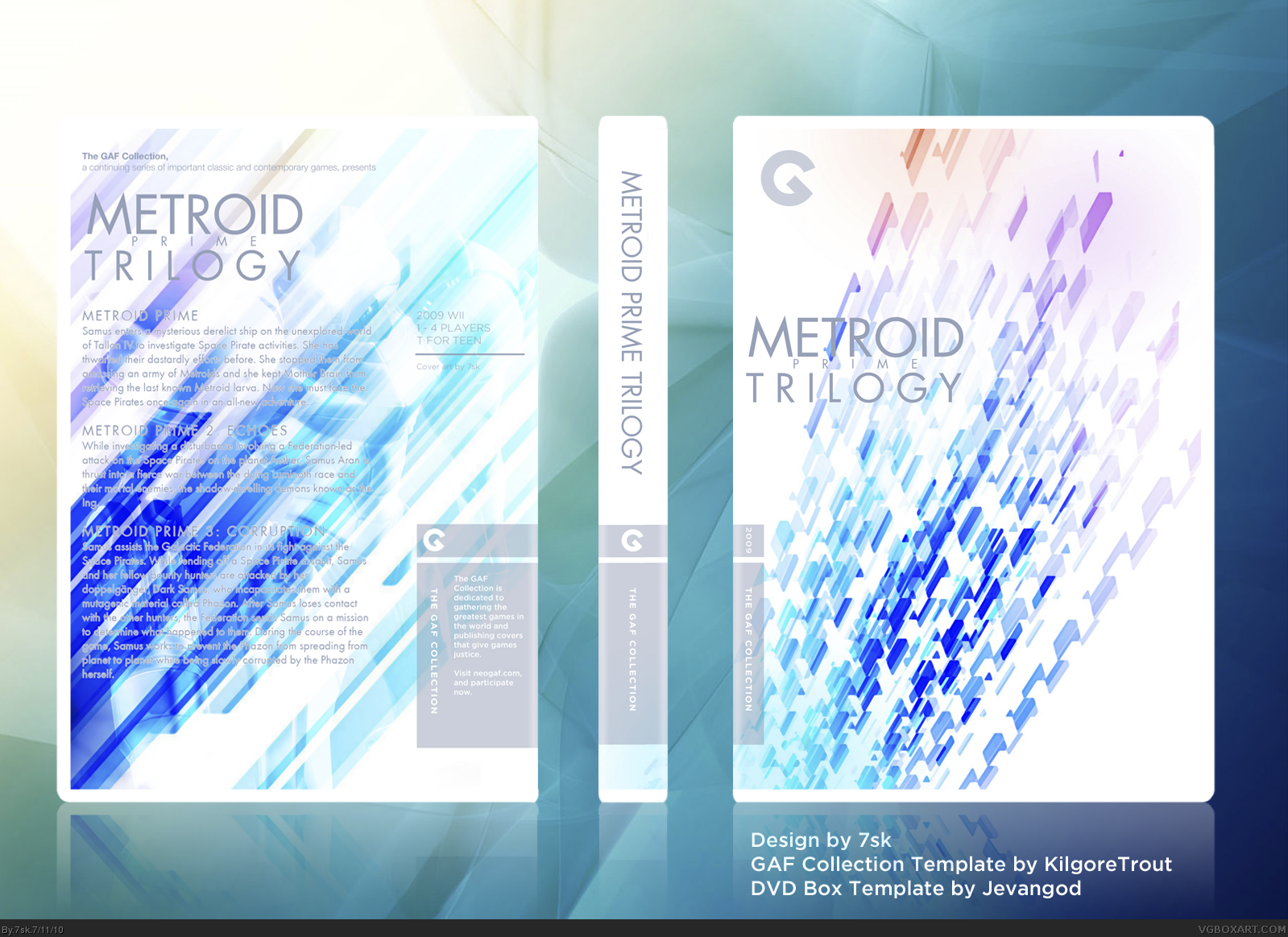
What does the g mean in the top-right corner?
[ Reply ]
#10 GAF Collection. Got the template from NeoGAF. It's basically like the Essence Collection.
I'm actually in the process of converting it to Essence right now.
Edited at 1 decade ago
[ Reply ]
Edited at 1 decade ago
[ Reply ]
There we go, now it's ready for VGBoxArt. I promise I'll W.I.P these from now on.
[ Reply ]
It's nice, but I don't honestly see much "Metroidy" about it. I can JUST see the Samus on the back but that's it.
[ Reply ]
It looks nice, though doesn't have much to do with Metroid other than a very faint image of Samus on the back.
[ Reply ]
I was going more for the feel of the series (or at least how I interpret the Metroid Prime feel) rather than having any recognizable game elements. Samus was a lot more pronounced before, but I had to lower the opacity of the back in order to make the text more legible.
[ Reply ]
Has the front something to do with Metroid or did you just love James White's arts, I just have his arts as a Theme in Google Chrome.
What I'm telling is.. Well. It's so light. What I expect from Metroid is she's in a dark scary planet to kill monsters and other scary stuffs.
But now I didn't said this template is Bad, I love James White Arts so.. this one is ok, I guess. Luckily I recognize it was Metroid at the back... hmmm you should have the back on the front instead, and make it darker.
[ Reply ]
#17
Since it's the Trilogy package, I wanted something that seemed more triumphant and cumulative, but also incorporated the theme of isolation. I found that light colors served to highlight the many colors of enemies Samus fought, as well as the number of beams she finds. The white serves the purpose of "triumphant" while still "isolated." The original James White artwork was rainbowed on a field of black, which I didn't think worked for a cumulative package. For MP1, sure, but not for a total collection. I took his work and inverted it/ran it through some filters until I came up with what what's up there.
[ Reply ]
Incredible job.
[ Reply ]
Thank you very much, #19 :)
[ Reply ]
NICE! This really does capture the essence of Metroid Prime- especially the feeling of isolation and the open atmosphere.
Great job 7sk. I'd author fav you but it doesn't seem to be working. :\
[ Reply ]
#21
Thank you! And yeah, I know, sometimes the site kinda freaks on me a bit too. But thanks for the box fave! I'm gonna post my Heavy Rain cover soon, as soon as I mock up a slip cover for it.
[ Reply ]
#18, Looking at it that way I can certainly see what you mean, and how it captures the essence of Prime. Maybe it's only me but it seems like it'd be difficult at first glance to really tell how this refers to Metroid other than the title, without it being explained first.
[ Reply ]
Sorry, but this is just too simplistic. I understand what the essence collection is supposed to be about but this just piggybacks off of the fact that it gives you an excuse to be simplistic and in some cases, lazy, while trying to make the box seem deeper than it is. I really don't think this works. Here's the thing, video game boxes shouldn't contain obscure symbolism, the art needs blatant or at least more blatant than this. To me, this looks like nothing more than brushes or textures (or in your case, picture, I suppose) slapped on a white background; hardly blatant enough, wouldn't you say? I'm sorry but this just looks lazy.
EDIT: I just read above that Samus is on the background and I can just barely see her when I get really close to the computer screen and squint.
Edited at 1 decade ago
[ Reply ]
#24
I'm sorry if you found my explanation unsatisfactory. You are fully entitled to your opinion. However, in the future, please refrain from referring to my designs as "lazy," as it undermines the work put into them and my integrity as a contributing member of this site. I may not be the most skilled Photoshopper, but I do take my time with each box to make sure it passes my standards before even considering asking for another person's opinion, be it on NeoGAF, VGBA, The Auteurs, or what have you. I am not in the business of making commercial video game boxes. I make these boxes for my own personal use, so I make them in the style that I prefer, oftentimes an ultra-minimalist style. Minimalism is, by definition, directly opposed to blatant or obvious displays, ultra-minimalism especially so. While it may not seem like much, the concept and work put behind my boxes is considerable. So again, I ask you to please respect my creative perspective, even if you don't agree with it.
#18
I realize that, but I'm glad that my explanation worked for you.
[ Reply ]