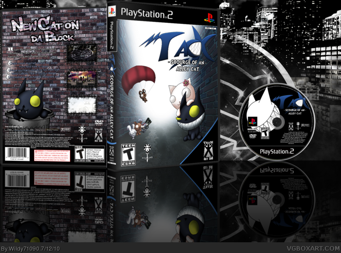
Its decent. I think the front is okay, though its a little bit plain. o think that the Logo should be in the middle. But the text on the back is very hard to read. I love the cat render at the bottom, here. And the use of screenshots is also very nice.
Keep up the good work.
 Tack: Scourge of an Alley Cat Box Cover Comments
Second case I've ever done. This, like my Chaotica case, is based off characters I made. Hope you enjoy!
Again, big thanks to
-master_general for his template
-Nerdysimmer for CD template
-Star89er for 3D box tutorial
-Google for the misc images and references
and
-Dafonts.com for the fonts
[ Reply ]
Its decent. I think the front is okay, though its a little bit plain. o think that the Logo should be in the middle. But the text on the back is very hard to read. I love the cat render at the bottom, here. And the use of screenshots is also very nice.
Keep up the good work.
[ Reply ]
#2 Thanks. Btw, which logo do you mean?
[ Reply ]
#3, The "TACK" logo on the front^^
[ Reply ]
I really like it, though the text on the back is hard to read but it's a quit good box you have there. Well done. :)
[ Reply ]