Well at least you're improving. The front looks decent but the renders are floating and seem out of proportion The back is boring and uninteresting. Maybe you could add screen borders and change the font to looks more sleek or futuristic and you could even add a stroke to it or something. BTW, to save the image in layers you have to save the file as ".xcf". Hope that helps you. :)
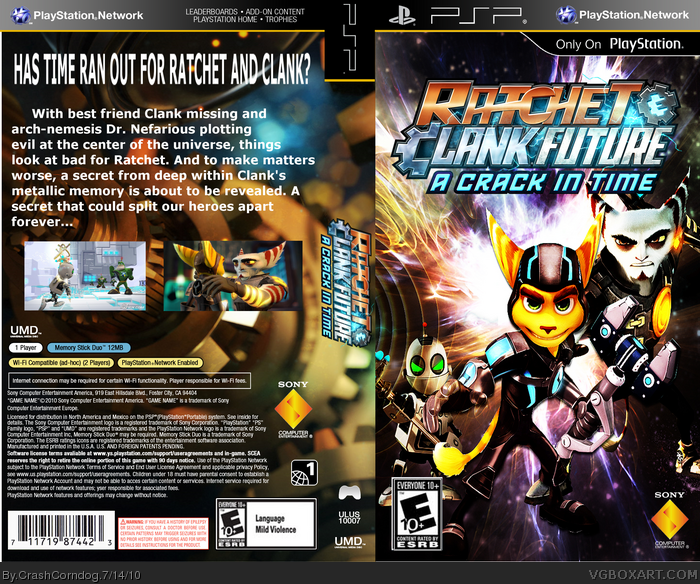
Well.the box is allright. But there are some problems.
Get rid of the background. Its blurry. Also, try to add some borders around the screenshots, I dont like it when they are placed right on the background. The font is also really really boring, try something else, and change the tagline, it has to look special.
The tagline is like an advertise, so try to add some effects or choose a special font. Cou can find them on www.dafont.com. I mean, the tagline should convince me to play the game. "Has time run out" sounds quite nixe, but it is presented so boring that I would rather avoid the game.
The text on the spine is too big, a part of the "Ratchet and Clank Future: A Crack in a Time Box Art" is standing on the back. Here again, get rid of this blurry background. Though I think he background would look better if a bit more effort would have been put in this box.
The front looks decent, though there is a bit much contrast. Also, Clank is a bit streched, and the background effects are placed OVER the render, it looks chaotic. Decent front though, as I said.
You ARE improving, post your work in the critiques section in the forum. Next time, try to add a plastic template and 3D it. If you cant 3D, im sure there are some guys at the forum who would help you.
Hope I helped.
Tell Insomniac Games that you think "Has Time Ran Out For Ratchet and Clank?" sounds quite nixe. I didn't come up the text on the back. I just copied it from the actual box. link
 Ratchet & Clank Future: A Crack in Time Box Cover Comments
I found my problem when saving my boxes on Gimp. I never flattened the layers. I just saved. Oh, well, I finally have a box worth posting.
Enjoy!!!
[ Reply ]
I think you should put some borders to your screen shots and the description!That would be a good start
[ Reply ]
I think you should put some effort into your boxes.
[ Reply ]
Well at least you're improving. The front looks decent but the renders are floating and seem out of proportion The back is boring and uninteresting. Maybe you could add screen borders and change the font to looks more sleek or futuristic and you could even add a stroke to it or something. BTW, to save the image in layers you have to save the file as ".xcf". Hope that helps you. :)
[ Reply ]
Well.the box is allright. But there are some problems.
Get rid of the background. Its blurry. Also, try to add some borders around the screenshots, I dont like it when they are placed right on the background. The font is also really really boring, try something else, and change the tagline, it has to look special.
The tagline is like an advertise, so try to add some effects or choose a special font. Cou can find them on www.dafont.com. I mean, the tagline should convince me to play the game. "Has time run out" sounds quite nixe, but it is presented so boring that I would rather avoid the game.
The text on the spine is too big, a part of the "Ratchet and Clank Future: A Crack in a Time Box Art" is standing on the back. Here again, get rid of this blurry background. Though I think he background would look better if a bit more effort would have been put in this box.
The front looks decent, though there is a bit much contrast. Also, Clank is a bit streched, and the background effects are placed OVER the render, it looks chaotic. Decent front though, as I said.
You ARE improving, post your work in the critiques section in the forum. Next time, try to add a plastic template and 3D it. If you cant 3D, im sure there are some guys at the forum who would help you.
Hope I helped.
Edited at 1 decade ago
[ Reply ]
Tell Insomniac Games that you think "Has Time Ran Out For Ratchet and Clank?" sounds quite nixe. I didn't come up the text on the back. I just copied it from the actual box.
link
[ Reply ]
#6, I dont really care wether you copied it, the tagline sounds nice.
[ Reply ]