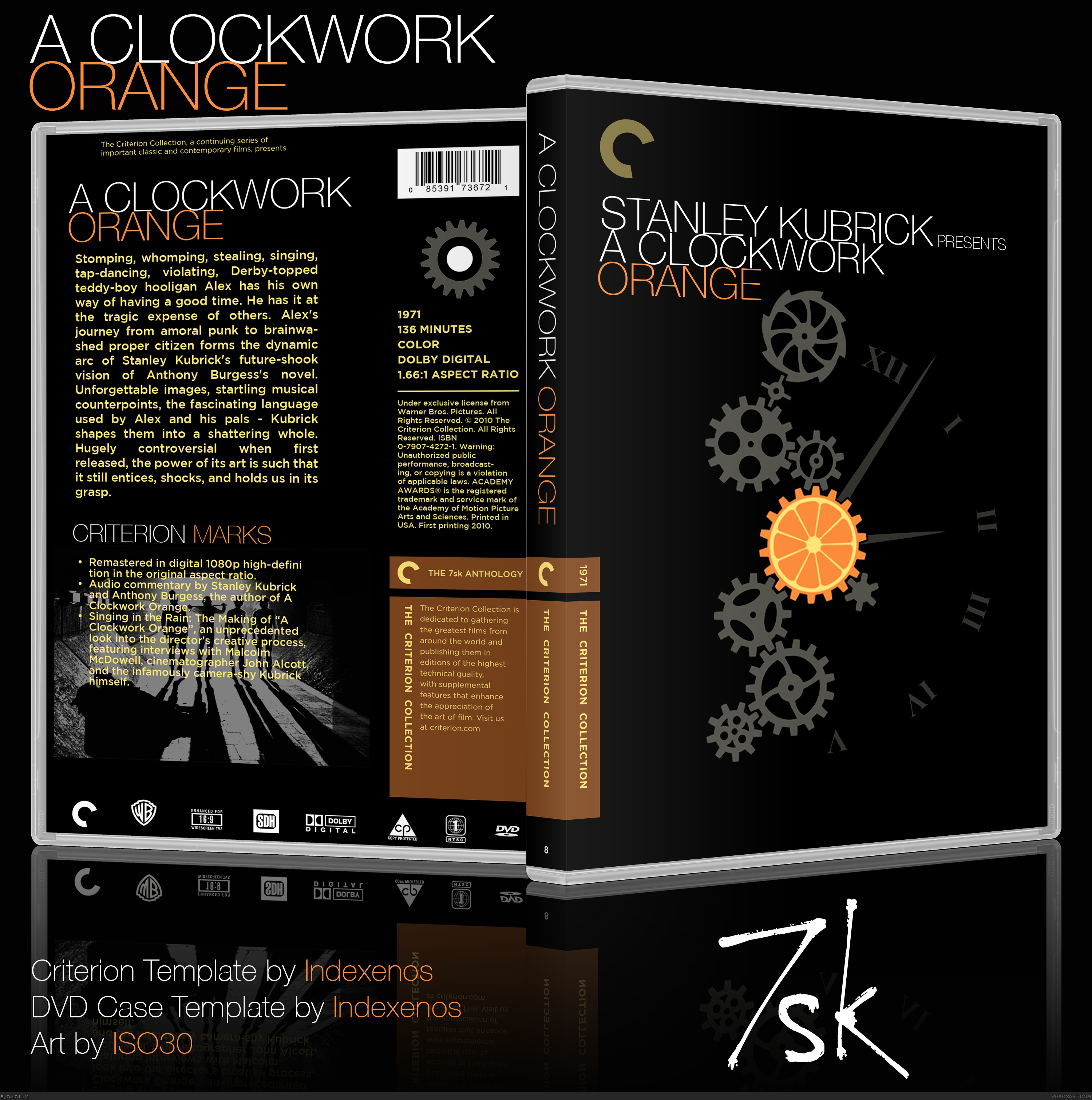
I have one small complaint the image on the back needs to be resized and shrunk down. The yellow text kind of clashes with the photo other than that Great job!
#2, I didn't have them originally, but I've been to add special features to my Criterion boxes. I'm actually not sold on them either, so if anything I'll just take 'em out. Thanks for the fave.
#3, #5, thanks you guys :D. #4, I may just do that soon/tonight. It's kinda bothering me too.
Really nice design! The shirt graphic works well on the box, and I love the streamlined layout.
I usually enter the shirt woot contest, and I remember this entry. It blew away all of us, and was the first design ever to win with over 1000 votes.Ironically enough, I did a Clockwork orange design as well for that very same contest, which I used in this box design:
EDIT: Oh wait, you didn't make the art? :( Just really loved the concept a lot and it's sad that you didn't make it. Oh well, it's still a good looking box. =]
I don't know why everyone is so disappointed it's not original art, is says so right there on the box.
This is a box I made a few months ago, when I had zero experience with Photoshop. At the time I was interested more in making nice-looking covers for my own DVDs, instead of making my own boxes. Maybe sometime later I'll make my own ACO box with my own art, but for now I'm leaving this here.
And yeah, Yoshistar, when I saw the art I was pretty sad I didn't make it, too.
Original art isn't really my thing, I'm not a great drawer/animator, so I usually use artwork from here and there and work it into a usable box (though my next Zelda box has pedestal that I drew myself). Most times it's not as...um, cut and paste as this one, but with that artwork, it was better to leave it as is.
 A Clockwork Orange Box Cover Comments
(Not sure why it shows up so small, but okay)
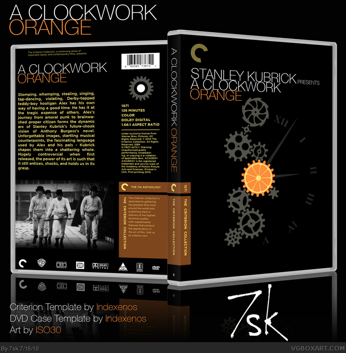
Here is my box for A Clockwork Orange. I found the art on 4chan and learned that it was created by Shirt.woot user ISO30, so he is credited there.
Pretty simple, speaks for itself. Comment and critique, thankyouverymuch :)
Edit: Oh, and don't forget to full-view and check out the printable. Thanks.
Edited at 1 decade ago
[ Reply ]
I'd take out the Criterion Marks. Other than that, great.
[ Reply ]
Love
[ Reply ]
I have one small complaint the image on the back needs to be resized and shrunk down. The yellow text kind of clashes with the photo other than that Great job!
[ Reply ]
I love this.
[ Reply ]
#2, I didn't have them originally, but I've been to add special features to my Criterion boxes. I'm actually not sold on them either, so if anything I'll just take 'em out. Thanks for the fave.
#3, #5, thanks you guys :D. #4, I may just do that soon/tonight. It's kinda bothering me too.
Edited at 1 decade ago
[ Reply ]
Nice. I like the design work on the front. And that blurb on the back is excellent, particularly how it starts, really sets the tone of the movie.
[ Reply ]
Really nice design! The shirt graphic works well on the box, and I love the streamlined layout.
I usually enter the shirt woot contest, and I remember this entry. It blew away all of us, and was the first design ever to win with over 1000 votes.Ironically enough, I did a Clockwork orange design as well for that very same contest, which I used in this box design:
link
Not advertising obviously, I just think this is an awesome coincidence. :)
[ Reply ]
#8, I saw that shirt, I thought it was really cute :)
Thanks for the comments and for being my first Blue fave :D
Edited at 1 decade ago
[ Reply ]
You found the art on the front on 4chan? So you didn't even make it?
[ Reply ]
#10
Really?
[ Reply ]
Give me your citrus
[ Reply ]
I LOOOOVE THIS MAN
EDIT: Oh wait, you didn't make the art? :( Just really loved the concept a lot and it's sad that you didn't make it. Oh well, it's still a good looking box. =]
Edited at 1 decade ago
[ Reply ]
These gears are blurry, and I don't like the way that picture on the back is chopped.
Seems like you just took some art and slapped it there, btw.
[ Reply ]
I don't know why everyone is so disappointed it's not original art, is says so right there on the box.
This is a box I made a few months ago, when I had zero experience with Photoshop. At the time I was interested more in making nice-looking covers for my own DVDs, instead of making my own boxes. Maybe sometime later I'll make my own ACO box with my own art, but for now I'm leaving this here.
And yeah, Yoshistar, when I saw the art I was pretty sad I didn't make it, too.
[ Reply ]
Version 2: Took out Special Features section, changed screenshot on the back.
[ Reply ]
It's just that custom art is so much more valuable, I guess you can say. (can't think of the right word atm, but you get the gist of what I'm saying)
Regardless, it still looks good, and much better after you removed the text over the picture.
[ Reply ]
Yeah, I know what you mean. But thanks.
Original art isn't really my thing, I'm not a great drawer/animator, so I usually use artwork from here and there and work it into a usable box (though my next Zelda box has pedestal that I drew myself). Most times it's not as...um, cut and paste as this one, but with that artwork, it was better to leave it as is.
[ Reply ]
I now have an 80% Hall of Fame entrance rate with my boxes (doesn't hurt that I've only got five total :p)
Thank you guys so much!
[ Reply ]