I don't really like the black on brown colour scheme.
The black kinda ruins the flow you have going with the old,aged style.
I'd suggest finding another shade of grey to go along with.
Overall, a pretty solid design across the board here.
Keep it up!
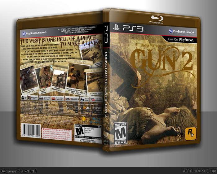
Not bad, but the "Rockstar Presents" part really bugs me. Also, the text on the back is really hard to read. You should get the full version of IMANDIX so you don't have the watermark taking up your box.
#5 I'm not telling you to steal it I'm just saying that the watermark takes away from the box. My suggestion is that you should find an alternate program that does the same as IMANDIX, but is free.
1. Rockstar didn't make Gun. It was Neversoft & Activision. 5 seconds on Wikipedia would've told you that.
2. Credit Roza for the Polaroid screenshot borders (link)
3. Why the fuck are you using Polaroid screenshot borders for a game set in the Old West?!
4. Brown color scheme is boring.
5. The 'Bleeding Cowboys' font is overused and boring.
6. The text doesn't stand out enough.
7. Make your box 3D yourself or don't do it at all. The Imandix watermark is horrible.
Overall, a bad box with a lot of mistakes that could've been fixed.
#15, It's called that because I wanted it to be called that.
@Grand - Whatever. I know who made Gun, I've fucking played it. Rockstar is just the master at sandbox games, they made Red Dead Redemption, so I thought it would be cool if they made Gun 2. Sorry for not crediting, they had cameras back then. I don't care if you don't like the font, I like the color scheme, I'm working on the color of the font, and I'm not paying 20 dollars for the program, and Manuel Alejandro is going to help me 3-d my box. Just don't comment on my boxes if you don't like them, I am so fucking sick of you and your attitude of "I'm greater than you" when you are extremely far from the best person on the site.
I really love the box, one of your best next to the lemon demon rock band. The colors and layout of the back are amazing. Also, you could just follow star89er's tutorial to 3d in photoshop.
#16, It was fair criticism, so calm down. I honestly laugh at people who just can't take any type of criticism, such as yourself.
I don't understand how he is mimicking an attitude of "I'm greater than you" when he is giving fair pointers to all the errors on the box.
And its specifically said that the title should be proper so it slots into the database. So don't make up your stupid excuses for a blatant mistake on your behalf. I'll remember for my next Jade Empire box to put 'Bioware Presents: Jade Empire' as the title.
#16, My criticism was perfectly constructive. Nut up and take it.
And yes, they had cameras back then, but Polaroids weren't invented until 1972. The photos on the back don't look anything like turn of the century photos.
#19, I agree with what you said, though I my self have been known to take criticism the wrong way. The title should be as SO pointed out Gun 2, you still could have the Rockstar presents in the logo, just don't file under it. I think that a drop shadow or some sort of glow would help the text on the back so much. It blends in with the background a little to much.
I actually really like the front layout with the girl, but the Polaroid screenshots aren't working for me, and as others have said, that bleeding cowboy font has been beaten into the ground. Maybe making the screenshot borders more like wanted posters, or old beat up parchment might be a better fit.
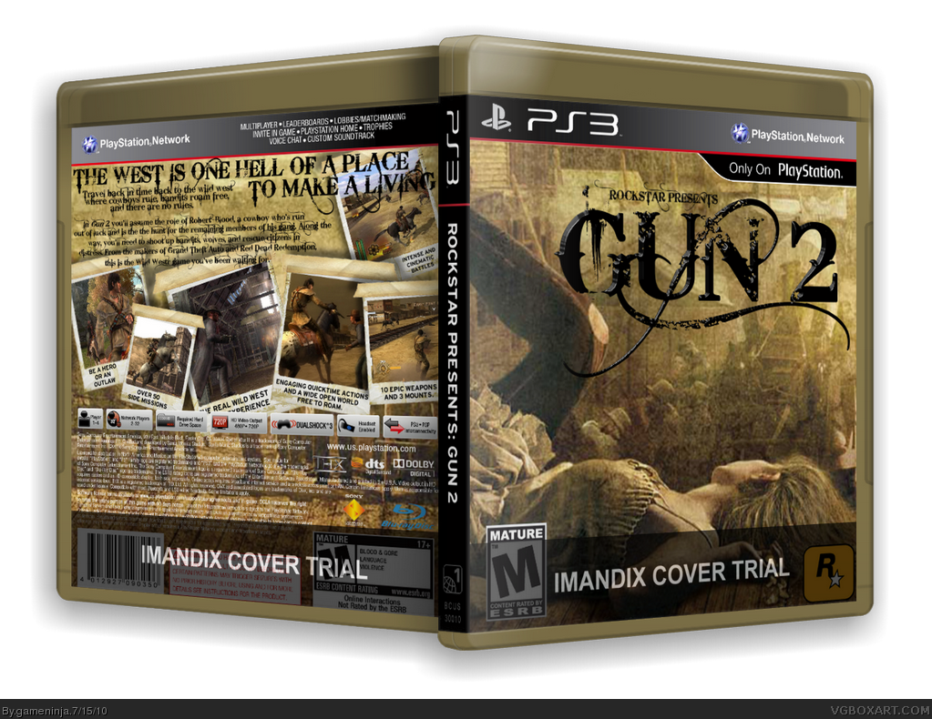
Updated. Big shout out to Manuel Alejandro, who 3d-ed the box for me. I tried to retain the brown on the logo, and change the font to a more readable level. I also switched out most of the Bleeding Cowboys font.
Well, the brow color on the Gun logo on the front makes it hard to read, the quality of the picture, chiefly the "Rockstar Presents" part. The Rockstar logo is too much near the corner. I don't like the way you placecd the tagline and the synopsis above the screenshots (Which, btw, shouldn't be polaroid photos, because it makes no sense at all). The "Wanted". The font used on the synopsis does not look well for an entire paragraph, looks more like a for a title. The arrangement of the screenshots is well done, but it'd have liked it more with the screenshots occupying less space (Maybe putting less ones), and replacing the free space with renders or something. Overall, you do have a really nice design here, but some problems (As the bad quality of the pictures you used, and the overcrowding with the back's screenshots) makes it seem like you could've worked more on it.
 Rockstar Presents: Gun 2 Box Cover Comments
Hey guys, this is my comp box against Magical.
PLEASE IGNORE THE IMANDIX WATERMARK
and view in full.
Faves welcome.
[ Reply ]
I don't really like the black on brown colour scheme.
The black kinda ruins the flow you have going with the old,aged style.
I'd suggest finding another shade of grey to go along with.
Overall, a pretty solid design across the board here.
Keep it up!
[ Reply ]
Wish it was higher res, looks pretty good though.
[ Reply ]
Not bad, but the "Rockstar Presents" part really bugs me. Also, the text on the back is really hard to read. You should get the full version of IMANDIX so you don't have the watermark taking up your box.
[ Reply ]
I'll fix those.
#4, I'm not stealing it and I'm not paying $20 for it. Why no fave?
Edited at 1 decade ago
[ Reply ]
#5 I'm not telling you to steal it I'm just saying that the watermark takes away from the box. My suggestion is that you should find an alternate program that does the same as IMANDIX, but is free.
[ Reply ]
Imandix cover trial is the downfall. The front is looking awesome, but the back is only average. The text is hard to read and i dont like the tagline.
Edited at 1 decade ago
[ Reply ]
Updated - It's a lot better now, in my opinion.
[ Reply ]
#8, its a BIT better. I still dont like the text on the back. But the Logo sure does look better now.
[ Reply ]
No.
[ Reply ]
Idk I liked the logo better when it was black. It reminded me of the original Gun logo colorwise
[ Reply ]
#10. What an incredibly helpful comment.
I preferred the black logo to be honest, this one's difficult to see.
[ Reply ]
Oh, this is Epic. Oh, and I understand the IMANDIX. but now I have the full version. Haha. but this is Epic. Plus Fav
[ Reply ]
1. Rockstar didn't make Gun. It was Neversoft & Activision. 5 seconds on Wikipedia would've told you that.
2. Credit Roza for the Polaroid screenshot borders (link)
3. Why the fuck are you using Polaroid screenshot borders for a game set in the Old West?!
4. Brown color scheme is boring.
5. The 'Bleeding Cowboys' font is overused and boring.
6. The text doesn't stand out enough.
7. Make your box 3D yourself or don't do it at all. The Imandix watermark is horrible.
Overall, a bad box with a lot of mistakes that could've been fixed.
[ Reply ]
Why is it called 'Rockstar Presents: Gun 2' rather than just Gun 2? Pretty stupid on your behalf.
I agree with what Grand said, especially on the font choice. I really, really hate Bleeding Cowboys, and it really just looks horrid here.
[ Reply ]
#15, It's called that because I wanted it to be called that.
@Grand - Whatever. I know who made Gun, I've fucking played it. Rockstar is just the master at sandbox games, they made Red Dead Redemption, so I thought it would be cool if they made Gun 2. Sorry for not crediting, they had cameras back then. I don't care if you don't like the font, I like the color scheme, I'm working on the color of the font, and I'm not paying 20 dollars for the program, and Manuel Alejandro is going to help me 3-d my box. Just don't comment on my boxes if you don't like them, I am so fucking sick of you and your attitude of "I'm greater than you" when you are extremely far from the best person on the site.
[ Reply ]
#16 I'll 3D it for you right now if you want. It will literally take me like 2 seconds cause I have the full version of IMANDIX
[ Reply ]
I really love the box, one of your best next to the lemon demon rock band. The colors and layout of the back are amazing. Also, you could just follow star89er's tutorial to 3d in photoshop.
[ Reply ]
#16, It was fair criticism, so calm down. I honestly laugh at people who just can't take any type of criticism, such as yourself.
I don't understand how he is mimicking an attitude of "I'm greater than you" when he is giving fair pointers to all the errors on the box.
And its specifically said that the title should be proper so it slots into the database. So don't make up your stupid excuses for a blatant mistake on your behalf. I'll remember for my next Jade Empire box to put 'Bioware Presents: Jade Empire' as the title.
[ Reply ]
#16, My criticism was perfectly constructive. Nut up and take it.
And yes, they had cameras back then, but Polaroids weren't invented until 1972. The photos on the back don't look anything like turn of the century photos.
[ Reply ]
#19, I agree with what you said, though I my self have been known to take criticism the wrong way. The title should be as SO pointed out Gun 2, you still could have the Rockstar presents in the logo, just don't file under it. I think that a drop shadow or some sort of glow would help the text on the back so much. It blends in with the background a little to much.
[ Reply ]
Rockstar, it wasn´t supossed to be activision to create the sequel ?
[ Reply ]
#22 He made it Rockstar because Red Dead Redemption was made by Rockstar and they would make an awesome open-world for Gun 2. Thats why.
[ Reply ]
The logo and text are extremely hard to read. Other than that, this is good. Funny, I started playing Gun again last night.
Edited at 1 decade ago
[ Reply ]
I actually really like the front layout with the girl, but the Polaroid screenshots aren't working for me, and as others have said, that bleeding cowboy font has been beaten into the ground. Maybe making the screenshot borders more like wanted posters, or old beat up parchment might be a better fit.
[ Reply ]
Updated. Big shout out to Manuel Alejandro, who 3d-ed the box for me. I tried to retain the brown on the logo, and change the font to a more readable level. I also switched out most of the Bleeding Cowboys font.
[ Reply ]
Well, the brow color on the Gun logo on the front makes it hard to read, the quality of the picture, chiefly the "Rockstar Presents" part. The Rockstar logo is too much near the corner. I don't like the way you placecd the tagline and the synopsis above the screenshots (Which, btw, shouldn't be polaroid photos, because it makes no sense at all). The "Wanted". The font used on the synopsis does not look well for an entire paragraph, looks more like a for a title. The arrangement of the screenshots is well done, but it'd have liked it more with the screenshots occupying less space (Maybe putting less ones), and replacing the free space with renders or something. Overall, you do have a really nice design here, but some problems (As the bad quality of the pictures you used, and the overcrowding with the back's screenshots) makes it seem like you could've worked more on it.
[ Reply ]