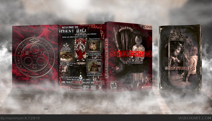
For those of you wondering what the deal with the back is, allow me to explain:
I started the box with the classic story/features setup on the back, but seeing how it its already been done enough and it IS one of my favorite games I wanted to do something different. While playing the game I ran across a brochure, where Heather mentioned that SH was once a resort town.
So I got the idea to make the back kind of like a brochure, but rather then using the normal SH images I decided to keep the normal lines of text but change the images to the nightmare version of SH just as it would change in the game, with a twisted sense of humor to it. So where you would normally have a mother walking hand in had with her child you have the mummified version of her clutching her child above the pit. Normal food replaced with roasted dog and so on
The colors are meant to signify the normal and altered version of the town .So brownish/blue color overtone signifying normal SH and blood red signifying the changed one.
The last sentence on the back I a reference to SH movie or rather |S P O I L E R | the end of it.
I strongly recommend viewing in full and printable especially for the logos.
I hope you like it and feedback is greatly appreciated.
 Silent Hill 3 Box Cover Comments
So…SH3:)
For those of you wondering what the deal with the back is, allow me to explain:
I started the box with the classic story/features setup on the back, but seeing how it its already been done enough and it IS one of my favorite games I wanted to do something different. While playing the game I ran across a brochure, where Heather mentioned that SH was once a resort town.
So I got the idea to make the back kind of like a brochure, but rather then using the normal SH images I decided to keep the normal lines of text but change the images to the nightmare version of SH just as it would change in the game, with a twisted sense of humor to it. So where you would normally have a mother walking hand in had with her child you have the mummified version of her clutching her child above the pit. Normal food replaced with roasted dog and so on
The colors are meant to signify the normal and altered version of the town .So brownish/blue color overtone signifying normal SH and blood red signifying the changed one.
The last sentence on the back I a reference to SH movie or rather |S P O I L E R | the end of it.
I strongly recommend viewing in full and printable especially for the logos.
I hope you like it and feedback is greatly appreciated.
Edited at 1 decade ago
[ Reply ]
I love this, it looks great. Though there are some areas where the quality is worse than others but I will let that slide for the amazing design.
[ Reply ]
The design is pretty fantastic!!
+fav
[ Reply ]
Love the presentation.
[ Reply ]
inb4 Pan
[ Reply ]
Nicely done. I love the slip case.
[ Reply ]
The presentation is enough for a fav
[ Reply ]
Thanks guys, I'm glad you like it
[ Reply ]
I'm glad I author faved you keep up the good work!
[ Reply ]
Hey, thanks a lot man!
[ Reply ]