DISCLAIMER: I am not 100% sure that this template belongs to Ninty. I took it of YS' Sancuary of Souls box. If it is yours YoshiStar, then I am very sorry, as I needed to use the plastic, as all of Ninty's 360 Template links (which I wanted) weren't working.
Not bad, I liked your previous efforts more though. There are things that should be addressed for this to be the best it can...
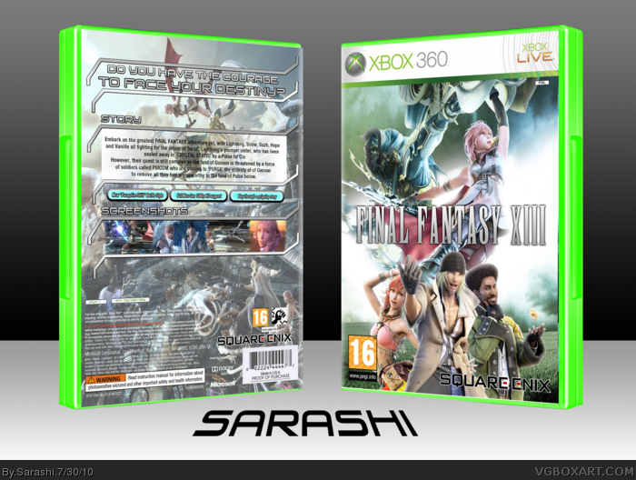
- Overall the front is pretty cool, I'm liking the use of Lightning + Odin as not many people have done that before. It looks good but the render is a little blurry.
- The layout of the back is not bad, I like that you're continuing the HUD-style. But the synopsis text is difficult to read against the background and rather choppy as well.
- The screenshots could be blended better.
- I think the background image on the back should be lightly faded to make reading easier, and possibly given a subtle blue/green tone to better match the front.
Overall, cool but I know it could be a lot better with some minor adjustments.
Sorry, I don't think the back is very good. First of all, if you look at most final fantasy games, most don't include a story blurb, and only have one to three sentences that just give a cryptic statement about the story. I'm not saying that you should copy this, but I think it really adds to the boxes because they're kind of like a bad-ass statement saying "you don't need to know what the story is, because you know it's gonna be good". Also, your blurb in general just gives too much away. Also, I think labeling the screenshots with "screenshots" is a really bad move. I TOTALLY understand it from the stylistic point-of-view, but I don't think it works here. Honestly, I would reccomend removing the story and blurb entirely, keeping the sentence and format on the top, and then putting more/larger screenshots with the features you listed referring to the screenshots.
This was a big critique, so take it or leave it. Other than that though you did a GREAT job with your layering, fades, effects and so on. And the front is nice too (although I would recommend including the full logo with the crystal artwork because it's such a staple for the series).
#7, Being cryptic may be Final Fantasy tradition, but the point is that this isn't the official type of box. If I wanted that, i'd go look at the official cover. I agree that the 'Story' and 'Screenshots' part is un-needed, but I thought i'd stick it in to make it more like MY work.
I see where you're coming from, but for this, i'll leave it at that.
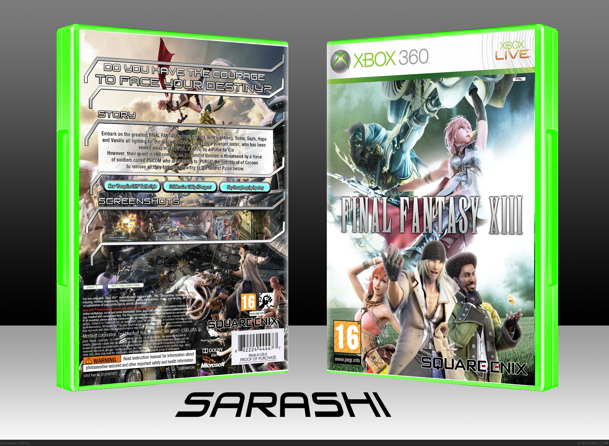
Looking between the two, like you said you've fixed everything I mentioned. Text is still a bit choppy but much easier to read and the back doesn't look near as crowded with the lighter/faded image. Good job Sarashi.
 Final Fantasy XIII Box Cover Comments
DISCLAIMER: I am not 100% sure that this template belongs to Ninty. I took it of YS' Sancuary of Souls box. If it is yours YoshiStar, then I am very sorry, as I needed to use the plastic, as all of Ninty's 360 Template links (which I wanted) weren't working.
[ Reply ]
Well done, Sarashi.
[ Reply ]
You need ton put a drop shadow on the front's logo other than that it looka perfect.
Inb4 sd1883
Edited at 1 decade ago
[ Reply ]
Nice job,the only thing is that the description text on the back is a little messed up.
[ Reply ]
#3, Screw you. :P
Not bad, I liked your previous efforts more though. There are things that should be addressed for this to be the best it can...
- Overall the front is pretty cool, I'm liking the use of Lightning + Odin as not many people have done that before. It looks good but the render is a little blurry.
- The layout of the back is not bad, I like that you're continuing the HUD-style. But the synopsis text is difficult to read against the background and rather choppy as well.
- The screenshots could be blended better.
- I think the background image on the back should be lightly faded to make reading easier, and possibly given a subtle blue/green tone to better match the front.
Overall, cool but I know it could be a lot better with some minor adjustments.
[ Reply ]
#5, OK I will fix it, and repost.
[ Reply ]
Sorry, I don't think the back is very good. First of all, if you look at most final fantasy games, most don't include a story blurb, and only have one to three sentences that just give a cryptic statement about the story. I'm not saying that you should copy this, but I think it really adds to the boxes because they're kind of like a bad-ass statement saying "you don't need to know what the story is, because you know it's gonna be good". Also, your blurb in general just gives too much away. Also, I think labeling the screenshots with "screenshots" is a really bad move. I TOTALLY understand it from the stylistic point-of-view, but I don't think it works here. Honestly, I would reccomend removing the story and blurb entirely, keeping the sentence and format on the top, and then putting more/larger screenshots with the features you listed referring to the screenshots.
This was a big critique, so take it or leave it. Other than that though you did a GREAT job with your layering, fades, effects and so on. And the front is nice too (although I would recommend including the full logo with the crystal artwork because it's such a staple for the series).
[ Reply ]
#7, Being cryptic may be Final Fantasy tradition, but the point is that this isn't the official type of box. If I wanted that, i'd go look at the official cover. I agree that the 'Story' and 'Screenshots' part is un-needed, but I thought i'd stick it in to make it more like MY work.
I see where you're coming from, but for this, i'll leave it at that.
[ Reply ]
Looking between the two, like you said you've fixed everything I mentioned. Text is still a bit choppy but much easier to read and the back doesn't look near as crowded with the lighter/faded image. Good job Sarashi.
[ Reply ]
What font did you use for the back?
It's the same font used for all of the in-game menus.
[ Reply ]