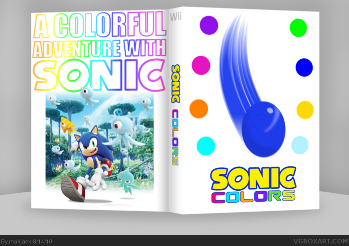
Decided to submit my box for the Summer Comp Round 1 after seeing Ayron's post. The round's theme was simplicity.It may not look like it, but this box took a lot of time. I'm very pleased how this turned out.
Comments and favs appreciated. Thanks for viewing.
I understand the simplistic approach, but when you add renders and backgrounds on the back that have to do with, non-vector artwork, the art direction is thrown off.
 Sonic Colors Box Cover Comments
Decided to submit my box for the Summer Comp Round 1 after seeing Ayron's post. The round's theme was simplicity.It may not look like it, but this box took a lot of time. I'm very pleased how this turned out.
Comments and favs appreciated. Thanks for viewing.
Well, enjoy.
Thanks for the quick favs, guys.
Edited at 1 decade ago
[ Reply ]
Wow, I love it :) Nice work.
[ Reply ]
This is so beautiful, the front grabs the attention right away with its simplicity. Great work, best of luck in the comp.
[ Reply ]
#3, yet no fav? Makjack is not amused.
[ Reply ]
#4, I forgot, that's why I came back. ;p
[ Reply ]
Beautiful.
[ Reply ]
#6, Thanks.
Thanks for the favs guys.
[ Reply ]
This got me second place in the comp, according to the judges.
Pretty good, huh?
[ Reply ]
Not bad. Worth a fav.
[ Reply ]
Thanks for the fresh favs guys.
[ Reply ]
I like how Sonic steps out of the back frame.Although the front is really lacking.
[ Reply ]
#11, lacking, as in?
Dude, the theme for the round was simplicity, so it fits well i think.
[ Reply ]
I understand the simplistic approach, but when you add renders and backgrounds on the back that have to do with, non-vector artwork, the art direction is thrown off.
[ Reply ]
Clean and Simple. Kick ass! =D
[ Reply ]
#15, thanks man!
[ Reply ]
This should be HOF!
[ Reply ]
#17, I think so too lol :p
Edited at 1 decade ago
[ Reply ]