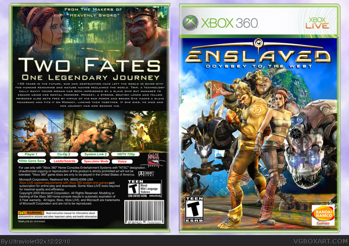
[ Box updated on December 22nd, 2010 ] [ original ]
 Enslaved: Odyssey to the West Box Cover Comments
Comment on Ultraviolet32x's Enslaved: Odyssey to the West Box Art / Cover.
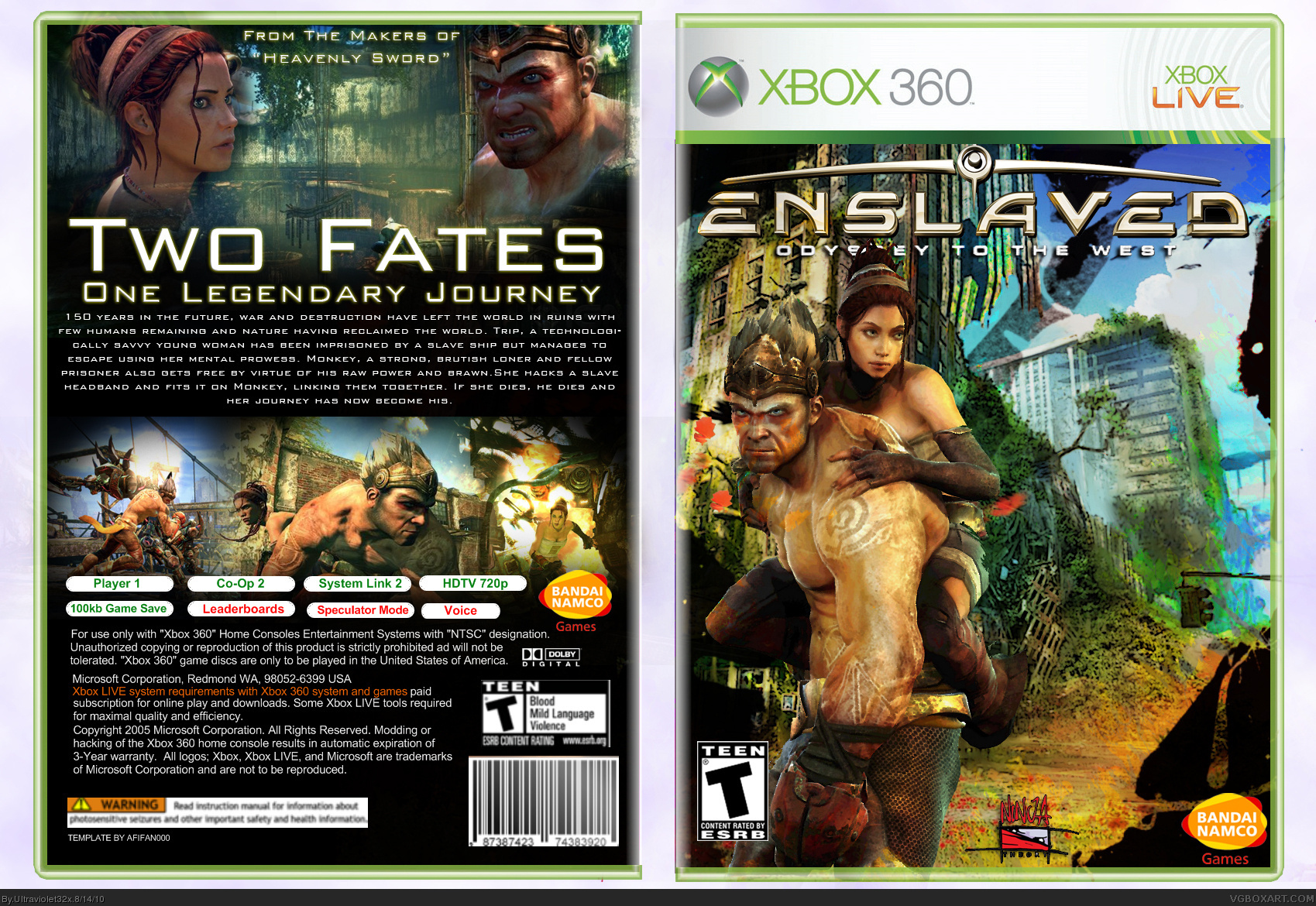
[ Box updated on December 22nd, 2010 ] [ original ]
Comment on Ultraviolet32x's Enslaved: Odyssey to the West Box Art / Cover.
Hey everyone! My newest box for Enslaved: Odyssey to the West. I really wanted the box design to focus on the two characters.
Credit to afifan000 for the template and qwerty334 & E_G for the esrb logos.
[ Reply ]
Great work! I just can't tell if this game will be good or not.
[ Reply ]
I reall like it. It's a good box. But when you want the focus on the two characters, I think you should do something with your front. They're not in the centre and they don't stick out from the background because the color schemes are too alike. I would definitely try to work on something here for them to stick out more. Maybe you turn down the contrast on the background or something.
For the rest: Great job. The back looks very professional.
[ Reply ]
nice)
[ Reply ]
I finally re-designed the front, which I was never happy with. Comments appreciated :)
Credit to Leegion for the character renders on the front.
[ Reply ]
Very good and a very new look at the front, however you should add more space to the text stuff (headline and logo) on the top on front and back. It's very cramped up there.
IMO the back should get some blue touch to fit the front a bit more as well.
[ Reply ]
great job dude nice custom, printable please
[ Reply ]