Here is my third box! I'm not sure if my talents have gotten better over time, I'll let you guys be the judge of that, but I do know that it doesn't take me as long to make one now at least. Let me know what you think! Thanks in advance ;)
Credits:
Template by Deiviuxs
Capcom Logo by Cerium
Holy Crap! These are my first favs ever! Thanks guys! And thank you Sonic the Hedgehog for breaking my +Fav cherry! Ratings or comments are welcome, I still have to learn ;)
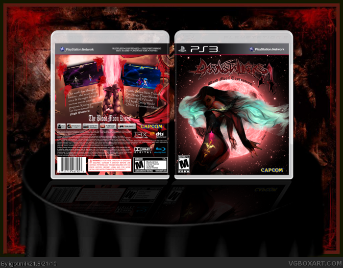
Thanks felipe. As for the back though, I did a plain back on purpose. I used other fighting games I own as a reference to how covers are done and the ones I have here aren't too complicated. Hardly any stories but descriptions on the games mechanics instead. But there's still work here. Those screenshots for example I edited a lot. It took me a long time to find a 3d Hsien-ko model though lol.
Looks great from a Distance. But then You see full view. I'm not one to really judge because i haven't made any yet. This look great to me. but you used like the Resident Evil's 4, and what appears to be Bayonetta's Moon. The Morrigan Fan Art clashes because there are so many other styles of Art in it. the Fonts are the biggest problem with the front to me. Bevel and Emboss DarkStalkers, The Resident Evil 4, then the Old English on the Moon you should have kept the Old English Font straight and Right under the DarkStalkers logo.
Don't really see to much a prob with the back other then the Screen Shots. no real Action in them they just kinda standing there. Stages are the same image in two diff colors. Could have Like used Old DarkStalkers Stages but im sure your reason for that is the 3d models for the characters. The bg for the stages would be fine if you had the Characters doing a Super Combo.
Over all I still like it. If you did this good, im sure you can do better.
Thank you for giving detailed critiques. I can't get any better if no one tells me specifically what they don't like right?
Yeah that's the Resident Evil 4, I just couldn't make my own '4' that looked any better. I thought it fit well. But now that you mention the different fonts clashing, I think you're right. Thanks for pointing that out.
That's not Bayonetta's moon. I didn't know she had one. That's a picture of the real moon recolored.
I liked wrapping the font on top of the moon like that. I think it made the sub-title stand out more.
I agree with the screenshots a lot actually. I modified MvC3 screenshots because, yeah, I was using 3D models.
Thanks for being on-point with me. I'm going to work on this again and update with a version 2 because I really like this. However I flattened the image so I'm going to start from scratch.
Okay, Version 2 is posted! I started from scratch like I said above. I completely over-hauled the back. I pretty much changed everything with the exception of Morrigan and the moon on the front.
This time I decided to push myself further and make a disc. It's my first one.
 Darkstalkers 4: Blood Moon Tournament Box Cover Comments
Here is my third box! I'm not sure if my talents have gotten better over time, I'll let you guys be the judge of that, but I do know that it doesn't take me as long to make one now at least. Let me know what you think! Thanks in advance ;)
Credits:
Template by Deiviuxs
Capcom Logo by Cerium
Edited at 1 decade ago
[ Reply ]
Holy Crap! These are my first favs ever! Thanks guys! And thank you Sonic the Hedgehog for breaking my +Fav cherry! Ratings or comments are welcome, I still have to learn ;)
Edited at 1 decade ago
[ Reply ]
No one has any critiques?
[ Reply ]
The front looks cool bro, but try to do a new back, that one is too generic!
[ Reply ]
Thanks felipe. As for the back though, I did a plain back on purpose. I used other fighting games I own as a reference to how covers are done and the ones I have here aren't too complicated. Hardly any stories but descriptions on the games mechanics instead. But there's still work here. Those screenshots for example I edited a lot. It took me a long time to find a 3d Hsien-ko model though lol.
[ Reply ]
Looks great from a Distance. But then You see full view. I'm not one to really judge because i haven't made any yet. This look great to me. but you used like the Resident Evil's 4, and what appears to be Bayonetta's Moon. The Morrigan Fan Art clashes because there are so many other styles of Art in it. the Fonts are the biggest problem with the front to me. Bevel and Emboss DarkStalkers, The Resident Evil 4, then the Old English on the Moon you should have kept the Old English Font straight and Right under the DarkStalkers logo.
Don't really see to much a prob with the back other then the Screen Shots. no real Action in them they just kinda standing there. Stages are the same image in two diff colors. Could have Like used Old DarkStalkers Stages but im sure your reason for that is the 3d models for the characters. The bg for the stages would be fine if you had the Characters doing a Super Combo.
Over all I still like it. If you did this good, im sure you can do better.
I give it 3/5
[ Reply ]
#6
Thank you for giving detailed critiques. I can't get any better if no one tells me specifically what they don't like right?
Yeah that's the Resident Evil 4, I just couldn't make my own '4' that looked any better. I thought it fit well. But now that you mention the different fonts clashing, I think you're right. Thanks for pointing that out.
That's not Bayonetta's moon. I didn't know she had one. That's a picture of the real moon recolored.
I liked wrapping the font on top of the moon like that. I think it made the sub-title stand out more.
I agree with the screenshots a lot actually. I modified MvC3 screenshots because, yeah, I was using 3D models.
Thanks for being on-point with me. I'm going to work on this again and update with a version 2 because I really like this. However I flattened the image so I'm going to start from scratch.
[ Reply ]
Okay, Version 2 is posted! I started from scratch like I said above. I completely over-hauled the back. I pretty much changed everything with the exception of Morrigan and the moon on the front.
This time I decided to push myself further and make a disc. It's my first one.
Comments/Favs are always welcome!
Updated Credits:
PS3 Disc by Rossaques
[ Reply ]
WOW! That's really awesome!!
[ Reply ]
#9... That's the first time someone's called one of my boxes awesome! Thanks so much!
[ Reply ]
#10 your welcome! but i think version 1 looks better. lol just my opinion :D
[ Reply ]
#11 That's cool, could you tell me why version 1 was better in your opinion? So perhaps I could combine the best elements of both versions.
[ Reply ]
I would love to see an English 'Darkstalkers Resurrection' cover...or at least an English translated version of the Japanese retail release. :D
[ Reply ]