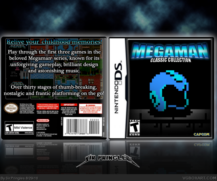
Wow, first box in a long while... I have a couple of works in progress, but I went for finishing this one. So...
What does VGBA think? :) Comments and Critique is VERY welcome!
1. Spellcheck
2. It's "Mega Man" not "Megaman"
3. Get some new fonts
4. Why wouldn't a classic collection include all of the NES titles? As in 1 through 6? Why just 1 through 3?
1) What is misspelled?
2) I seriously doesn't find that too important, but sure, I'll fix it.
3) Just because you CAN use "high-tech" (in lack of better words) fonts, doesn't mean you SHOULD. I happen to find that this font works well with the box.
4) Because I thought that 6 games in 1 would be too much. Plus, I think that these are the best games in the series (except maybe Megaman 9) so it was natural for me.
#5: Oh no, I wrote three words incorrectly. The whole box is ruined.
Seriously, try to be nice. Just because you're highly ranked doesn't mean you can yell at people for doing the slightest mistake. This is easily fixed, and barely noticeable.
This site is just for hobbyists, if even that. Don't take things so seriously, you'll just look like a douche. People like you scare away newcomers. Next time, try to be nice.
#7, Well it is ruined. Though this is a site for people's hobby, we also try to be professional here. Making spelling mistakes is not professional. And they are very noticeable, they were the first things I saw.
#3, capcom is a greedy mf-ing company, even in an individual's fantasy capcom still holds out for more cash by releasing a second game containing mega man 4 through 6.
As for the box, I was impressed by the front based off the thumbnail but was disappointed by the back. I would love to see a reworked back with the same motif and theme as the front cover
#17, Well, the front for me gives off a feeling of isolation and struggle, also just having the helmet on the front makes me think I'll actually see mega man in full on the back side
I love the idea for the front cover but for the back i think you should change the font a little bit and maybe put screens near the text instead of behind it (meaning less screens). Still good.
 Megaman: Classic Collection Box Cover Comments
Wow, first box in a long while... I have a couple of works in progress, but I went for finishing this one. So...
What does VGBA think? :) Comments and Critique is VERY welcome!
[ Reply ]
i love the case :)
[ Reply ]
SPELLCHECK, MOTHERFUCKER, DO YOU USE IT?!
--Jules Winnfield
But seriously:
1. Spellcheck
2. It's "Mega Man" not "Megaman"
3. Get some new fonts
4. Why wouldn't a classic collection include all of the NES titles? As in 1 through 6? Why just 1 through 3?
Front is nice, but this needs some work.
[ Reply ]
1) What is misspelled?
2) I seriously doesn't find that too important, but sure, I'll fix it.
3) Just because you CAN use "high-tech" (in lack of better words) fonts, doesn't mean you SHOULD. I happen to find that this font works well with the box.
4) Because I thought that 6 games in 1 would be too much. Plus, I think that these are the best games in the series (except maybe Megaman 9) so it was natural for me.
Edited at 1 decade ago
[ Reply ]
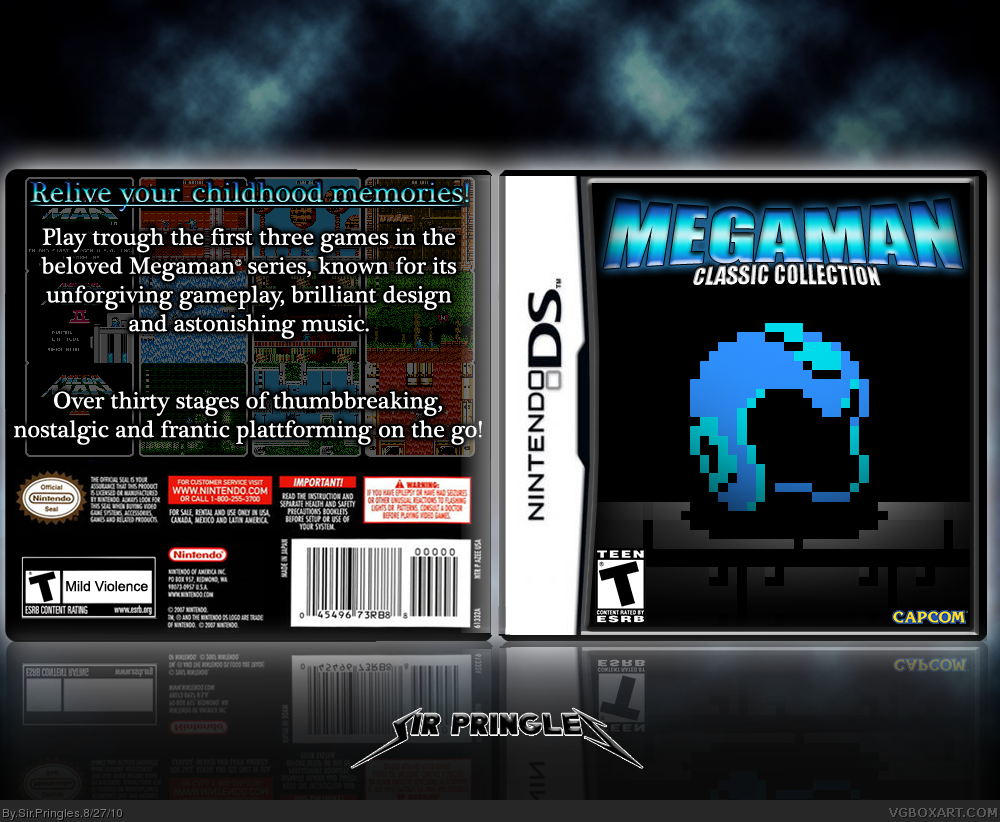
Play "TROUGH" the first three games...
Over thirty stages of "THUMBBREAKING" (should be hyphenated)
Frantic "PLATTFORMING"
Seriously.
[ Reply ]
#3, Splellcheck yourself "Motherfucker". You rude! Shame.
[ Reply ]
#5: Oh no, I wrote three words incorrectly. The whole box is ruined.
Seriously, try to be nice. Just because you're highly ranked doesn't mean you can yell at people for doing the slightest mistake. This is easily fixed, and barely noticeable.
This site is just for hobbyists, if even that. Don't take things so seriously, you'll just look like a douche. People like you scare away newcomers. Next time, try to be nice.
[ Reply ]
As Grand as, the front is nice, but the back needs a lot of work.
[ Reply ]
#7, Well it is ruined. Though this is a site for people's hobby, we also try to be professional here. Making spelling mistakes is not professional. And they are very noticeable, they were the first things I saw.
[ Reply ]
As Grand as, the front is nice, but the back needs a lot of work.
[ Reply ]
UPDATE.
No more spelling mistakes. Can someone tell me what they think of the box now?
#8: How to improve?
[ Reply ]
#6, There have never been any spelling mistakes on my boxes. And you have clearly never seen Pulp Fiction.
[ Reply ]
#12: Very well, now that there is no spelling mistakes, would you tell me how to improve it instead of saying "Needs more work"?
[ Reply ]
It should be rated E for everybody, not T for Teen
[ Reply ]
Interesting but there are some flaws as stated in previous comments
[ Reply ]
#3, capcom is a greedy mf-ing company, even in an individual's fantasy capcom still holds out for more cash by releasing a second game containing mega man 4 through 6.
As for the box, I was impressed by the front based off the thumbnail but was disappointed by the back. I would love to see a reworked back with the same motif and theme as the front cover
[ Reply ]
#16: Any suggestions for a back? :) I'd be glad to here them.
[ Reply ]
#17, Well, the front for me gives off a feeling of isolation and struggle, also just having the helmet on the front makes me think I'll actually see mega man in full on the back side
[ Reply ]
I love the idea for the front cover but for the back i think you should change the font a little bit and maybe put screens near the text instead of behind it (meaning less screens). Still good.
[ Reply ]