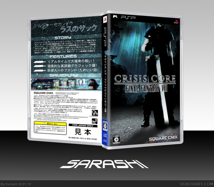
1: For people who saw the one I posted before, I have attempted to fix it, by removing the feathers and 'properly rendering' it. I also tried to make him fit with the enviroment. However it wasn't that easy, as the image came higher res than the others, but came with odd levels.
2: I am going to effectivly concise what I said before. Decided to use ideas that I didn't use in my Birth by Sleep box on this, like the star writing.
3: I am going to say, that by far, making boxes in Japanese (or mock Japanese in this case) is the easiest and the most fun.
I'm gonna say that I really really like your front, the back though.............................................. no! Sorry.
I don't think I am a big fan of the Japanese boxes, their backs alwas seem to be crowded with text and less creativity (not meaning you here). But I'd have wanted to see a more shiney, creative back for this front.
I absolutely love the front. It has a dark, calming feel to it. You just need to fix Zack's shadow, there's nothing underneath his right foot at the moment.
As for the back, it's rather lacking in comparison to the front. It could have done with some characters, and maybe remove whatever effect is on the tagline.
I really like the front, really nice. But I do agree with what's already been said about the back. it is a bit lacking. It doesn't really look great with all that text and the screens look squadhed at the bottom.
 Crisis Core: Final Fantasy VII Box Cover Comments
Firstly, I am going to seize first comment and say credit to Jevangod for the 3D plastic.
[ Reply ]
Next I am going to say...
1: For people who saw the one I posted before, I have attempted to fix it, by removing the feathers and 'properly rendering' it. I also tried to make him fit with the enviroment. However it wasn't that easy, as the image came higher res than the others, but came with odd levels.
2: I am going to effectivly concise what I said before. Decided to use ideas that I didn't use in my Birth by Sleep box on this, like the star writing.
3: I am going to say, that by far, making boxes in Japanese (or mock Japanese in this case) is the easiest and the most fun.
[ Reply ]
I'm gonna say that I really really like your front, the back though.............................................. no! Sorry.
I don't think I am a big fan of the Japanese boxes, their backs alwas seem to be crowded with text and less creativity (not meaning you here). But I'd have wanted to see a more shiney, creative back for this front.
[ Reply ]
I love the front and I think that the back would look better if it was a little darker.
Still a fav though.
[ Reply ]
I absolutely love the front. It has a dark, calming feel to it. You just need to fix Zack's shadow, there's nothing underneath his right foot at the moment.
As for the back, it's rather lacking in comparison to the front. It could have done with some characters, and maybe remove whatever effect is on the tagline.
Still, awesome job on the front.
[ Reply ]
I agree wiith sd1833, I really like the front. The back could use some screenshots/ characters though.
[ Reply ]
The front looks really nice.
The back... is really lacking something. There's just text and screen shots.
[ Reply ]
As others said the back doesn't live up to the front it could ue something more than the BG, text, and screenshots.
[ Reply ]
I agree the back needs something. Also can't say I'm a big fan of the starry font thing on the back.
[ Reply ]
I really like the front, really nice. But I do agree with what's already been said about the back. it is a bit lacking. It doesn't really look great with all that text and the screens look squadhed at the bottom.
[ Reply ]