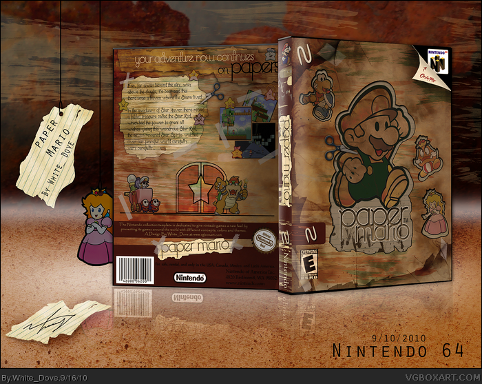
This was suppose to be for the Summer Comp Round 2 which was: Create a box with the opposite theme usually associated with the game. So, I chose a Mario game and applied a grungy feel to it. I don't really like this box much because I don't like Mario games and because going against the game's theme was a bit annoying for me since I like to do the game box as the game makes me feel. Anyway, hope you like it somehow.
This is by no means an essence box, I just made the template look like an essence one because it would have been awkward to fit a Nintendo template on a big box. The 'N' obviously stands for Nintendo.
Woooaaaahhh. The only flaw I have found is that the design for the back looks more like super paper mario (With the 2d layout, and the door, and the super paper mario screenshots. But it is wickedd.
 Paper Mario Box Cover Comments
This was suppose to be for the Summer Comp Round 2 which was: Create a box with the opposite theme usually associated with the game. So, I chose a Mario game and applied a grungy feel to it. I don't really like this box much because I don't like Mario games and because going against the game's theme was a bit annoying for me since I like to do the game box as the game makes me feel. Anyway, hope you like it somehow.
This is by no means an essence box, I just made the template look like an essence one because it would have been awkward to fit a Nintendo template on a big box. The 'N' obviously stands for Nintendo.
Thanks for any C&C.
~NF
[ Reply ]
Why there is two "N" on the front?
[ Reply ]
Wow this is a very different look on Paper Mario...i love it!
[ Reply ]
Badass.
[ Reply ]
Great, wish it was brighter thought.
[ Reply ]
Great, wish it was brighter though.
[ Reply ]
very awesome WD, your best yet!
[ Reply ]
Well done.
[ Reply ]
Wow, this turned out really really well!
[ Reply ]
Woooaaaahhh. The only flaw I have found is that the design for the back looks more like super paper mario (With the 2d layout, and the door, and the super paper mario screenshots. But it is wickedd.
[ Reply ]
You nailed the "opposite" look.
Quite scary.
[ Reply ]
Your work seems to be very well executed and professional.
+ author fav
+ box fav
[ Reply ]
Looks really great... but it's very dark. It's almost too desaturated, and the text on the back is very hard to read.
[ Reply ]
Oh it's supposed to be the opposite....got it. NM.
[ Reply ]
This one is going straight to the Hall!
[ Reply ]
This kind of makes me think Wood Mario for some reason. ¿?
[ Reply ]
Nice and refreshing design white_dove!
[ Reply ]
bump, this need to be on the hall!
[ Reply ]
This is def HoF. Maybe MW?
[ Reply ]
Woooahhhh!! Thanks guys for all the favs, I would have never guessed that my least favorite box has got more favorites than any other of mine. lol
[ Reply ]
Great job. I like the dark tone.
[ Reply ]
The dark colors are a nice change of pace from the generic, brightly lit designs. Great job!
[ Reply ]
Congrats!You totally deserved it and you have some more of them that should be in here.
[ Reply ]
This is spectacular!
[ Reply ]
Wow!! I never expected this box off all others to get to HOF. Thank you guys for the attention and recognition, it means so much to me. :)
[ Reply ]
Wooow, i wish one day i'll be as good as you. How long did this one take you?
[ Reply ]
Awesome work!
[ Reply ]
Amazing!!!!!!
[ Reply ]
the box is wrong but it looks great other than that
[ Reply ]
This is very nice! The paper "cut and paste" thing really catches the eye and fits well with the game. Congrats!
[ Reply ]