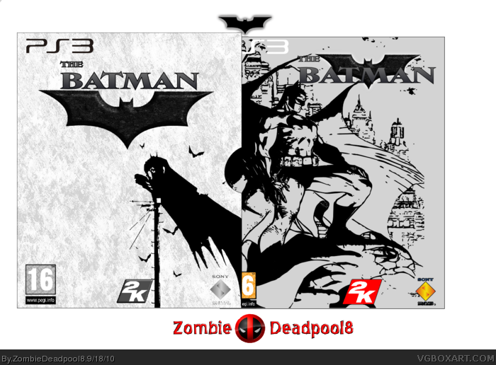
Hi people. I fancied doing a Batman box without it being Arkham City or anything. the bat emblem was actually made by me using the line tool and various nodes. It's a slipcase design so no back. Credit where needed. Also the front is supposed to be empty, it's how I wanted it..
Not bad. I don' think the font you chose for your logo really matches the artwork you used. It kinda comes across as fun, and the artwork has a more serious tone. Also on the slip cover you could probably get away with leaving out the dev logos if you want to keep it really empty.
 The Batman- Black edition Box Cover Comments
Hi people. I fancied doing a Batman box without it being Arkham City or anything. the bat emblem was actually made by me using the line tool and various nodes. It's a slipcase design so no back. Credit where needed. Also the front is supposed to be empty, it's how I wanted it..
[ Reply ]
Not bad. I don' think the font you chose for your logo really matches the artwork you used. It kinda comes across as fun, and the artwork has a more serious tone. Also on the slip cover you could probably get away with leaving out the dev logos if you want to keep it really empty.
[ Reply ]
#2, ok thanks for the reply. Although I don't agree with the font thing it's you're opinion, so I appreciate it. Thanks anyhow.
[ Reply ]
Kool
[ Reply ]
the bat you used on the front doesnt realy fit the style of the box, dont be afraid to play with the levels
[ Reply ]