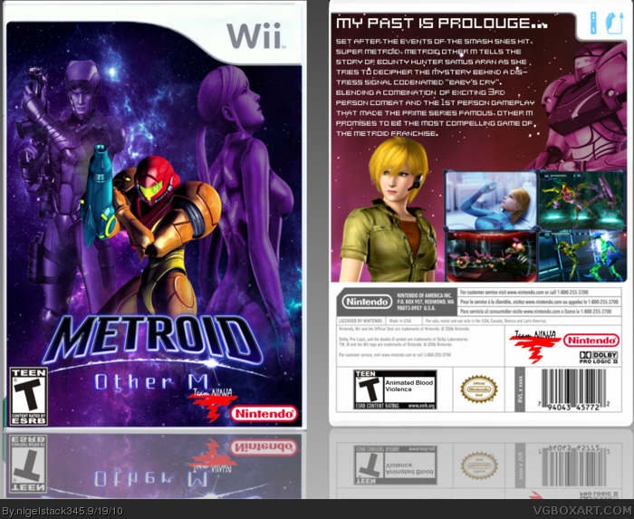
This was originally a movie box but due to overwhelming persuasion from YoshiStar and others, this was turned to an Other M box. Enjoy.
Credits:
Other M logo: KoopaDasher
Samus renders: TwistRox, Squall234 and Da_Kid
I really like this box. The front is nice and Metroid esque, the back however, although good, needs something else, don't know what, but something. I'll FAV though.
lol, it's odd to see back on right and front on the left.
I like the front and the back as well though it could have been better. Front is much more eye-catching with its colors. Good work. :)
You didn't seem to take any of the advice from the WIP thread, the front more or less looks the same...
- Some images on the front are stretched, mainly the two of Samus, it's more noticeable with her in the Zero Suit.
- The color scheme of it all just looks off. The ZSS and Adam are both completely purple against a blue background and it clashes. If you'd blended them in better, similar to the look of Other M's ending, it'd be perfect.
- Varia Suit Samus could use some work too, mainly the colors and lighting. As of right now she looks simply slapped onto the front, her colors go against everything else on the front and it's distracting.
- There's empty space as well, particulary in between ZSS and Adam. Maybe an image of Samus' gunship, or the Bottle Ship would work nicely.
- As for the back, it's uninspired. Everything's laid out in a boring or generic fashion, nothing really flows together to make a strong design. It looks rushed.
- The VS Samus on here is better, because the colors make her fit in better with her surroundings. I would have preferred a subtle color tone or overlay instead of making her completely purple but it's not bad.
- Young Samus is randomly placed as if to simply fill up space. Try being more creative with your layouts instead of placing renders wherever you don't know what to do. Take the time to think things through instead of trying to get them done quickly.
 Metroid: Other M Box Cover Comments
This was originally a movie box but due to overwhelming persuasion from YoshiStar and others, this was turned to an Other M box. Enjoy.
Credits:
Other M logo: KoopaDasher
Samus renders: TwistRox, Squall234 and Da_Kid
[ Reply ]
I really like this box. The front is nice and Metroid esque, the back however, although good, needs something else, don't know what, but something. I'll FAV though.
[ Reply ]
Oh, I forgot, thanks to everyone that helped me on the WiP forums.
[ Reply ]
The front is pretty good, the back isn't. 6/10. Should have kept it in WiP a little longer. Sorry. :(
[ Reply ]
#4, No prob. I'm not that good in making backs. :)
[ Reply ]
It's nice but the back could have been better.
[ Reply ]
Uh, Comment #2?
[ Reply ]
#7, You already commented.
[ Reply ]
lol, it's odd to see back on right and front on the left.
I like the front and the back as well though it could have been better. Front is much more eye-catching with its colors. Good work. :)
[ Reply ]
You didn't seem to take any of the advice from the WIP thread, the front more or less looks the same...
- Some images on the front are stretched, mainly the two of Samus, it's more noticeable with her in the Zero Suit.
- The color scheme of it all just looks off. The ZSS and Adam are both completely purple against a blue background and it clashes. If you'd blended them in better, similar to the look of Other M's ending, it'd be perfect.
- Varia Suit Samus could use some work too, mainly the colors and lighting. As of right now she looks simply slapped onto the front, her colors go against everything else on the front and it's distracting.
- There's empty space as well, particulary in between ZSS and Adam. Maybe an image of Samus' gunship, or the Bottle Ship would work nicely.
- As for the back, it's uninspired. Everything's laid out in a boring or generic fashion, nothing really flows together to make a strong design. It looks rushed.
- The VS Samus on here is better, because the colors make her fit in better with her surroundings. I would have preferred a subtle color tone or overlay instead of making her completely purple but it's not bad.
- Young Samus is randomly placed as if to simply fill up space. Try being more creative with your layouts instead of placing renders wherever you don't know what to do. Take the time to think things through instead of trying to get them done quickly.
[ Reply ]