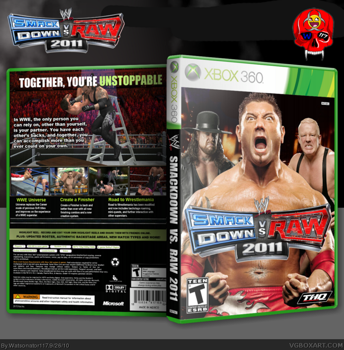
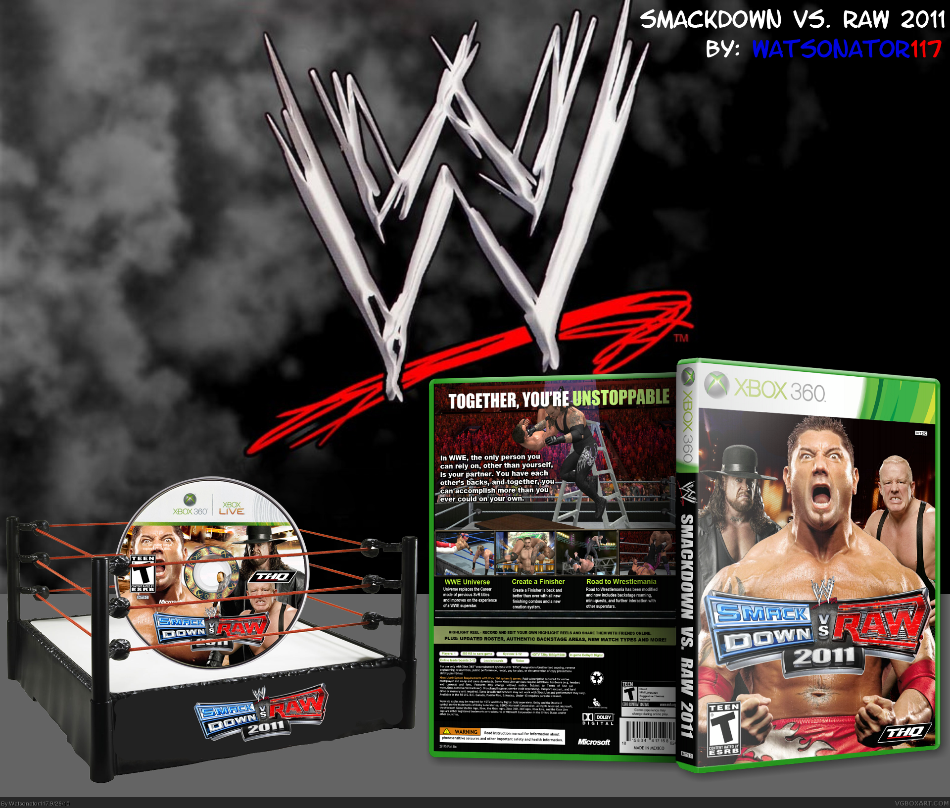
Hey guys I'm back and this is one of the boxes that I was working on while I was banned. I realize that there aren't many (or any) good SvR boxes on this site so I decided to end that and make a good box for Smackdown vs. RAW 2011. I put a lot of time and effort into this and I believe it paid off :)
#2 He's still one of the best wrestlers the WWE has ever seen. I believe he deserves to be box-center even though he retired this year. But I do see your point about him being box-center since he's retired. However, I put him box-center because he is still a legend.
It's a decent box, but what I really dislike is the presentation. It's way too big and there's just too much going on which completely takes away attention from the box itself. I'd suggest making a simple presentation so the cover stands out.
#10 Thanks dude :) I tried to give the presentation a mystic WWE wrestling style but I guess it didn't go over too well lol the box is what really matters anyway. Thanks for the fav!
this is good, and im pretty sure the only good wrestling box on the site, i dont play wrestling nor watch it but i like this box. the only problem i have is the text on the back is a little boring.
#14 Thanks man :) the back was inspired by previous SvR boxes and there's not much text on the back of a wrestling box other than a little sentence or two about wrestling. Glad you like the box though!
#16 Yeah the back design was inspired by past SvR boxes. I'll look into improvements for it and at the same time will take tips or critique on how to make it better.
 WWE Smackdown Vs Raw 2011 Box Cover Comments
Hey guys I'm back and this is one of the boxes that I was working on while I was banned. I realize that there aren't many (or any) good SvR boxes on this site so I decided to end that and make a good box for Smackdown vs. RAW 2011. I put a lot of time and effort into this and I believe it paid off :)
[ Reply ]
The box is fine but Batista has retired. Making him box-centre is a bit silly.
[ Reply ]
#2 He's still one of the best wrestlers the WWE has ever seen. I believe he deserves to be box-center even though he retired this year. But I do see your point about him being box-center since he's retired. However, I put him box-center because he is still a legend.
[ Reply ]
This is nice, mate.
[ Reply ]
#4 Thank you man :) I got extra creative with this box lol
[ Reply ]
It's a decent box, but what I really dislike is the presentation. It's way too big and there's just too much going on which completely takes away attention from the box itself. I'd suggest making a simple presentation so the cover stands out.
[ Reply ]
#6 I updated it to v2 and lessened the presentation so that the main focus is on the box and the disc :) tell me what you think!
[ Reply ]
You're getting better.
[ Reply ]
#8 Thanks dude :) like I said before, I've been working on this box since a day or two before I got banned and finished a few days ago.
[ Reply ]
The box looks great, the presentation ruins it though.
+fav anyway...
[ Reply ]
#10 Thanks dude :) I tried to give the presentation a mystic WWE wrestling style but I guess it didn't go over too well lol the box is what really matters anyway. Thanks for the fav!
[ Reply ]
Presentation is still too much imo. If I were you, I would get rid of everything that's on the left and just leave the box by itself.
[ Reply ]
#12 Alright I updated it to v3. I removed everything on the left and added the logo and my logo to the top. How does it look now?
[ Reply ]
this is good, and im pretty sure the only good wrestling box on the site, i dont play wrestling nor watch it but i like this box. the only problem i have is the text on the back is a little boring.
[ Reply ]
#14 Thanks man :) the back was inspired by previous SvR boxes and there's not much text on the back of a wrestling box other than a little sentence or two about wrestling. Glad you like the box though!
[ Reply ]
It looks ok, but you could have used something else other than a screenshot at the top of the back.
The vibrancy and shading of the characters on the back seem a little pale.
[ Reply ]
#16 Yeah the back design was inspired by past SvR boxes. I'll look into improvements for it and at the same time will take tips or critique on how to make it better.
[ Reply ]
It looks ok, but has a slapped together look to it, some nicer, more interesting looking text on the back could help out a lot.
[ Reply ]
It's alright, but that look the guy on the front is giving is hilarious
[ Reply ]
#18 Alright I'll edit the text on the back and make it more interesting.
#19 Thats Batista, he's an animal!
[ Reply ]
Decent at best. It's really bland and the Finlay render is horribly cut (is he even in the game?).
[ Reply ]
#21 Thank you for the constructive comment. Yes, they are in the game
[ Reply ]
Not bad. The back description is the same one from 2009. Also I agree with #21, Finlay is badly cut. Otherwise...good job.
[ Reply ]
#23 Thanks and yeah, it's hard to come up with descriptions for a WWE box so I just went with the main design and put that in from 2009
[ Reply ]
Thanks BosS
[ Reply ]