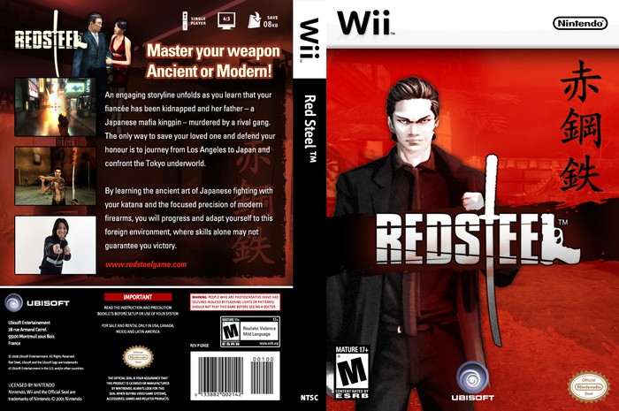
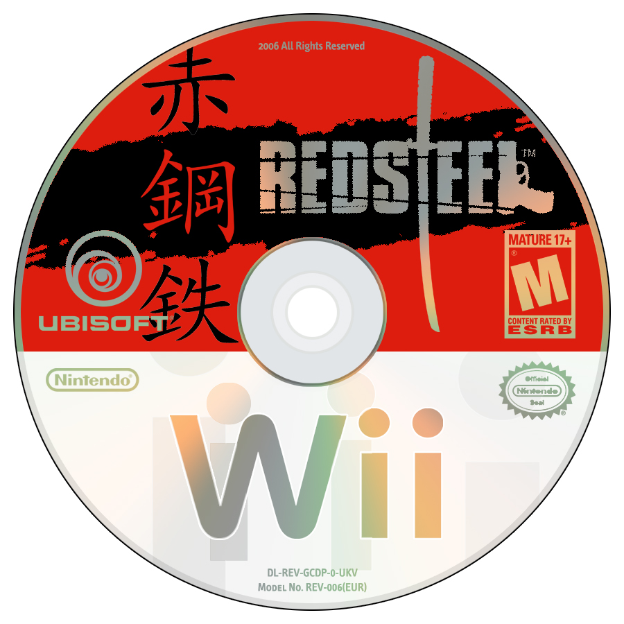
OK I have settled on my Wii Template, Same as used for my Resident Evil: Aftermath box. This time I turned my hadn at making a US Box, and I chose Red Steel as it is a game I am not very interested in, so it would offer a challenge. I also included a Disc Design with my Wii Disc Template just to show how the two match together.
i like the disc template it looks like it would be the official one.
the box is a bit different the template could use some work its a little plain also the binding should have the red steel logo on it instead of text. other then that its ok. 4/5
The DS boxes in europe use plain text instead of a logo, same as many european GCN boxes, so I decided to keep it plain and simple, so when stacked or put side by side, they match up, also the template is purposly simple, black and white won't clash with the box art's colours, and it will stand out from the competitors.
Nicely done, mdtauk. The template is pretty good if you ask me - it doesn't have to be super-complicated to look good. 5/5. My only complaint with this is that Ubisoft says they're eliminating blood and gore so they can keep a T rating from the ESRB.
#5, yeah, he looks out of place...
Other than that, i like the template mainly becuase of it's simplicity. i disc looks increadibley real, and the box itself is great! 5/5
 Red Steel Box Cover Comments
OK I have settled on my Wii Template, Same as used for my Resident Evil: Aftermath box. This time I turned my hadn at making a US Box, and I chose Red Steel as it is a game I am not very interested in, so it would offer a challenge. I also included a Disc Design with my Wii Disc Template just to show how the two match together.
[ Reply ]
i like the disc template it looks like it would be the official one.
the box is a bit different the template could use some work its a little plain also the binding should have the red steel logo on it instead of text. other then that its ok. 4/5
[ Reply ]
The DS boxes in europe use plain text instead of a logo, same as many european GCN boxes, so I decided to keep it plain and simple, so when stacked or put side by side, they match up, also the template is purposly simple, black and white won't clash with the box art's colours, and it will stand out from the competitors.
[ Reply ]
Nicely done, mdtauk. The template is pretty good if you ask me - it doesn't have to be super-complicated to look good. 5/5. My only complaint with this is that Ubisoft says they're eliminating blood and gore so they can keep a T rating from the ESRB.
[ Reply ]
I don't like the last pic. with the guy holding the controller.. I dunno why lol. Other then that its sweet man.
[ Reply ]
#5, yeah, he looks out of place...
Other than that, i like the template mainly becuase of it's simplicity. i disc looks increadibley real, and the box itself is great! 5/5
[ Reply ]
Yeah the guy with the dread-locks is out of place compared to the Japanese Jakuza style so 4/5.
[ Reply ]
very good
where is the background from on the front cover?
[ Reply ]