I'm kinda new to this site too so take my opinions with a grain of salt lol.
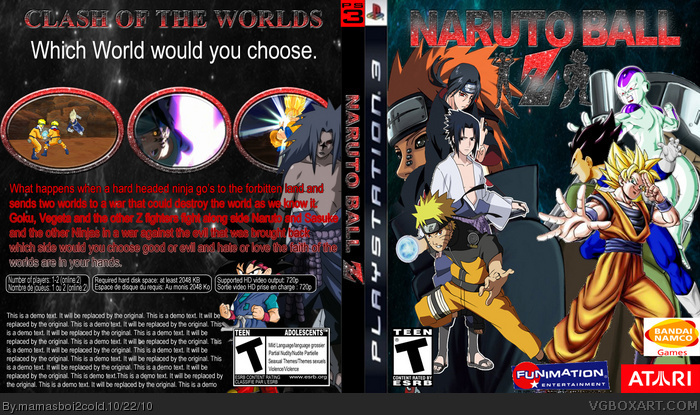
I like the back more than the front. The artwork on the front clashes a lot. The title should stand out a bit more. It blends in a bit too much. Also the brand logos should be smaller.
I don't have too many complaints about the back.
Overall a good first in my opinion ;)... better than my first for sure.
 Naruto Ball Z Box Cover Comments
This is My first game box tell me what you think
[ Reply ]
I'm kinda new to this site too so take my opinions with a grain of salt lol.
I like the back more than the front. The artwork on the front clashes a lot. The title should stand out a bit more. It blends in a bit too much. Also the brand logos should be smaller.
I don't have too many complaints about the back.
Overall a good first in my opinion ;)... better than my first for sure.
[ Reply ]
thx for the tip
[ Reply ]