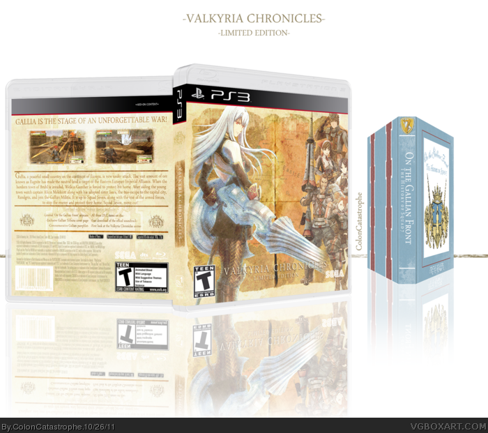
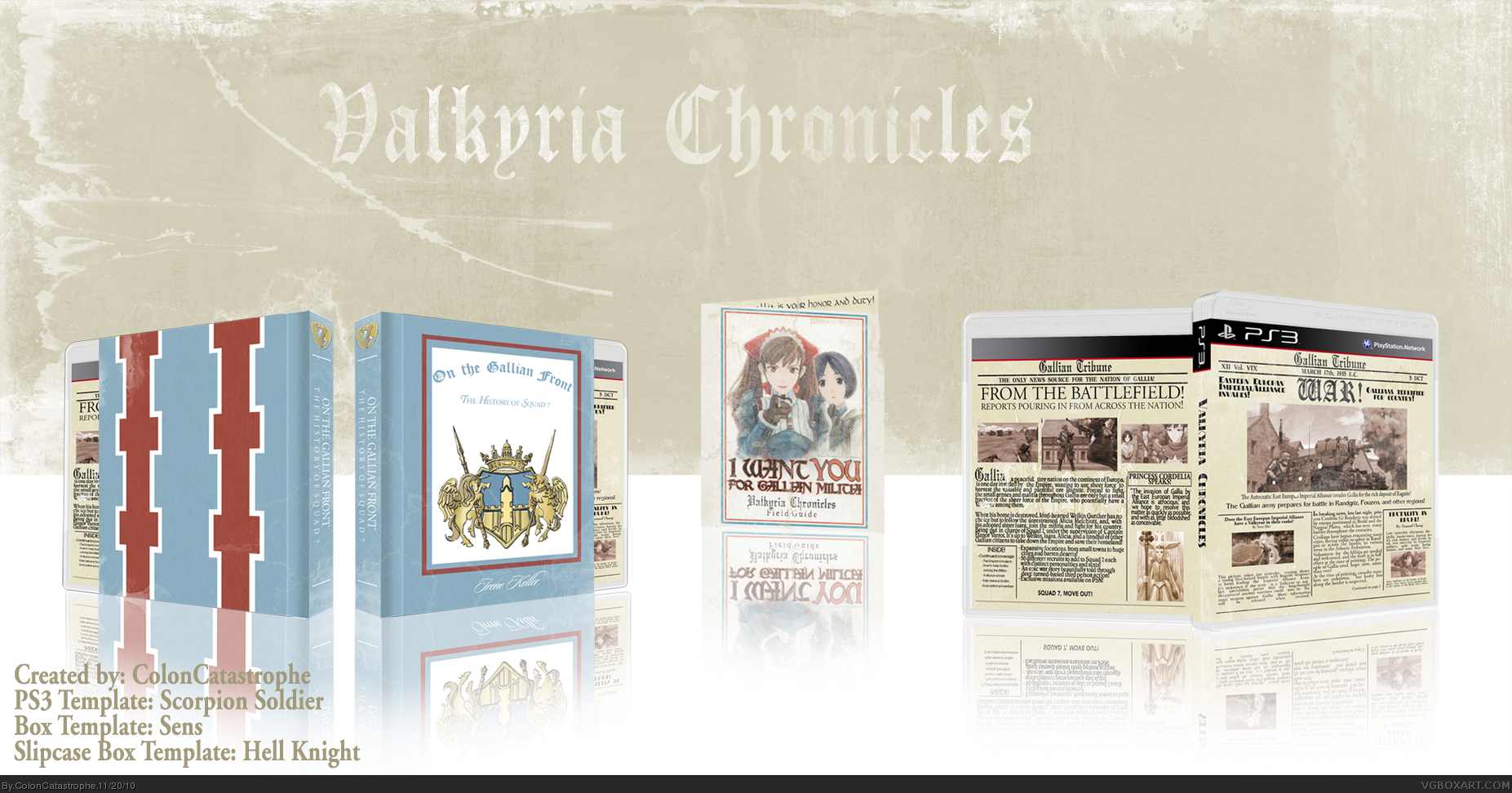
Here's my complete Valkyria Chronicles box I've been working on for awhile.
Originally, I just wanted the art to be a different take on the book that the game takes place in, but it just was turning out a little too plain. That's when I decided to use that as a slipcase!
Next was deciding on the actual artwork. I like the idea of old newspapers/magazines, so I decided to make a newspaper on the morning after invasion. The back was a bit more difficult, so I decided to give a description of the game and such. It was hard to keep it on the day after the invasion, so I just added some details to flesh out the game.
The manual is like a propaganda poster, and inside is just a blurb about how to protect and serve Gallia.
Still, template problems, but I think it turned out decently. Hope you enjoy it!
Thanks to everyone on the forums for the advice and pushing me to finish it!
Also, the detailing on the art is lostin the small size, so if you check out the printable version, you'll be able to read what I wrote.
Lastly, I'll put a downloadable link to a full size printable slipcase as well, in case you'd like to print that out on cardstock or something thick as well. Easy to construct too!
I love the slipcover, and the field guide is a nice touch. About the main cover:
- The paper texture you used is a bit blurry, it'd be great if you could find a high quality one to use.
- Maybe fade the text and images if only slightly, to make it look like a older, worn newspaper.
- I understand you probably didn't want the same basic text for everything, which is why you opted for something else for the synopsis. But if your goal was a newspaper style layout, using the same font from the front would make more sense, and probably make it less cluttered.
- This could have been a file size issue, but everything's very small and low-res in full view. I'm glad you added a printable, but I wish I could see the other two pieces in higher resolution.
Thanks for pointing out what could be improved, SD! I'll go back and try to punch up the paper texture, but I just used a few grunge brushes and such to try and cover up the paper texture a little, but it did really turn out a bit blurry on the text.
As for the different fonts, I did pretty much want to mix it up a little, but I completely understand where you're coming from. I just felt like a different font for the game description would help make it stick out a little more, but chances are people who are reading this already know about the game.
And yeah, I had to resize the file a few times to get it to upload, unfortunately. But, here is the download to the slipcase. It should be the perfect size if anybody ever does feel like printing it out, and it's fairly easy to construct.
Alright, box updated. I'm a bit sad that I had to sacrifice space and detail to make the box readable and still have the file small enough to upload, but alas, it's up and I'd taken a few of the critiques and added them to the box. Hope you enjoy it, as it took me a good few hours to figure out how to lay it out and get the text semi-readable.
very good, but I don't get a real box feeling here. I guess it's because everything looks like a limited edition - almost like a Matroshka. you open the box and get another limited-edition box and get another one, and another one... To make this short: I am missing a box with real front (including logos, ...).
btw: the presentation could be a bit better. You cover half of the "cardboards" front in the background and everything is so bright. The box should stand out, be the prominent part of the presentation.
#9, Thanks for checking out the box! I was going for a limited edition feel, to be honest, and I wanted something that would fit the game but not really reveal too much. I went for the newspaper idea for the cover, because it's almost like if you open up the game, you're starting from the Gallian prespective (with the front at least.) On the back, you can learn more about the actual game. I felt like the front would help immerse players right off the bat.
With the slipcase, that was originally going to be the cover, but I didn't want to add anything else to it. I felt like if I started weighing it down with unnecessary images and such, it would hamper the feeling I was shooting for. I was trying to avoid a retail-box look as much as possible, since Valkyria Chronicles is one of my favorite games and I wanted something special.
As for the presentation, don't even get me started, haha. There was no way to get everything on there, being able to read the cover (which you barely can still,) and have it small enough to upload. I hated that I had to cover a lot of the manual and slipcase with the actual box, but that was the only way to make the cover even remotely legible. As for being too bright, I can see where you're coming from with that, but I think the destroyed background is a good clash for the reflective area.
#11, It's a .jpg file, which sucks, but was the only way to keep the size under the allotted file limit. I'm thinking of trying to flesh out the manual a little, and throwing all three printable in a rar file and link that as well, but I'm having trouble on the manual, and would probably have to rebuild it from scratch. If you'd prefer a .PNG at this moment (just in case) PM me and I'll send it your way. It's like 8.3 MB, so it was JUST over the max size....
#10, I can understand the "i wanted to make something special" part, but as I said it's almost like a Matroshka link!Russian-Matroshka_no_bg.jpg XDIt's okay, 'casue everything is fitting, but I just do miss something that looks like a real package I guess. It's just me ;)
Haha, I completely understand, you're just waiting for more stuff to come out. Well, don't worry, cause inside the manual is a papercraft of Rosie! I appreciate your criticism though, and I completely understand where you're coming from, to be honest. It's almost "too much." It's just one of the games that I wish got a nice treatment over here, but Sega not knowing how successful it was going to be, ya know... It's almost the same case with Demon's Souls, except they did end up releasing a collector's edition and it sky-rocketed in value. Regardless, I am happy for your feedback, everybody. This is a little different from my other two boxes, but I feel like I did a decent enough job at giving one of my favorite games of all time a proper tribute.
#15, it's meant to be more of a collector's edition sort of art. I wanted to strip most of what would make people see it as a game (rating, legal info, etc.) to help immerse somebody who would pick it up. I do have some info on the back of the box that does break the feel, but I felt like it had to be on there to give people an idea of what was really in the game. Plus, like mentioned above, the front and back kind of clash, as the front is supposed to be aimed at the morning after invasion, and the back has plot details of the actual game. Regardless, I'm happy with it, and I'm glad that people are enjoying it!
The artistry of this is fantastic. It really captures the feel of propaganda, as well as the game's book menu. I was still away from this site when you did this, so I'm happy to have found this.
#19 & #20, thank you guys so much! I know this is a little aside, but now that I work at OfficeMax, I'm gonna try to get at least the cover and slipcase printed. I'd try to do a full manual, if I had more time, but right now, I just don't think I'd finish it. Seriously, though, seeing two members of the site who are so renowned giving me that level of praise, it really inspires me to keep working hard on covers. All of the feedback from everybody has helped, so seriously, I can't say thanks enough.
Alright, so, I decided to update this a little bit. As I was preparing to print this, I realized I liked the idea, but didn't think it would hold it's own as a great box. I went back and looked at the few boxes we have. I really liked the cover for Vividamage's box, and decided to work with something like that. It's the first box I've rendered characters out for, and I think it turned out... Pretty well for my first time.
I wanted to keep the newspaper feel incorporated, so, since the PS3 cases are clear, I will put that on the backside of the artwork, so you can open the case and read the articles. I will be printing off the pamphlet as well. As for the other "Limited Edition" items, they're mostly digital, so aside from a few little things I could do to try and tie it together, I'll just set those aside. Anyways, I hope you enjoy the update.
Wow, I can't believe it's been a full year since I had uploaded this. I didn't know I put it up that early into my life on here. Anyways, thanks to a wonderful comment from a new user, I've uploaded all three files for download:
 Valkyria Chronicles Box Cover Comments
Here's my complete Valkyria Chronicles box I've been working on for awhile.
Originally, I just wanted the art to be a different take on the book that the game takes place in, but it just was turning out a little too plain. That's when I decided to use that as a slipcase!
Next was deciding on the actual artwork. I like the idea of old newspapers/magazines, so I decided to make a newspaper on the morning after invasion. The back was a bit more difficult, so I decided to give a description of the game and such. It was hard to keep it on the day after the invasion, so I just added some details to flesh out the game.
The manual is like a propaganda poster, and inside is just a blurb about how to protect and serve Gallia.
Still, template problems, but I think it turned out decently. Hope you enjoy it!
Thanks to everyone on the forums for the advice and pushing me to finish it!
[ Reply ]
Also, the detailing on the art is lostin the small size, so if you check out the printable version, you'll be able to read what I wrote.
Lastly, I'll put a downloadable link to a full size printable slipcase as well, in case you'd like to print that out on cardstock or something thick as well. Easy to construct too!
[ Reply ]
Beautiful
[ Reply ]
whoops sorry I missed this. very stylish and clean, but just a bit too small, but still a FAV
[ Reply ]
I love the slipcover, and the field guide is a nice touch. About the main cover:
- The paper texture you used is a bit blurry, it'd be great if you could find a high quality one to use.
- Maybe fade the text and images if only slightly, to make it look like a older, worn newspaper.
- I understand you probably didn't want the same basic text for everything, which is why you opted for something else for the synopsis. But if your goal was a newspaper style layout, using the same font from the front would make more sense, and probably make it less cluttered.
- This could have been a file size issue, but everything's very small and low-res in full view. I'm glad you added a printable, but I wish I could see the other two pieces in higher resolution.
[ Reply ]
Thanks for pointing out what could be improved, SD! I'll go back and try to punch up the paper texture, but I just used a few grunge brushes and such to try and cover up the paper texture a little, but it did really turn out a bit blurry on the text.
As for the different fonts, I did pretty much want to mix it up a little, but I completely understand where you're coming from. I just felt like a different font for the game description would help make it stick out a little more, but chances are people who are reading this already know about the game.
And yeah, I had to resize the file a few times to get it to upload, unfortunately. But, here is the download to the slipcase. It should be the perfect size if anybody ever does feel like printing it out, and it's fairly easy to construct.
link
[ Reply ]
Absolute Perfection!
[ Reply ]
Alright, box updated. I'm a bit sad that I had to sacrifice space and detail to make the box readable and still have the file small enough to upload, but alas, it's up and I'd taken a few of the critiques and added them to the box. Hope you enjoy it, as it took me a good few hours to figure out how to lay it out and get the text semi-readable.
[ Reply ]
very good, but I don't get a real box feeling here. I guess it's because everything looks like a limited edition - almost like a Matroshka. you open the box and get another limited-edition box and get another one, and another one... To make this short: I am missing a box with real front (including logos, ...).
btw: the presentation could be a bit better. You cover half of the "cardboards" front in the background and everything is so bright. The box should stand out, be the prominent part of the presentation.
But as I said it is very good.
[ Reply ]
#9, Thanks for checking out the box! I was going for a limited edition feel, to be honest, and I wanted something that would fit the game but not really reveal too much. I went for the newspaper idea for the cover, because it's almost like if you open up the game, you're starting from the Gallian prespective (with the front at least.) On the back, you can learn more about the actual game. I felt like the front would help immerse players right off the bat.
With the slipcase, that was originally going to be the cover, but I didn't want to add anything else to it. I felt like if I started weighing it down with unnecessary images and such, it would hamper the feeling I was shooting for. I was trying to avoid a retail-box look as much as possible, since Valkyria Chronicles is one of my favorite games and I wanted something special.
As for the presentation, don't even get me started, haha. There was no way to get everything on there, being able to read the cover (which you barely can still,) and have it small enough to upload. I hated that I had to cover a lot of the manual and slipcase with the actual box, but that was the only way to make the cover even remotely legible. As for being too bright, I can see where you're coming from with that, but I think the destroyed background is a good clash for the reflective area.
[ Reply ]
Really liking the update, better in every way. I may just have to print this one out.
[ Reply ]
#11, It's a .jpg file, which sucks, but was the only way to keep the size under the allotted file limit. I'm thinking of trying to flesh out the manual a little, and throwing all three printable in a rar file and link that as well, but I'm having trouble on the manual, and would probably have to rebuild it from scratch. If you'd prefer a .PNG at this moment (just in case) PM me and I'll send it your way. It's like 8.3 MB, so it was JUST over the max size....
[ Reply ]
#10, I can understand the "i wanted to make something special" part, but as I said it's almost like a Matroshka link!Russian-Matroshka_no_bg.jpg XDIt's okay, 'casue everything is fitting, but I just do miss something that looks like a real package I guess. It's just me ;)
[ Reply ]
Haha, I completely understand, you're just waiting for more stuff to come out. Well, don't worry, cause inside the manual is a papercraft of Rosie! I appreciate your criticism though, and I completely understand where you're coming from, to be honest. It's almost "too much." It's just one of the games that I wish got a nice treatment over here, but Sega not knowing how successful it was going to be, ya know... It's almost the same case with Demon's Souls, except they did end up releasing a collector's edition and it sky-rocketed in value. Regardless, I am happy for your feedback, everybody. This is a little different from my other two boxes, but I feel like I did a decent enough job at giving one of my favorite games of all time a proper tribute.
[ Reply ]
I don't understand this because to me it doesn't really look or feel like a box art. It's nice and clean though
[ Reply ]
This deserves a hell of a lot more attention. Seriously.
[ Reply ]
#15, it's meant to be more of a collector's edition sort of art. I wanted to strip most of what would make people see it as a game (rating, legal info, etc.) to help immerse somebody who would pick it up. I do have some info on the back of the box that does break the feel, but I felt like it had to be on there to give people an idea of what was really in the game. Plus, like mentioned above, the front and back kind of clash, as the front is supposed to be aimed at the morning after invasion, and the back has plot details of the actual game. Regardless, I'm happy with it, and I'm glad that people are enjoying it!
#16, I appreciate that a lot!
[ Reply ]
#17 Ah I see now. I like the concept now that I understand it
[ Reply ]
The artistry of this is fantastic. It really captures the feel of propaganda, as well as the game's book menu. I was still away from this site when you did this, so I'm happy to have found this.
[ Reply ]
Why has this not received more attention? It's bloody brilliant.
[ Reply ]
#19 & #20, thank you guys so much! I know this is a little aside, but now that I work at OfficeMax, I'm gonna try to get at least the cover and slipcase printed. I'd try to do a full manual, if I had more time, but right now, I just don't think I'd finish it. Seriously, though, seeing two members of the site who are so renowned giving me that level of praise, it really inspires me to keep working hard on covers. All of the feedback from everybody has helped, so seriously, I can't say thanks enough.
[ Reply ]
Alright, so, I decided to update this a little bit. As I was preparing to print this, I realized I liked the idea, but didn't think it would hold it's own as a great box. I went back and looked at the few boxes we have. I really liked the cover for Vividamage's box, and decided to work with something like that. It's the first box I've rendered characters out for, and I think it turned out... Pretty well for my first time.
I wanted to keep the newspaper feel incorporated, so, since the PS3 cases are clear, I will put that on the backside of the artwork, so you can open the case and read the articles. I will be printing off the pamphlet as well. As for the other "Limited Edition" items, they're mostly digital, so aside from a few little things I could do to try and tie it together, I'll just set those aside. Anyways, I hope you enjoy the update.
[ Reply ]
This needs more attention!! Amazing box
[ Reply ]
I can't beleive I avoided this...
[ Reply ]
I loved it before, I love it now. I'd give a more in-depth opinion now, but I'm not at my home PC at the moment.
Might I ask where you found that artwork of Selvaria? Is it from the anime?
Edited at 1 decade ago
[ Reply ]
Found it on Google, but it could potentially be from the anime.
link
[ Reply ]
#26: Thanks for the link. It looks like it's from the third game, so that's why I hadn't seen it before.
Anyway, I love the changes you've made, while keeping in line with the newspaper/editorial look. Simply sublime.
[ Reply ]
Wow, I can't believe it's been a full year since I had uploaded this. I didn't know I put it up that early into my life on here. Anyways, thanks to a wonderful comment from a new user, I've uploaded all three files for download:
Box outside: link
Box inside: link
Slipcase: link
Enjoy!
[ Reply ]