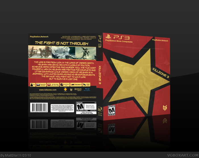
Hey I've been busy, so I haven't posted a box in a while. I saw a socialist propaganda poster, and the colors and everything looked awesome, so it spawned this. I like the way it turned out.
I hate to say the same, but yeah, Rockstar. I do really like the idea and execution, though. It's simple, clean, and very neat. Maybe if you changed the color-scheme or something, it would look a little less like a can of death, but it's still definitely not bad at all.
Does it have to look like every other Killzone box on the site?
I think it looks great just because it's different.
This site can use boxes like these and I can't really understand your negativity here.
Thanks everyone, I know it doesn't look like the game it's representing, oddly enough, but I came at it more with an artistic sense. I hope you like it from an artistic side at least. I like the color scheme myself. Thanks again for the comments and favs.
 Killzone 3 Box Cover Comments
Hey I've been busy, so I haven't posted a box in a while. I saw a socialist propaganda poster, and the colors and everything looked awesome, so it spawned this. I like the way it turned out.
[ Reply ]
I really don't get a Killzone vibe from this. If I saw it in the store I'd find myself asking how Rockstar Energy Drink got a video game.
[ Reply ]
I get the style you were going for, but i have to agree with Box.
[ Reply ]
#2, Haha yeah I can see that too.
[ Reply ]
I agree that this doesn't scream "Killzone".
But it's still a really awesome box.
[ Reply ]
I have to agree with everyone else, it doesn't look anything like a Killzone 3 box.
[ Reply ]
#6, I agree, still, it's a good box.
[ Reply ]
I like it, its still a well executed box.
[ Reply ]
Like others have said, this doesn't really say Killzone. I thought energy drink when I saw it. :P
[ Reply ]
I hate to say the same, but yeah, Rockstar. I do really like the idea and execution, though. It's simple, clean, and very neat. Maybe if you changed the color-scheme or something, it would look a little less like a can of death, but it's still definitely not bad at all.
[ Reply ]
Does it have to look like every other Killzone box on the site?
I think it looks great just because it's different.
This site can use boxes like these and I can't really understand your negativity here.
[ Reply ]
Thanks everyone, I know it doesn't look like the game it's representing, oddly enough, but I came at it more with an artistic sense. I hope you like it from an artistic side at least. I like the color scheme myself. Thanks again for the comments and favs.
[ Reply ]
Seems very Soviet.
[ Reply ]
i like the idea, there's really something good approach
[ Reply ]
looks great
[ Reply ]