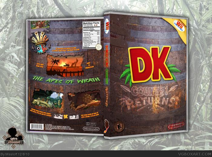
Just a box I made to make. Yeah nothing uber. And prolly not to original either. But I needed to make one for my empty case. the original box is still perfect tho. That's kinda why i put it on my box.
You may not think so, but this is pretty damn creative. I already like the barrel theme, but subtle touches like the banana peel with Wii sticker, and the nutritional facts on the back make this a really special design. I love it.
The only real flaw I see are a couple spelling mistakes, "severvings" and "compatable".
The only thing I think that could be a tad bit better, is the Country Returns logo on the front. Its sort of hard to see. If it is meant to be a 'branding' on the barrel, then I think it should be darker brown/black instead. If though it was like a sticker on the barrel that just got torn off and revealed 'clean' wood underneath, then it should stay the same color but maybe be a little more noticeable
I won't lie, I'm really not a fan of this box. I really don't get what you were going for. Is the barrel supposed to be indicative of some sort of alcohol? I don't know any foods to come in or be aged in barrels. If it is supposed to be indicative of alcohol, it doesn't make sense since Nintendo's key demographic wouldn't know much about alcohol. And if it's not supposed to be representative of something meant to be ingested, why have the nutritional facts? It looks amateurish in my opinion. There's no uniform color scheme, nothing's blended really well and, as I already mentioned, it makes no sense to me. Sorry dude, you've made some really great boxes, but this isn't one of them.
#7, It's a barrel because... Donkey Kong? I assumed the nutrition facts were more a reference to bananas, although the actual facts would be pretty far off in that case.
Wow, now this is awesome. It reminds me a lot of the Oddworld Munch's Odyssey box, where it was basically a soda can. This is really unique, and it's incredibly well made. The only thing I kinda have a problem with is the opacity of "Country Returns" on the front.
#7, Alcohol? Hrm, I'm guessing you've never played/heard of/seen artwork for Donkey Kong before...
Masloff, I'm a HUGE fan. The only things turning me off right now are the few spelling mistakes, but other than that this is an incredible box. Pssh, "nothing uber" my ass!
#10, dude I've played every DK game to date almost in their entirety, I understand what the barrel represents to the game but then the nutrition facts make no sense. I figured they (nutrition facts) pertained to the contents of the barrel and alcohol is aged in barrels, hence I made the reference. I was trying to emphasize how I didn't think the nutrition facts worked.
#11, That is why the actual nutrient facts for a banana, and that's what the barrel is supposed to be full of, also it's a DK barrel so it could be seen either way. Also the nutrient facts label serves as the information on how to play the game.
Well, I actually agree with LooseJuice to be honest. I don't really see what he was trying to go for and although it is unique, it isnt very appealing visually imo.
I don't like the way you highlighted the ESRB on the front nor the way the screenshots look like holes in the picture rather than holes in the barrel. Also both front and back have quite a big free space in the top (In the front It's like it just seems, due to the colors at the bottom of the barrel). Plus that green text on the back looks awkard, It just doesn't seem to have something to doneither with DK nor with the box.
Very creative the Nutrition Facts thing, btw, tough I'd've liked it better if it looked like sticked to the barrel.
not that bad, but the mixed look of the logos on the front doesn't work for me and the transparent ones could stand out more. There are also issues at the perspective of some of the text on the back (including the missing perspective of the nutrition facts).
 Donkey Kong Country Returns Box Cover Comments
Just a box I made to make. Yeah nothing uber. And prolly not to original either. But I needed to make one for my empty case. the original box is still perfect tho. That's kinda why i put it on my box.
[ Reply ]
Very plain, but I love the barrel theme none the less.
[ Reply ]
#2, I don't think its plain, I think its awesome. Its a lot different from the typical boxes on this site too so its good to see some variety
[ Reply ]
You may not think so, but this is pretty damn creative. I already like the barrel theme, but subtle touches like the banana peel with Wii sticker, and the nutritional facts on the back make this a really special design. I love it.
The only real flaw I see are a couple spelling mistakes, "severvings" and "compatable".
[ Reply ]
(because I can't edit heres another comment)
The only thing I think that could be a tad bit better, is the Country Returns logo on the front. Its sort of hard to see. If it is meant to be a 'branding' on the barrel, then I think it should be darker brown/black instead. If though it was like a sticker on the barrel that just got torn off and revealed 'clean' wood underneath, then it should stay the same color but maybe be a little more noticeable
[ Reply ]
#4, Frined
[ Reply ]
I won't lie, I'm really not a fan of this box. I really don't get what you were going for. Is the barrel supposed to be indicative of some sort of alcohol? I don't know any foods to come in or be aged in barrels. If it is supposed to be indicative of alcohol, it doesn't make sense since Nintendo's key demographic wouldn't know much about alcohol. And if it's not supposed to be representative of something meant to be ingested, why have the nutritional facts? It looks amateurish in my opinion. There's no uniform color scheme, nothing's blended really well and, as I already mentioned, it makes no sense to me. Sorry dude, you've made some really great boxes, but this isn't one of them.
[ Reply ]
#7, It's a barrel because... Donkey Kong? I assumed the nutrition facts were more a reference to bananas, although the actual facts would be pretty far off in that case.
[ Reply ]
Wow, now this is awesome. It reminds me a lot of the Oddworld Munch's Odyssey box, where it was basically a soda can. This is really unique, and it's incredibly well made. The only thing I kinda have a problem with is the opacity of "Country Returns" on the front.
[ Reply ]
#7, Alcohol? Hrm, I'm guessing you've never played/heard of/seen artwork for Donkey Kong before...
Masloff, I'm a HUGE fan. The only things turning me off right now are the few spelling mistakes, but other than that this is an incredible box. Pssh, "nothing uber" my ass!
[ Reply ]
#10, dude I've played every DK game to date almost in their entirety, I understand what the barrel represents to the game but then the nutrition facts make no sense. I figured they (nutrition facts) pertained to the contents of the barrel and alcohol is aged in barrels, hence I made the reference. I was trying to emphasize how I didn't think the nutrition facts worked.
[ Reply ]
#11. Bananas. They have a little something to do with the DK games.
[ Reply ]
I also get that bananas have to do with the game. It just doesn't work in my opinion.
[ Reply ]
#11, That is why the actual nutrient facts for a banana, and that's what the barrel is supposed to be full of, also it's a DK barrel so it could be seen either way. Also the nutrient facts label serves as the information on how to play the game.
[ Reply ]
Well, I actually agree with LooseJuice to be honest. I don't really see what he was trying to go for and although it is unique, it isnt very appealing visually imo.
[ Reply ]
Personally I like the Nutrition Facts thing
[ Reply ]
I don't like the way you highlighted the ESRB on the front nor the way the screenshots look like holes in the picture rather than holes in the barrel. Also both front and back have quite a big free space in the top (In the front It's like it just seems, due to the colors at the bottom of the barrel). Plus that green text on the back looks awkard, It just doesn't seem to have something to doneither with DK nor with the box.
Very creative the Nutrition Facts thing, btw, tough I'd've liked it better if it looked like sticked to the barrel.
[ Reply ]
not that bad, but the mixed look of the logos on the front doesn't work for me and the transparent ones could stand out more. There are also issues at the perspective of some of the text on the back (including the missing perspective of the nutrition facts).
[ Reply ]
i like it a lot, good job.
[ Reply ]
This was just a quick make. No Beer ref, and yes somethings I admit, I slacked on.
But meh... I like it
[ Reply ]
I love it,I love the style
[ Reply ]